
Projects
Color you can
live in.work in.play in.feel.
Lisbon · Residential consultation
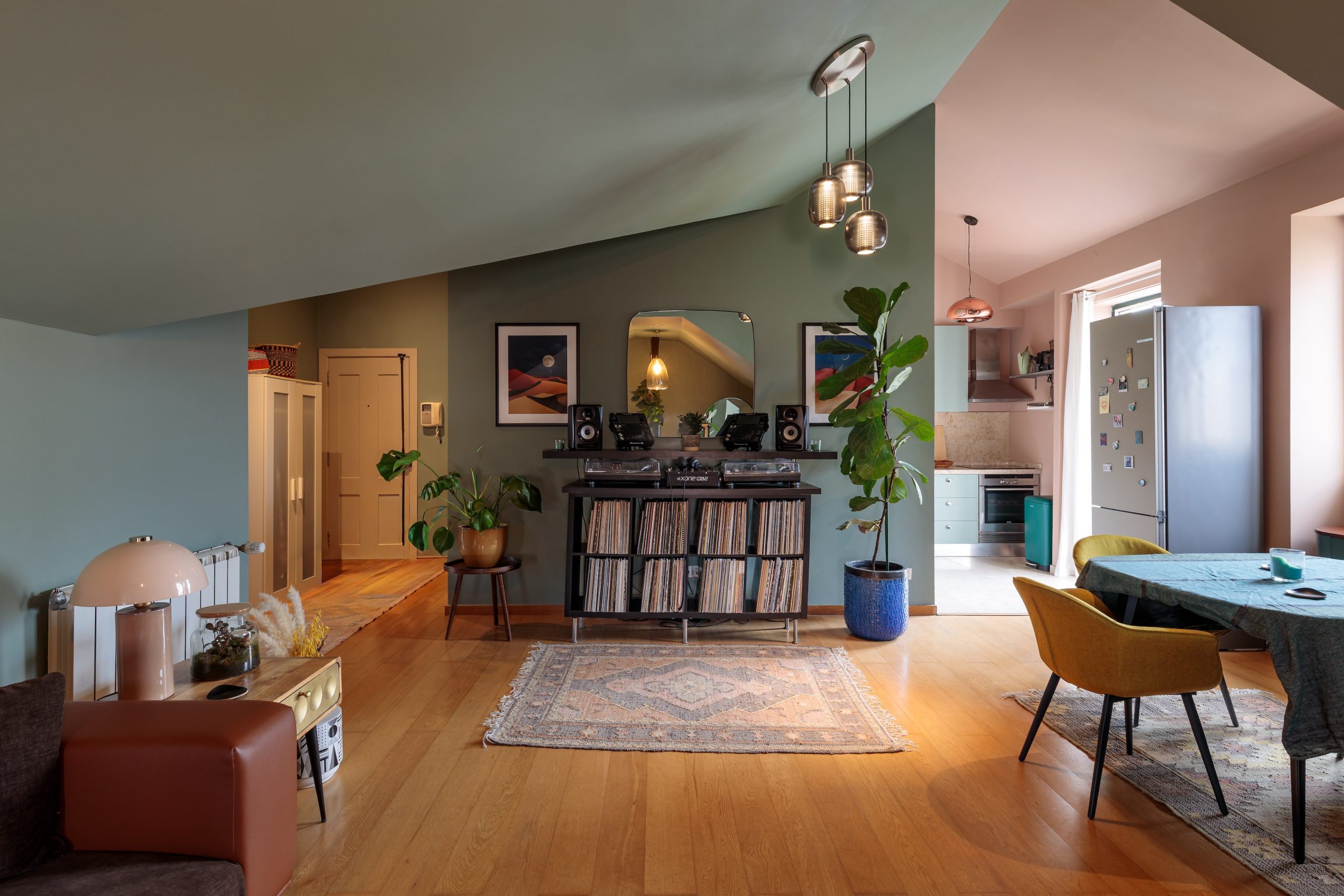 02Graça Apartment
Lisbon · Residential consultation
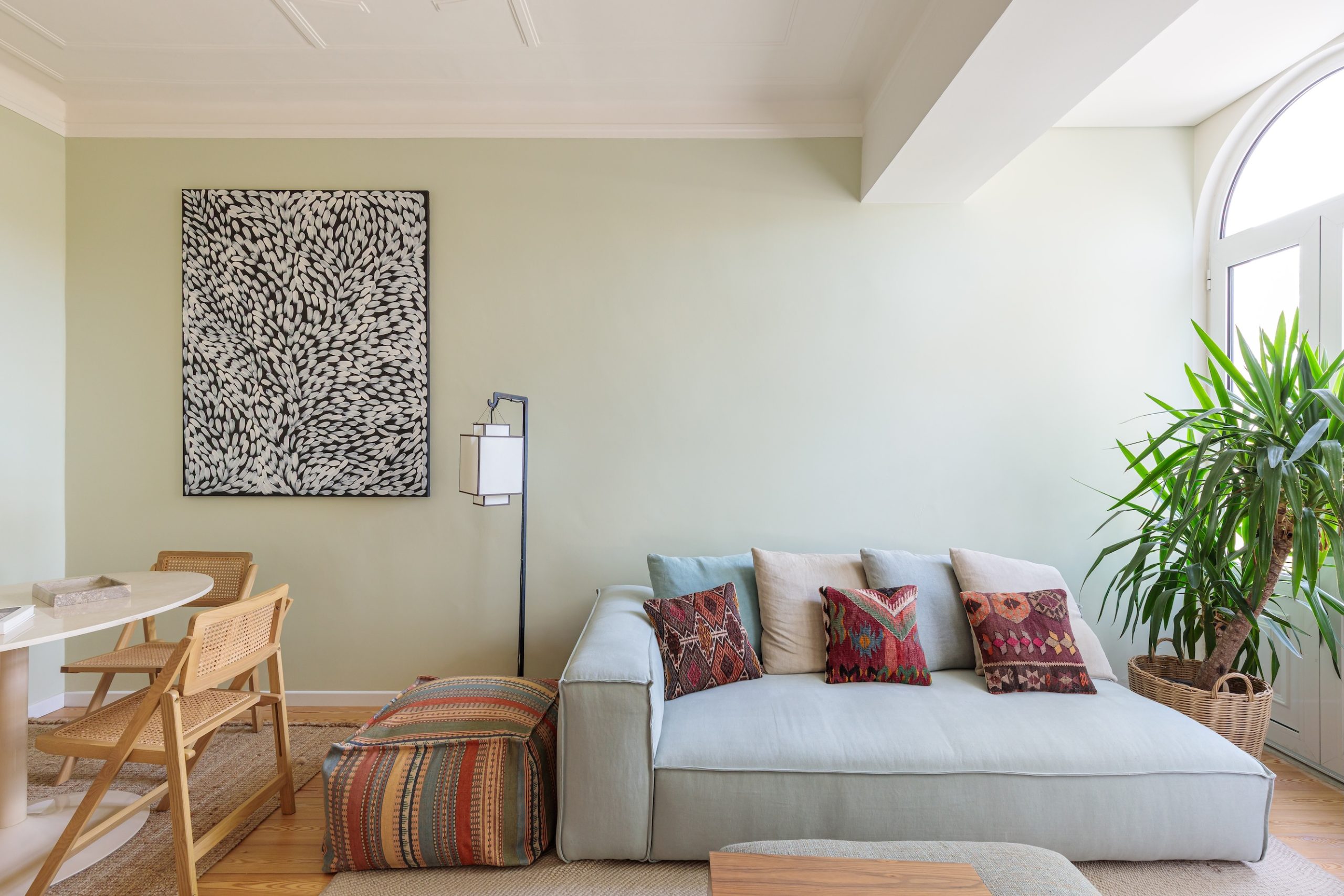
 03Sintra Home
Sintra · Residential consultation
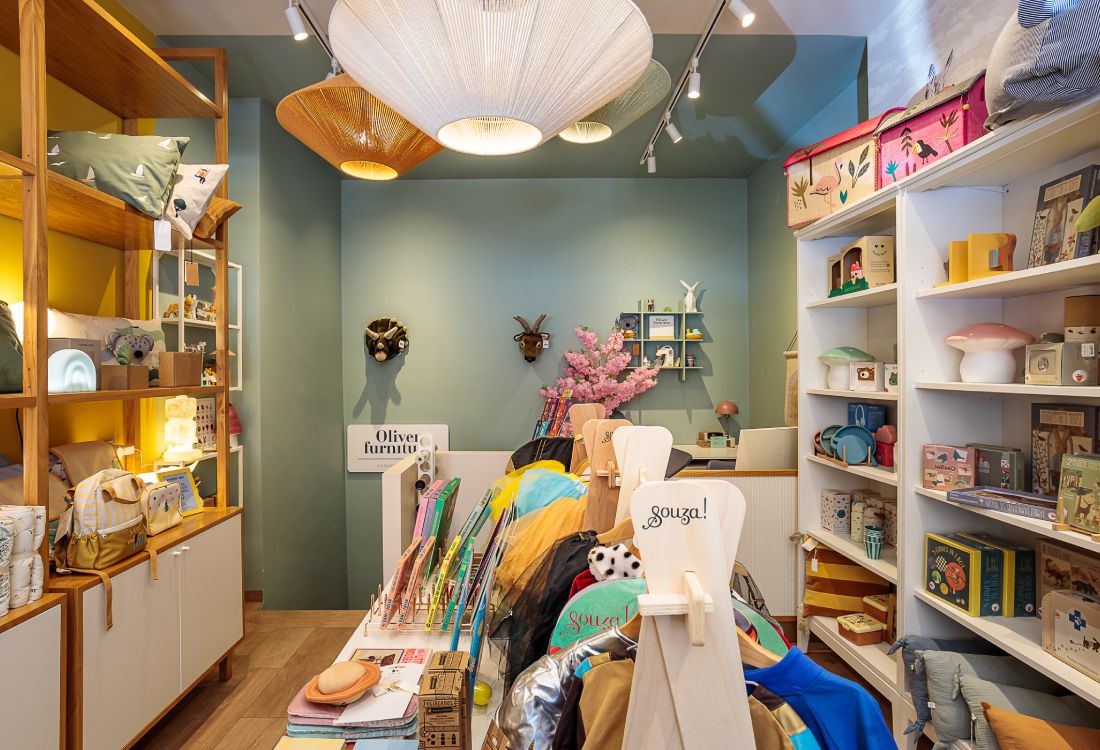
 04Bahú Kids
Lisbon · Commercial consultation
 05Como Branco
Lisbon · Corporate consultation
 06Lagos Apartment
Lagos, Algarve · Commercial consultation
 07Adega
Algarve · Commercial consultation
Príncipe Real Apartment
Scroll the photos →
The brief
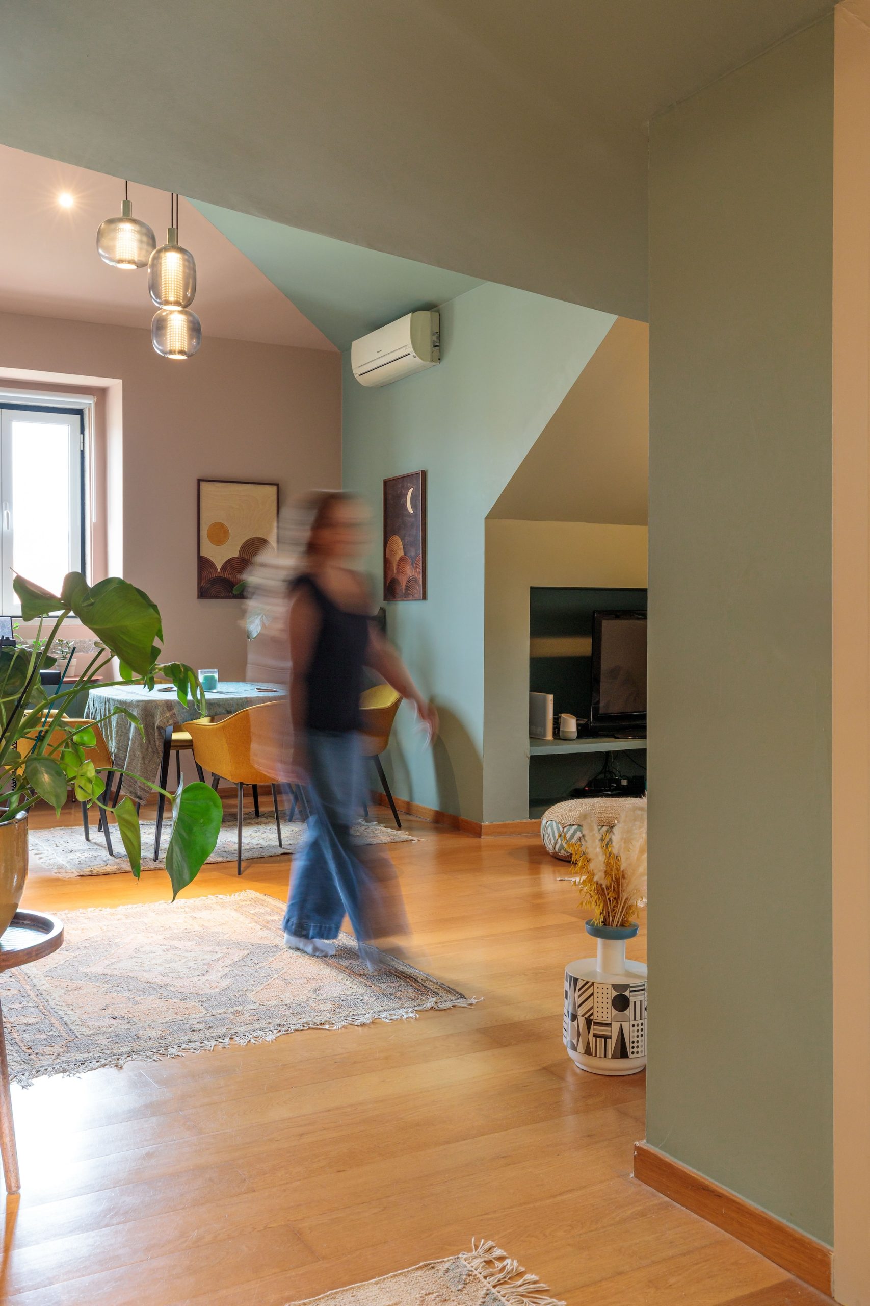
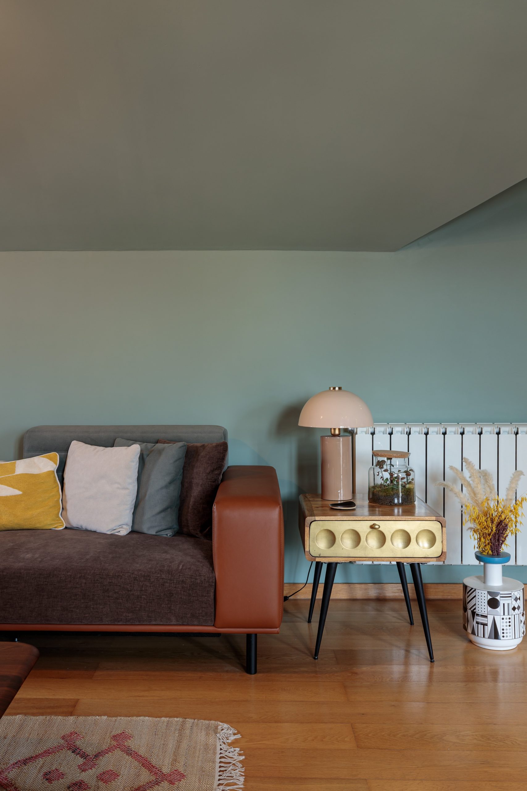
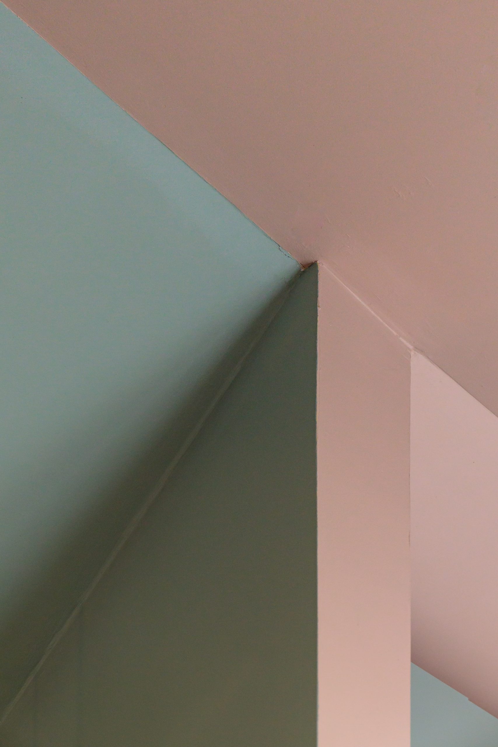
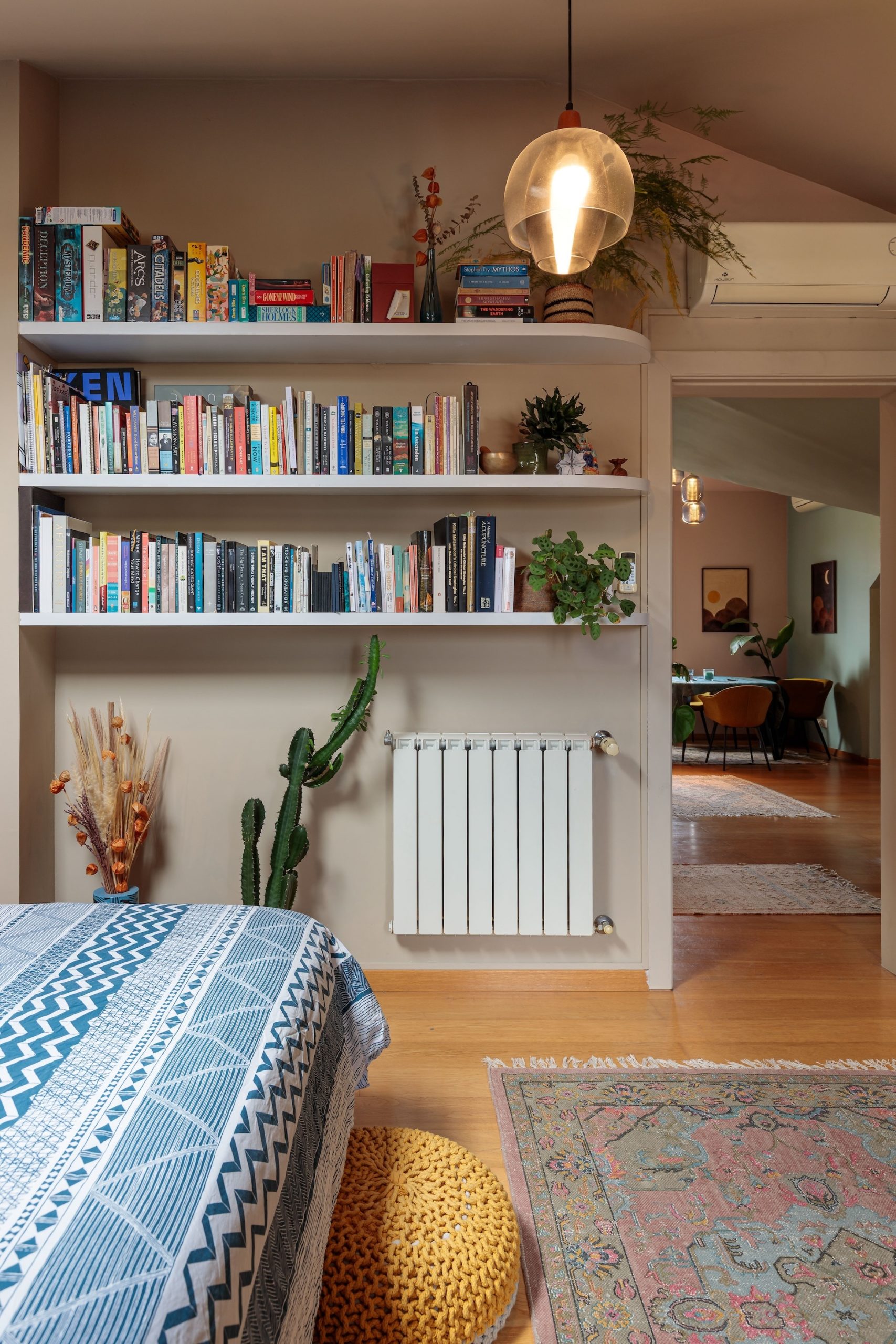
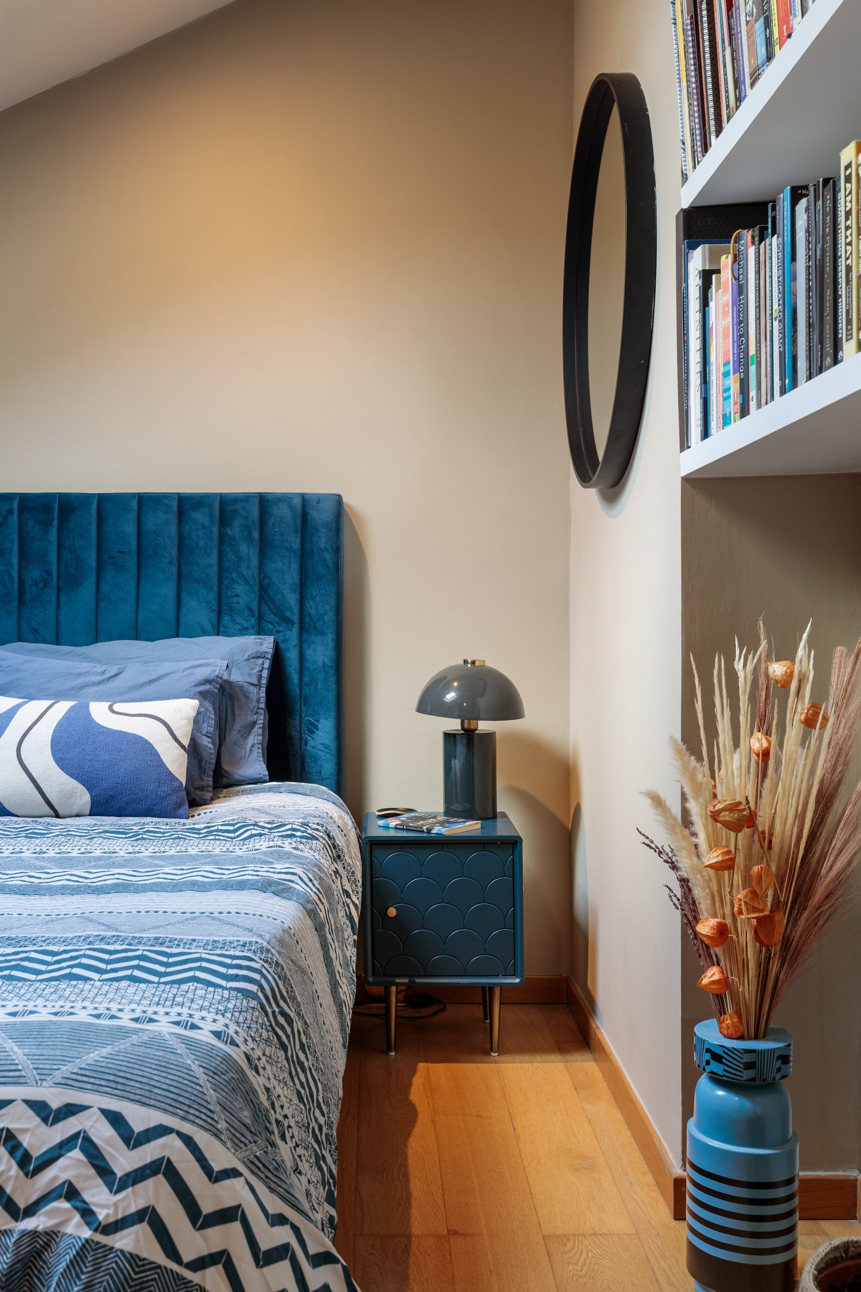
For this couple’s apartment in Príncipe Real, we developed a cohesive color palette that flows throughout the home, with each hue carefully chosen to complement the others.
The color story
Color blocking subtly defines the boundary between the kitchen–dining area and the living space. A soft aquamarine creates a calm, relaxing living room, while a gentle pink brings warmth and softness to the kitchen and dining areas.
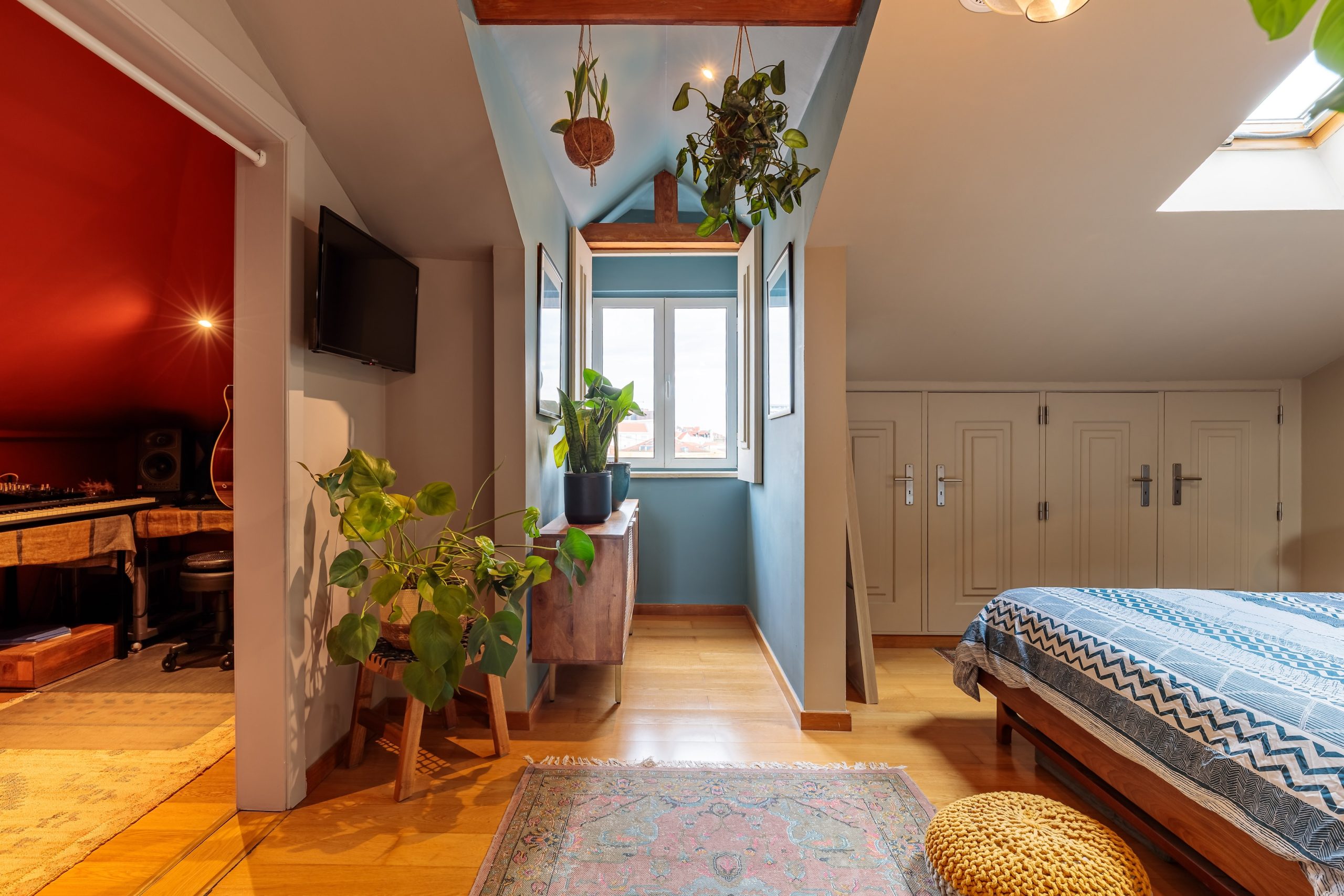
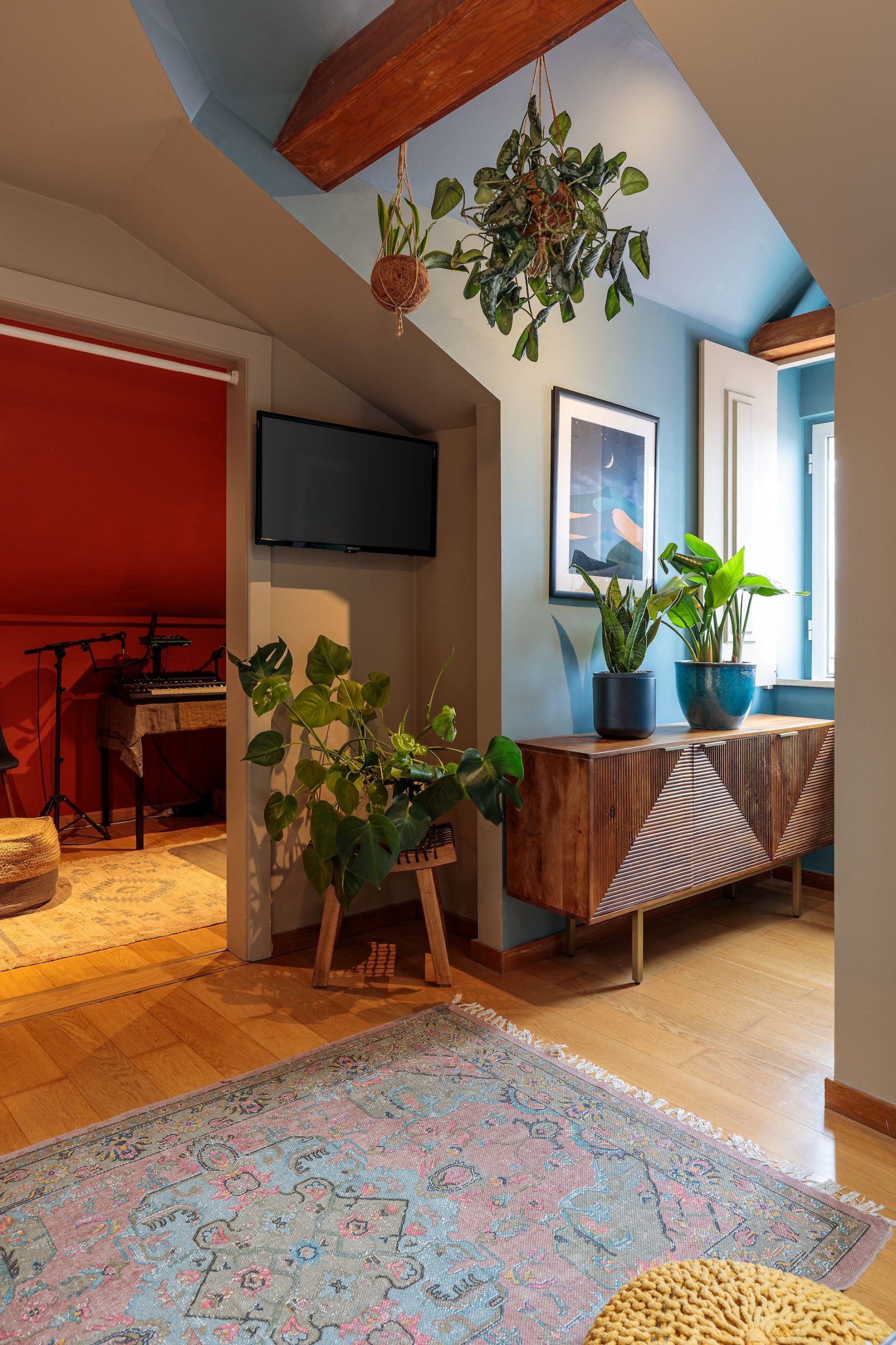
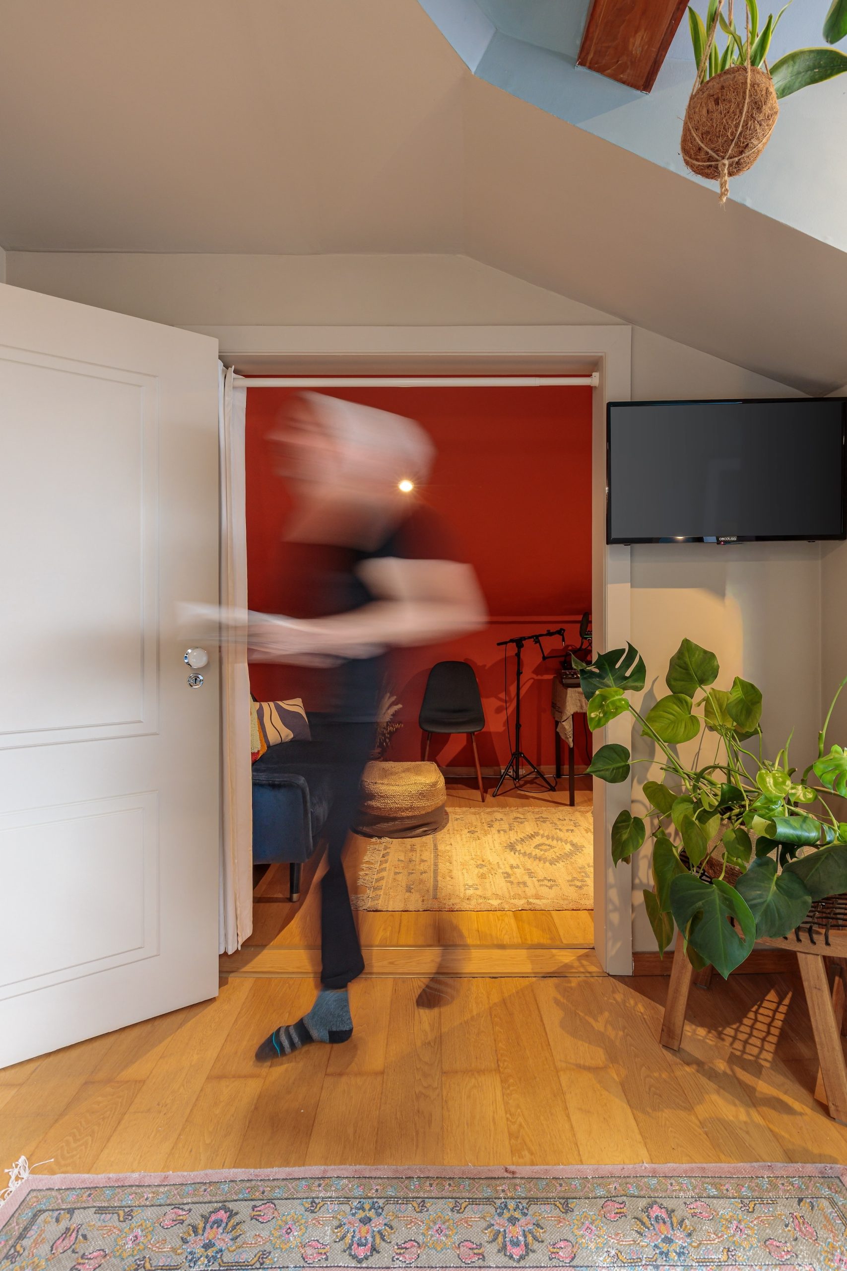
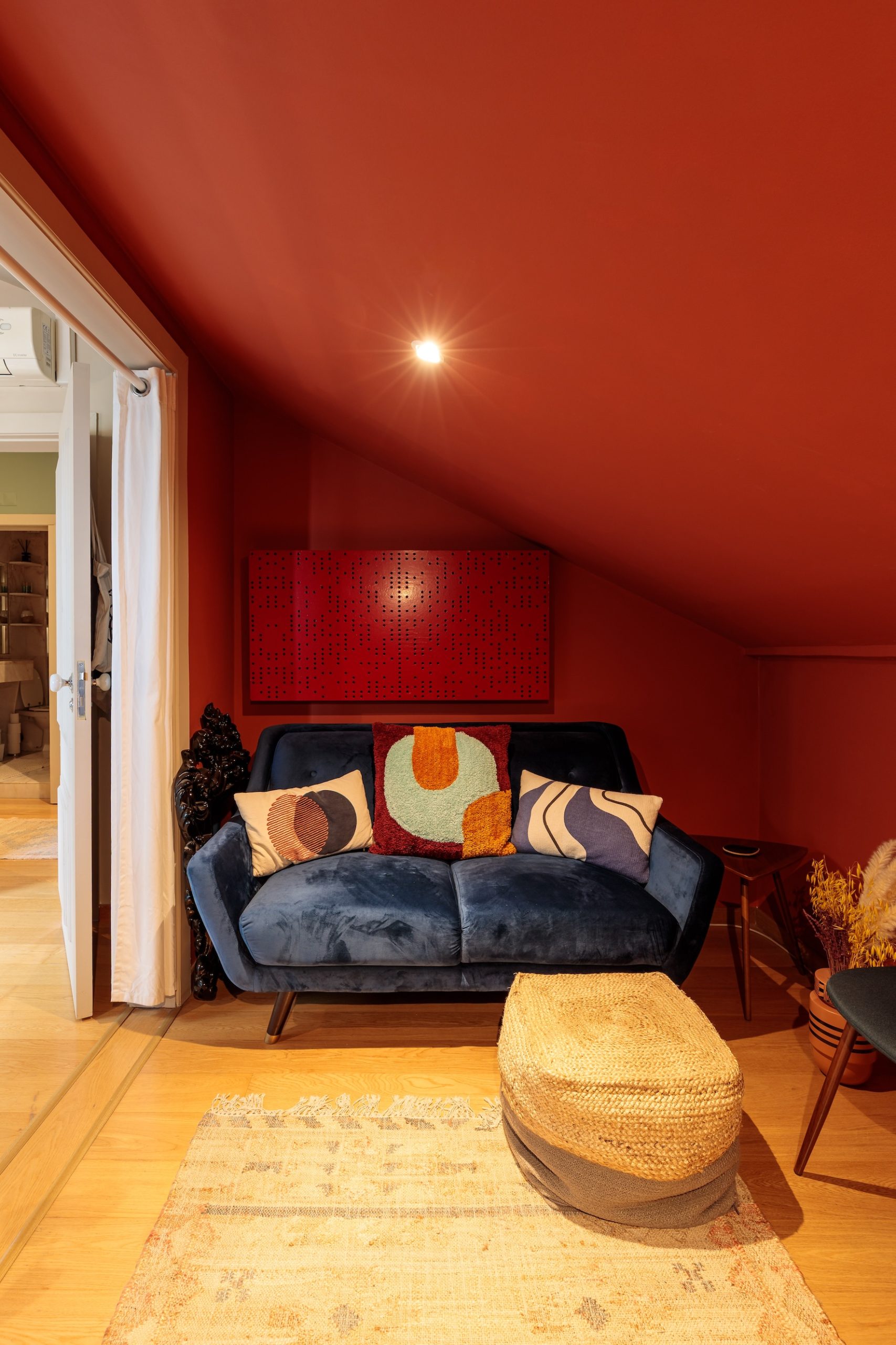
In the bedroom, a clay tone adds warmth and comfort, with the window alcove highlighted in a complementary soft blue. For one of the owners’ workspaces, an unexpected yet inviting red in a color-drenched scheme creates a cozy, energizing place for focused work.
“Susan really knows her colors! You will get great combos that make sense for your space.”H.E. · Lisbon
Graça Apartment
Scroll the photos →
The brief
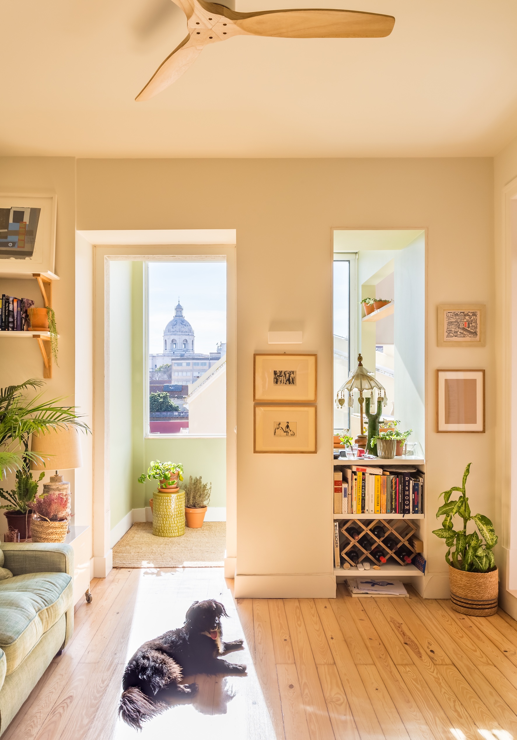
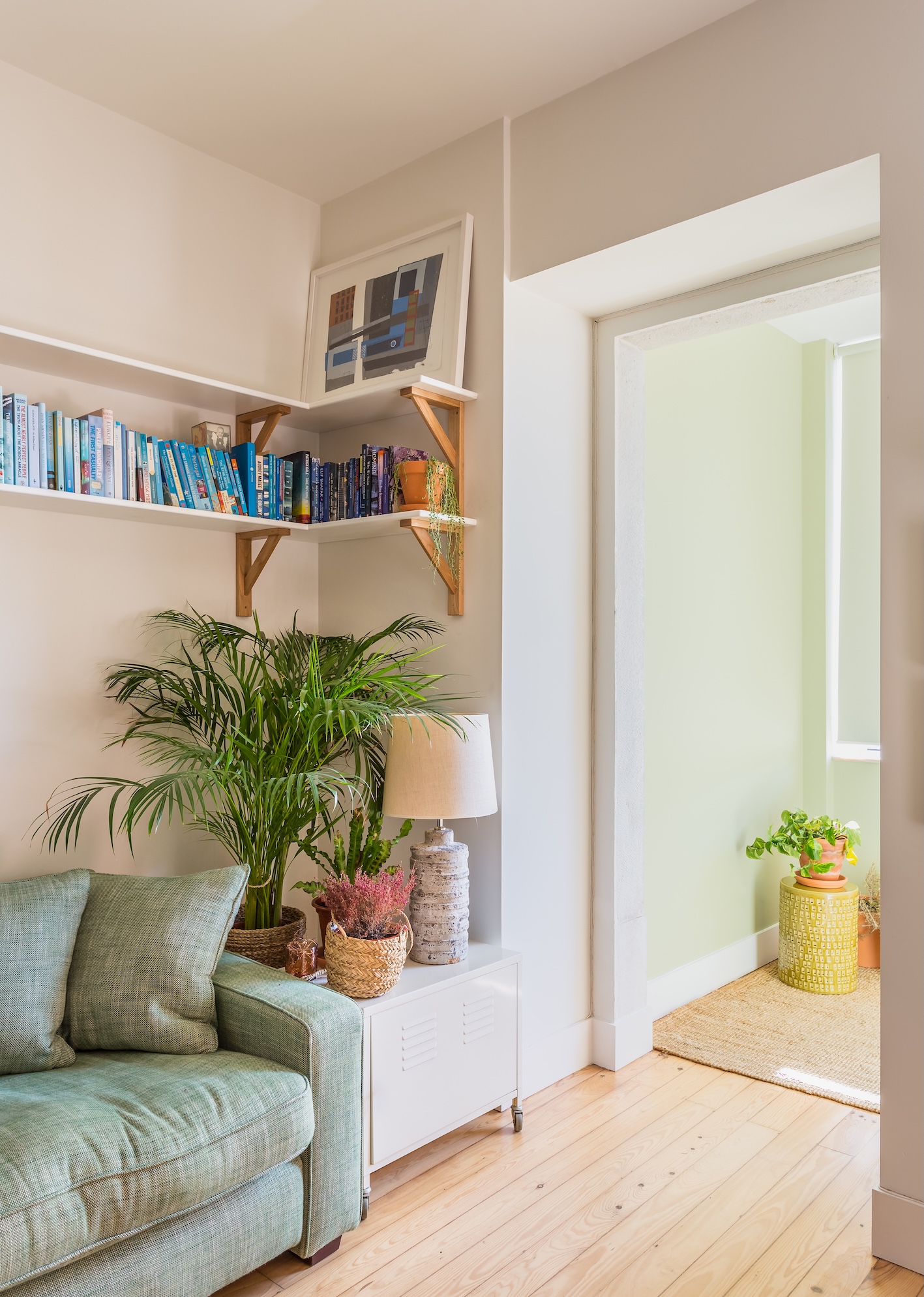
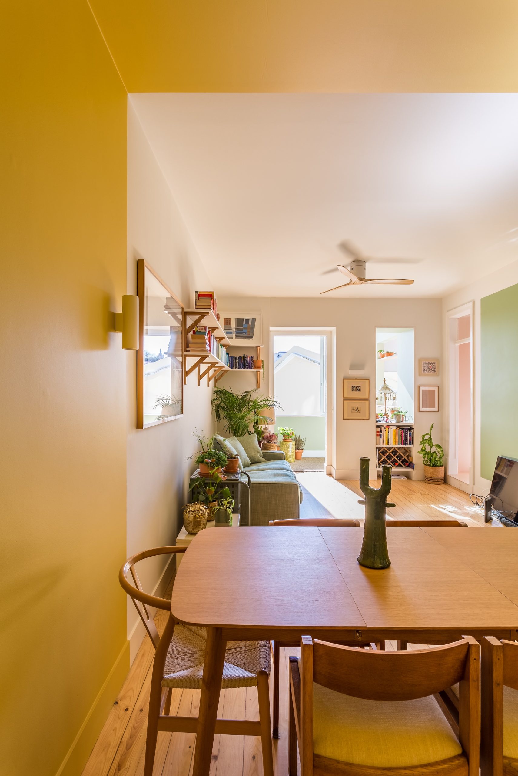
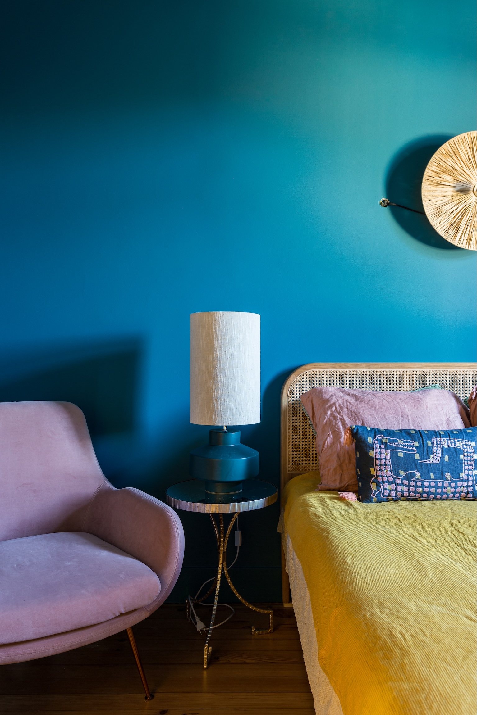
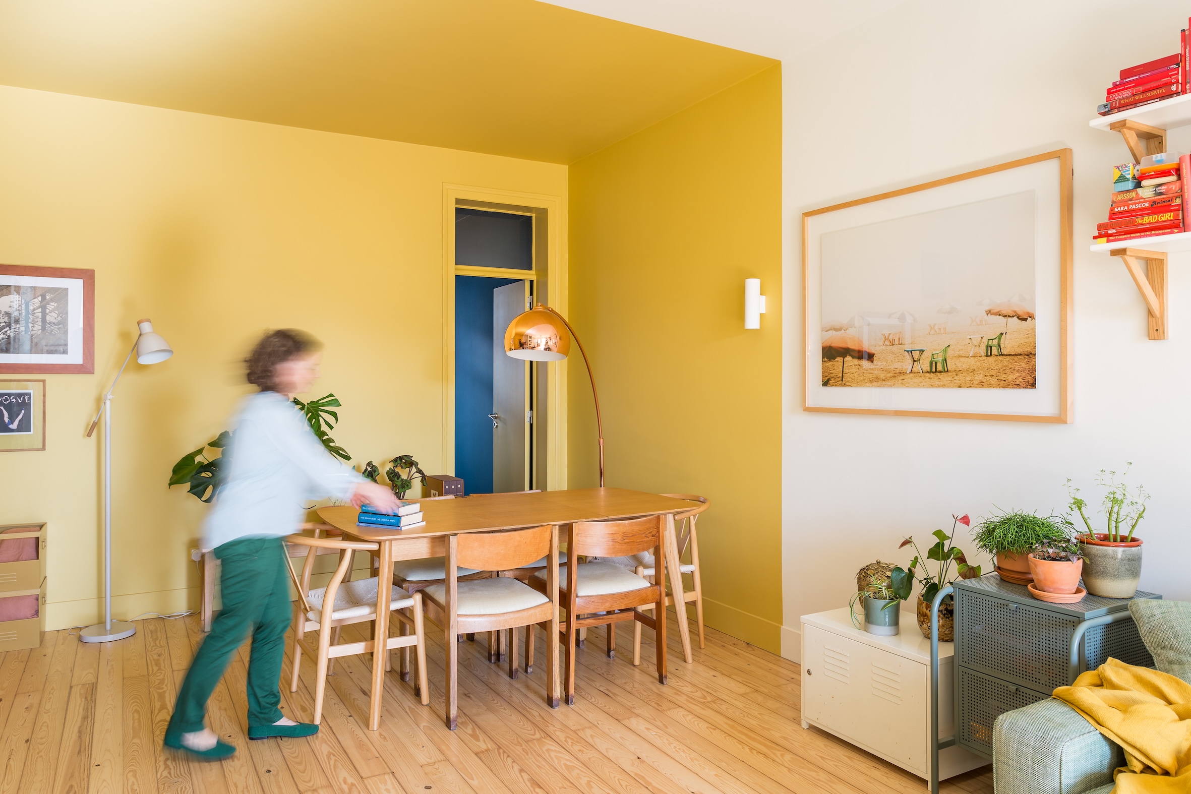
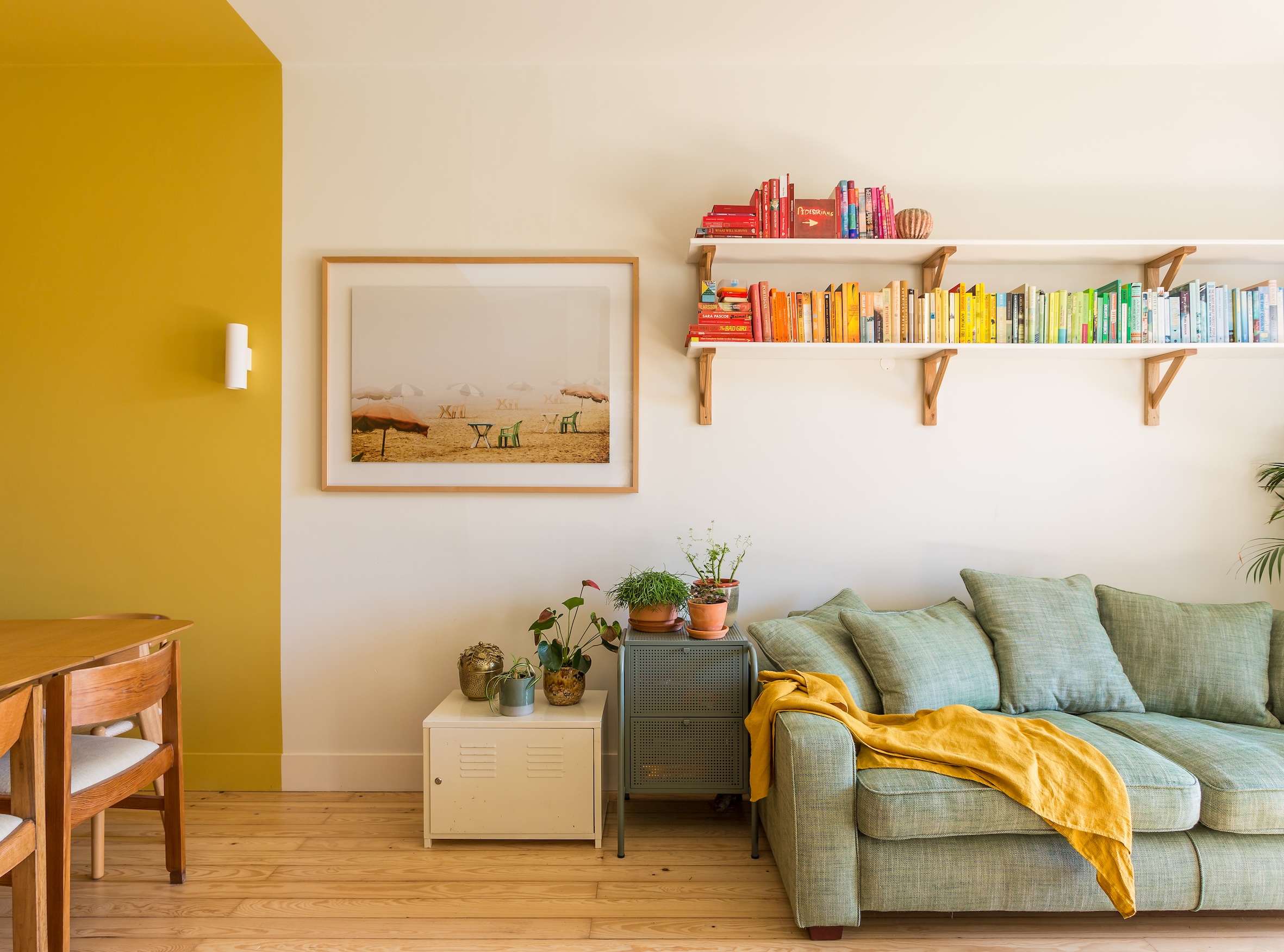
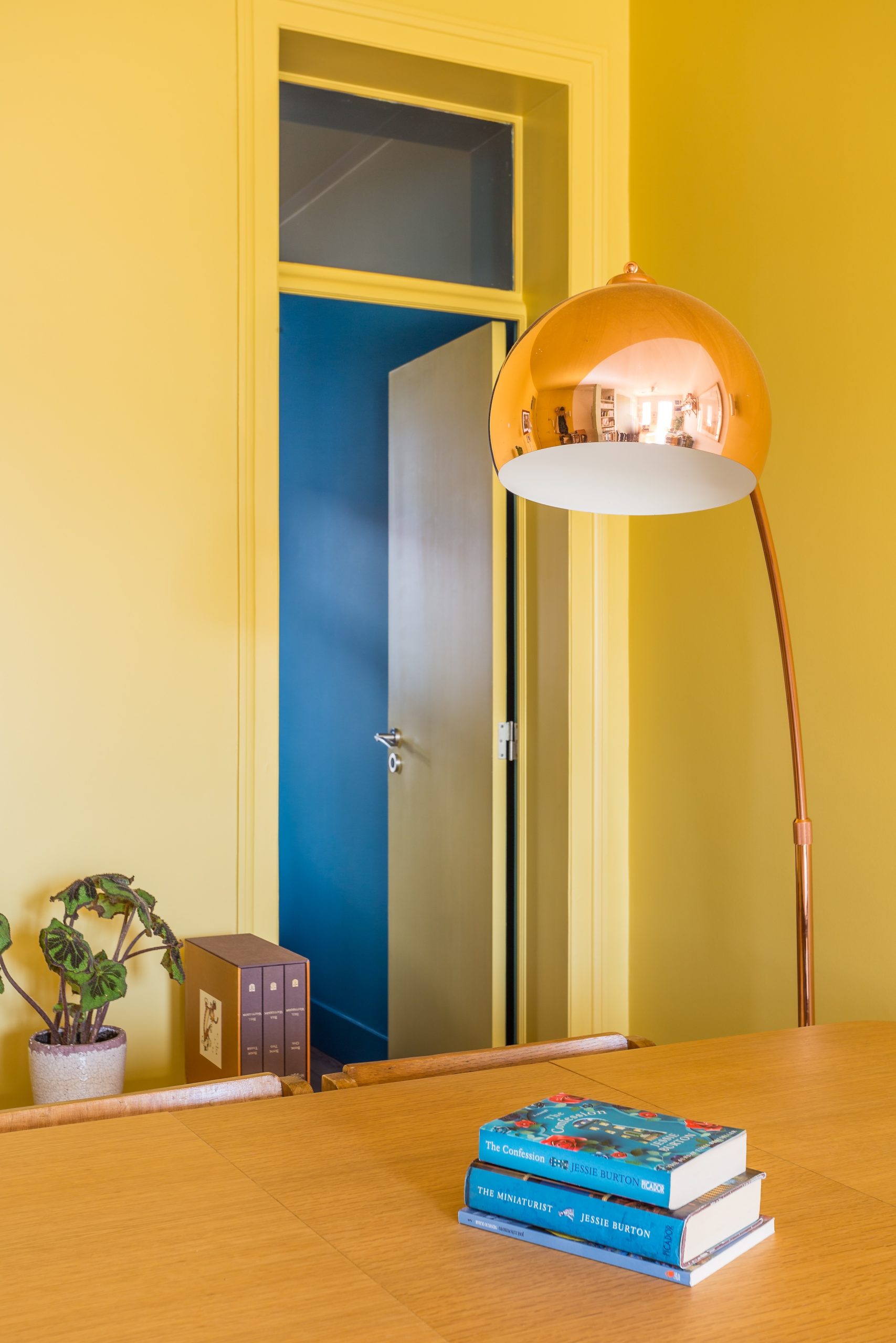
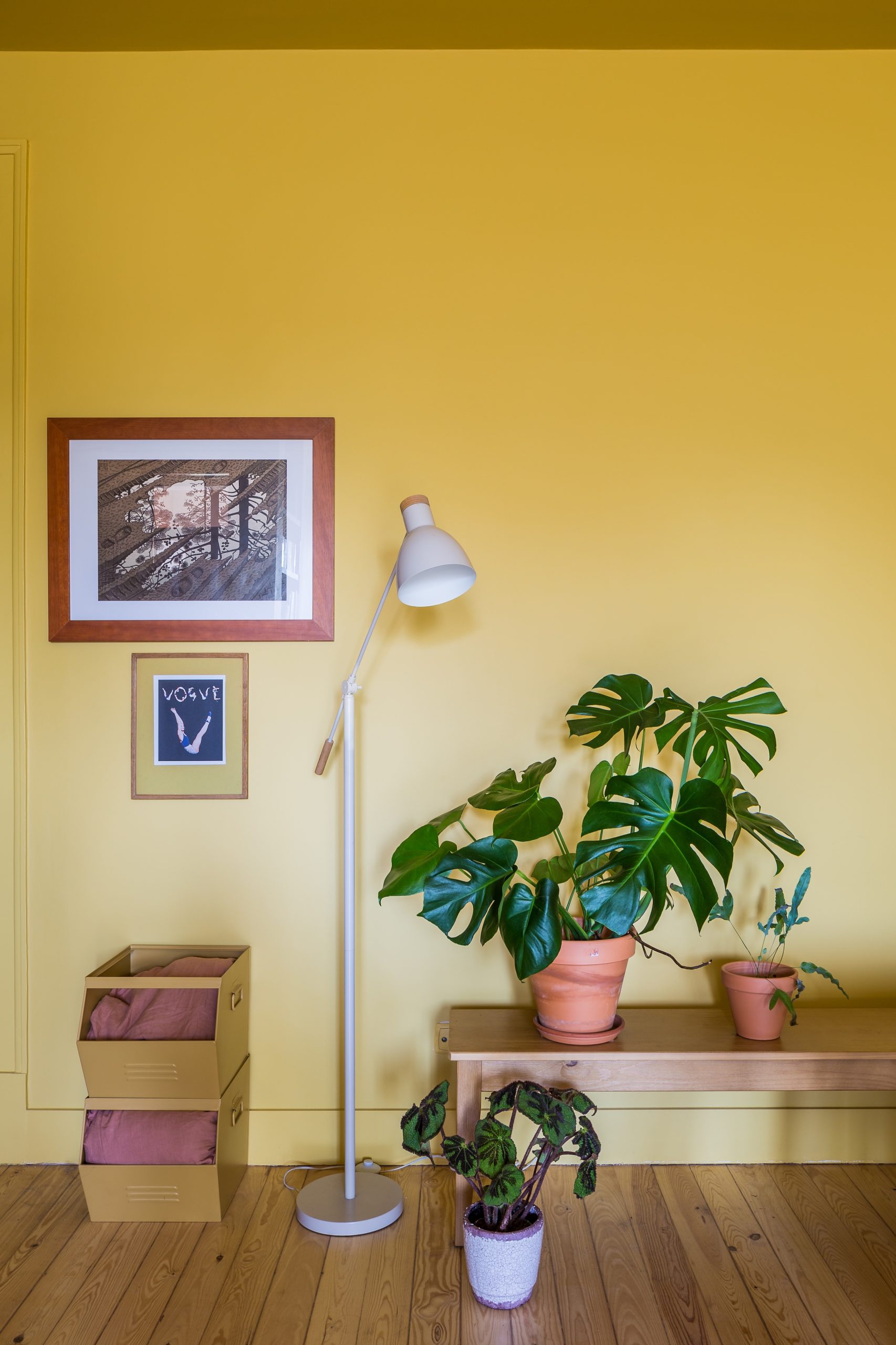
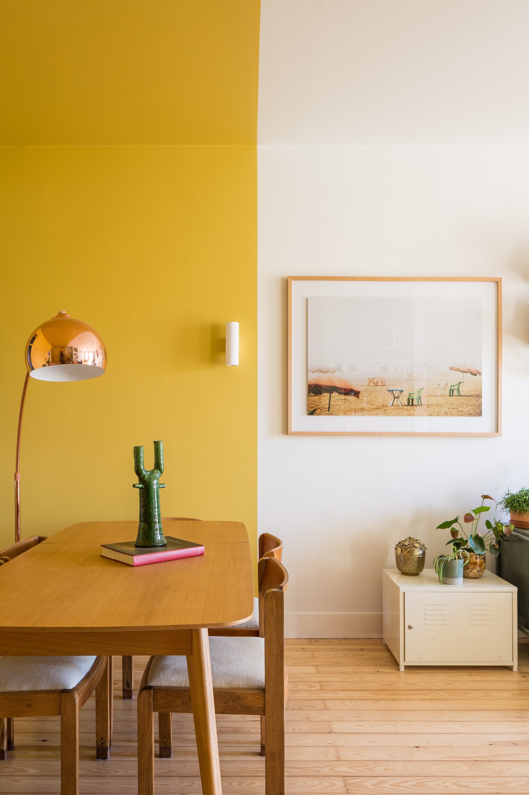
Maximize the sense of space while introducing a vibrant, confident use of color. A creative herself, the client embraced bold choices from the start.
The color story
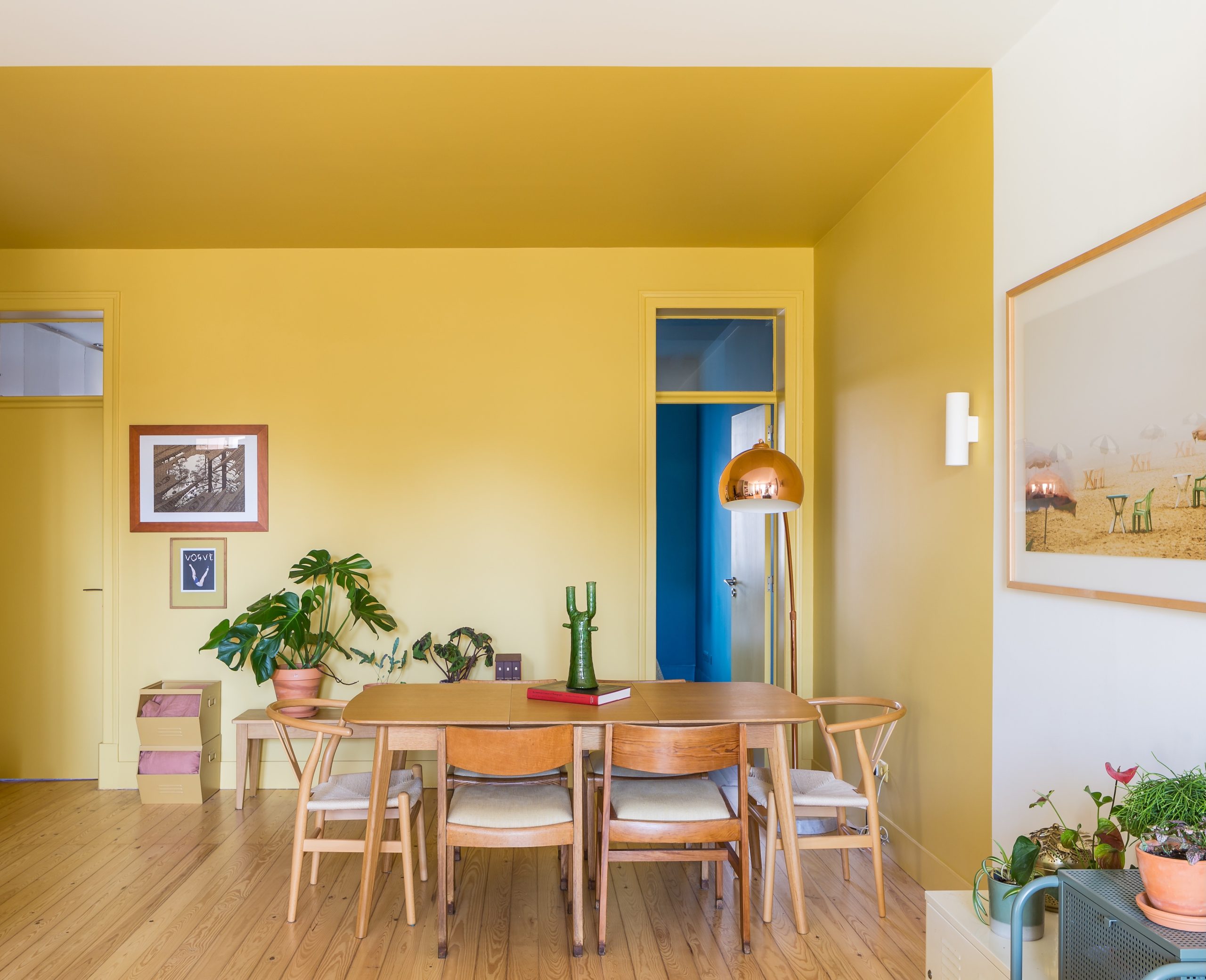
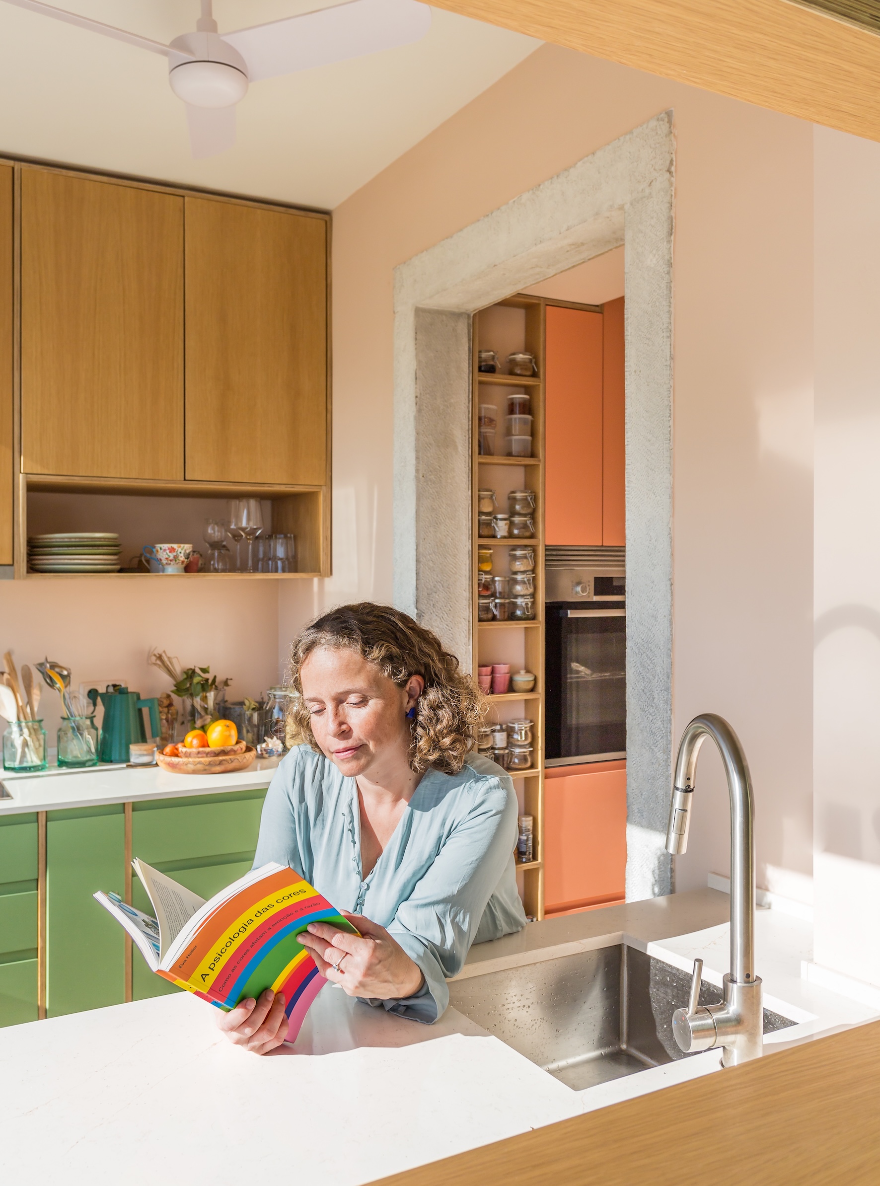
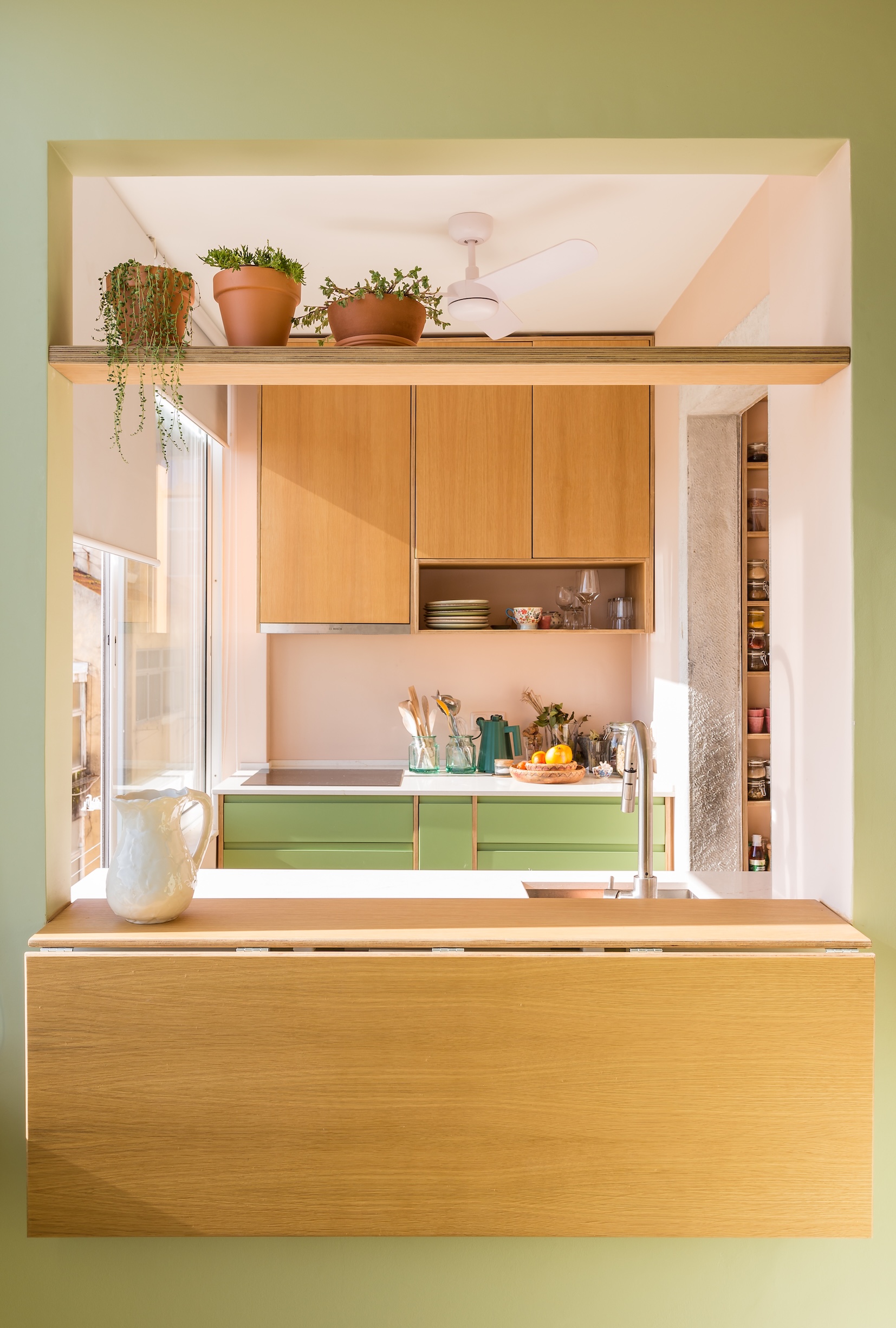
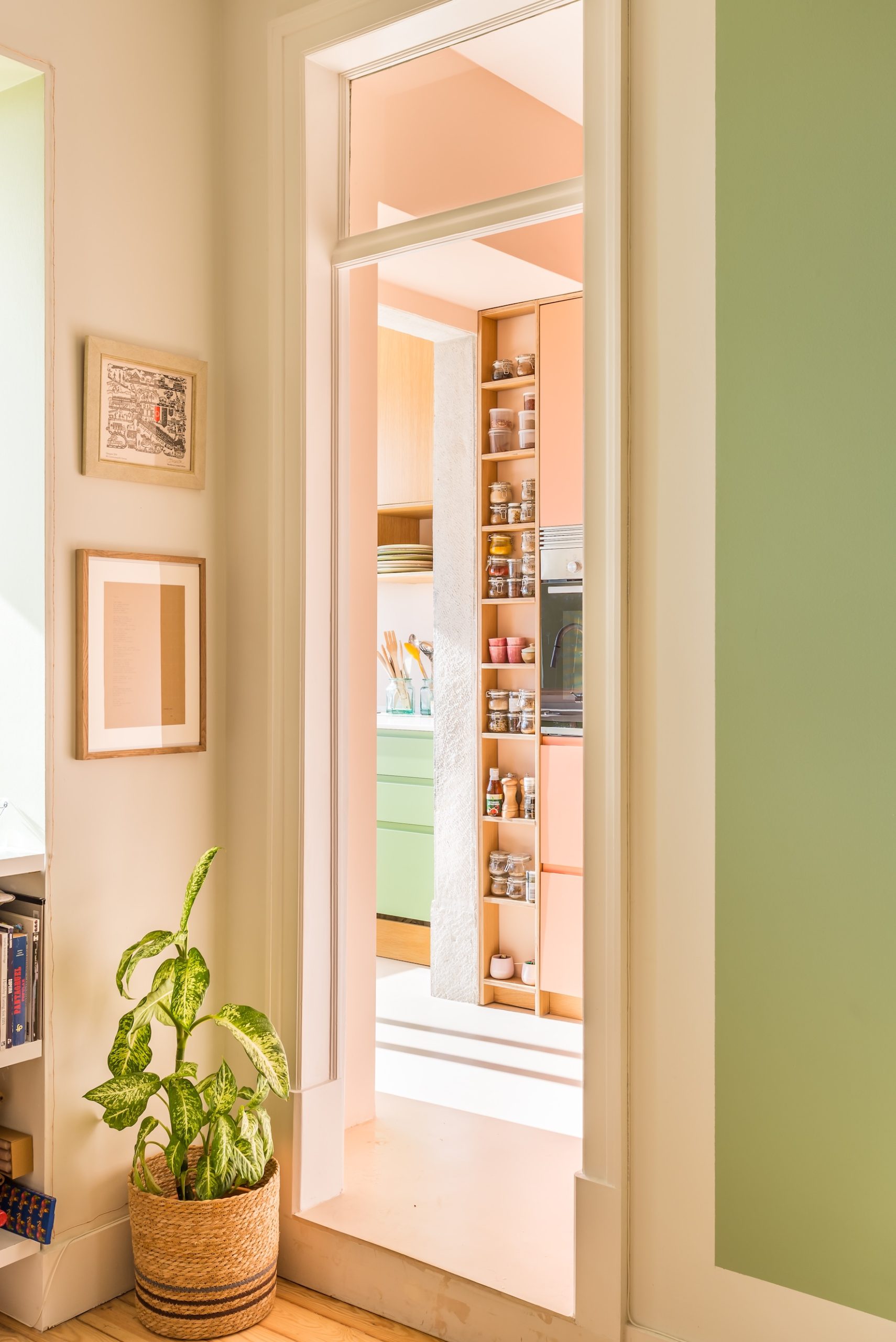
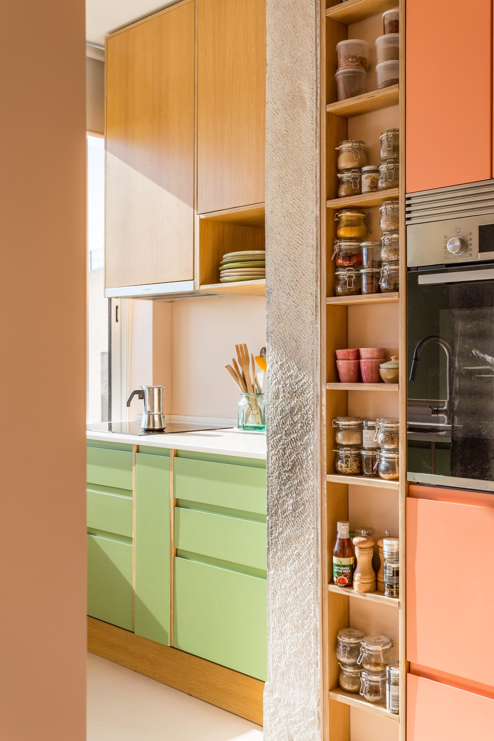
A striking yellow color block runs from the entrance along the corridor into the dining area — a single gesture that threads the open-plan space together. In the kitchen, greens echo the trees beyond the window and terracotta picks up the rooftops.
Sintra Home
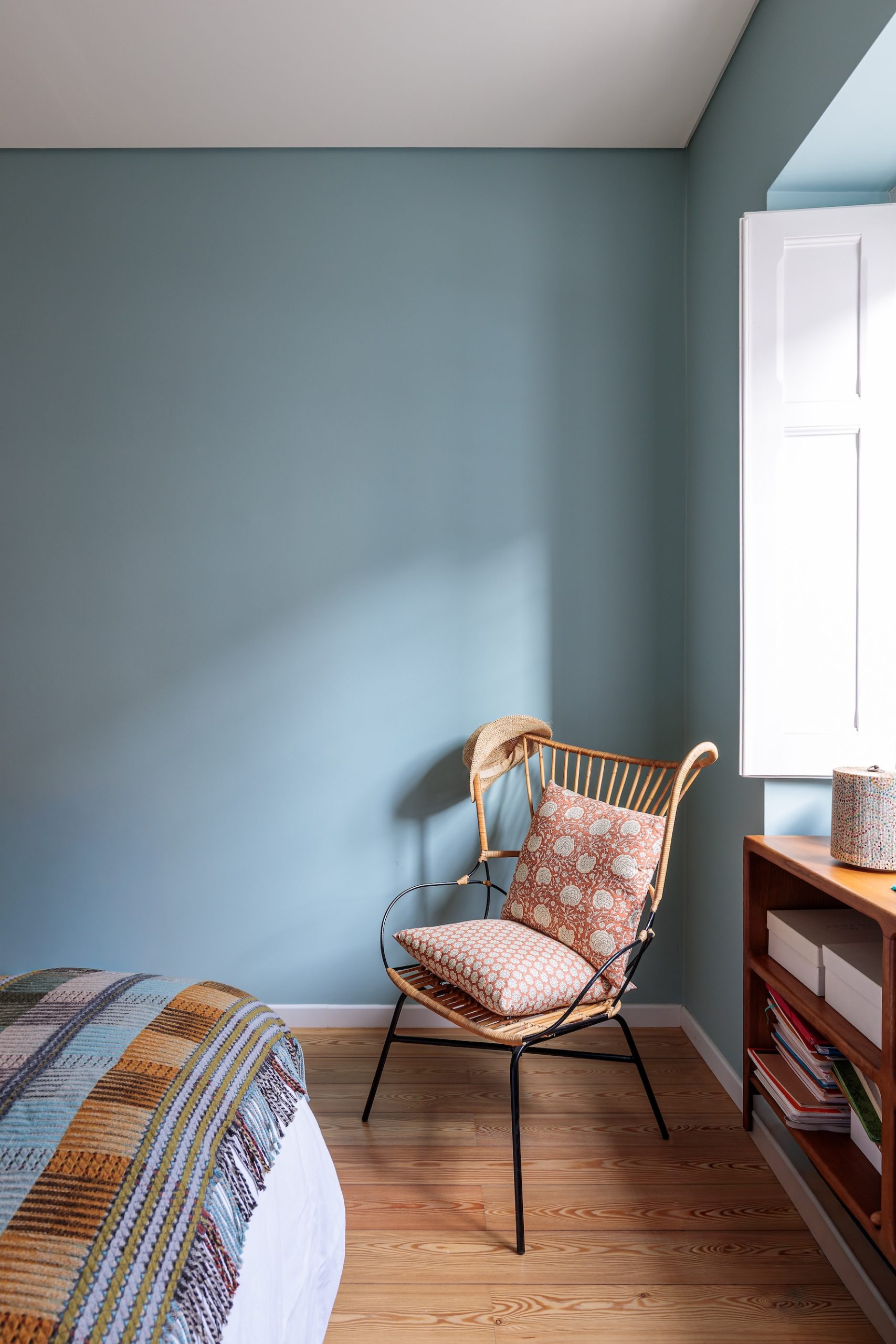
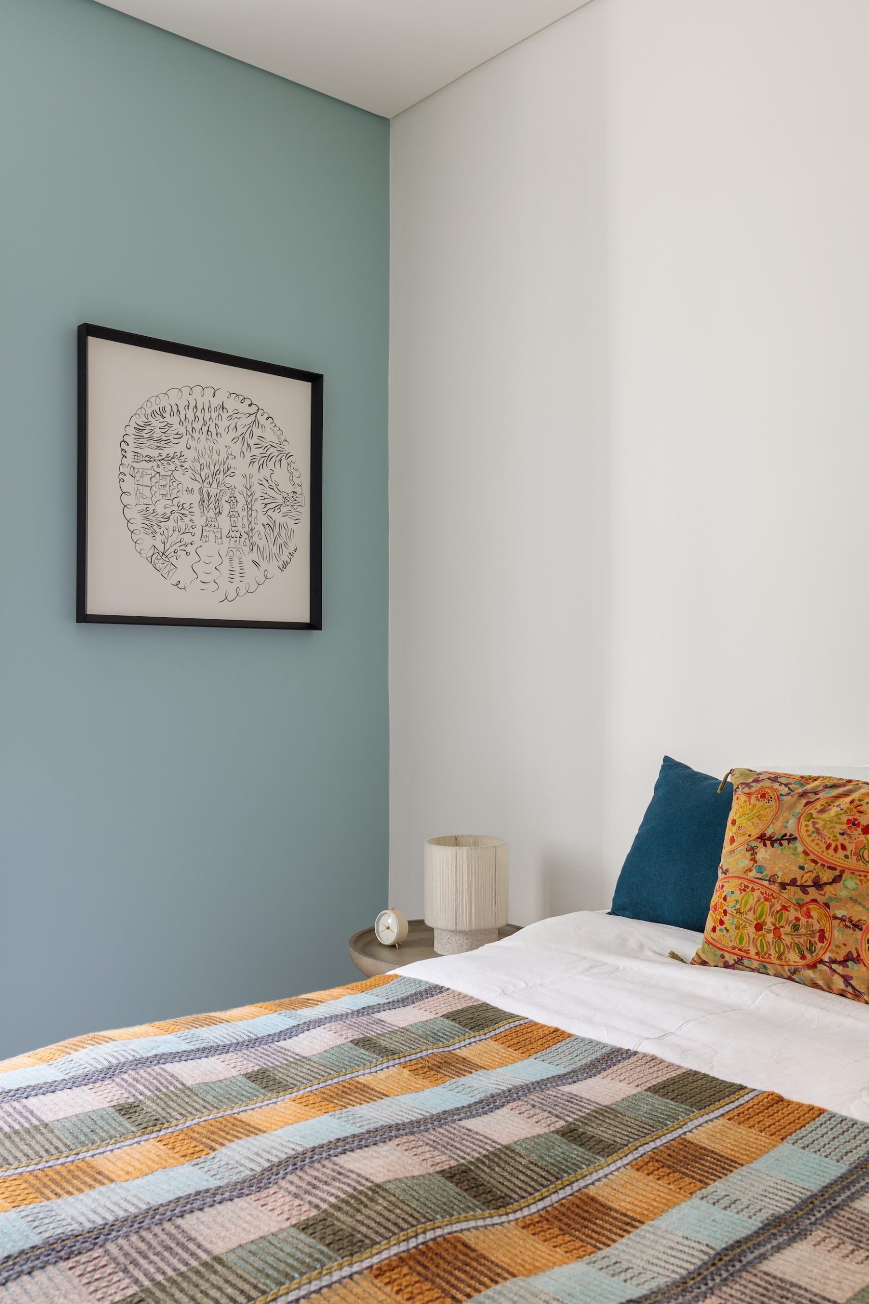
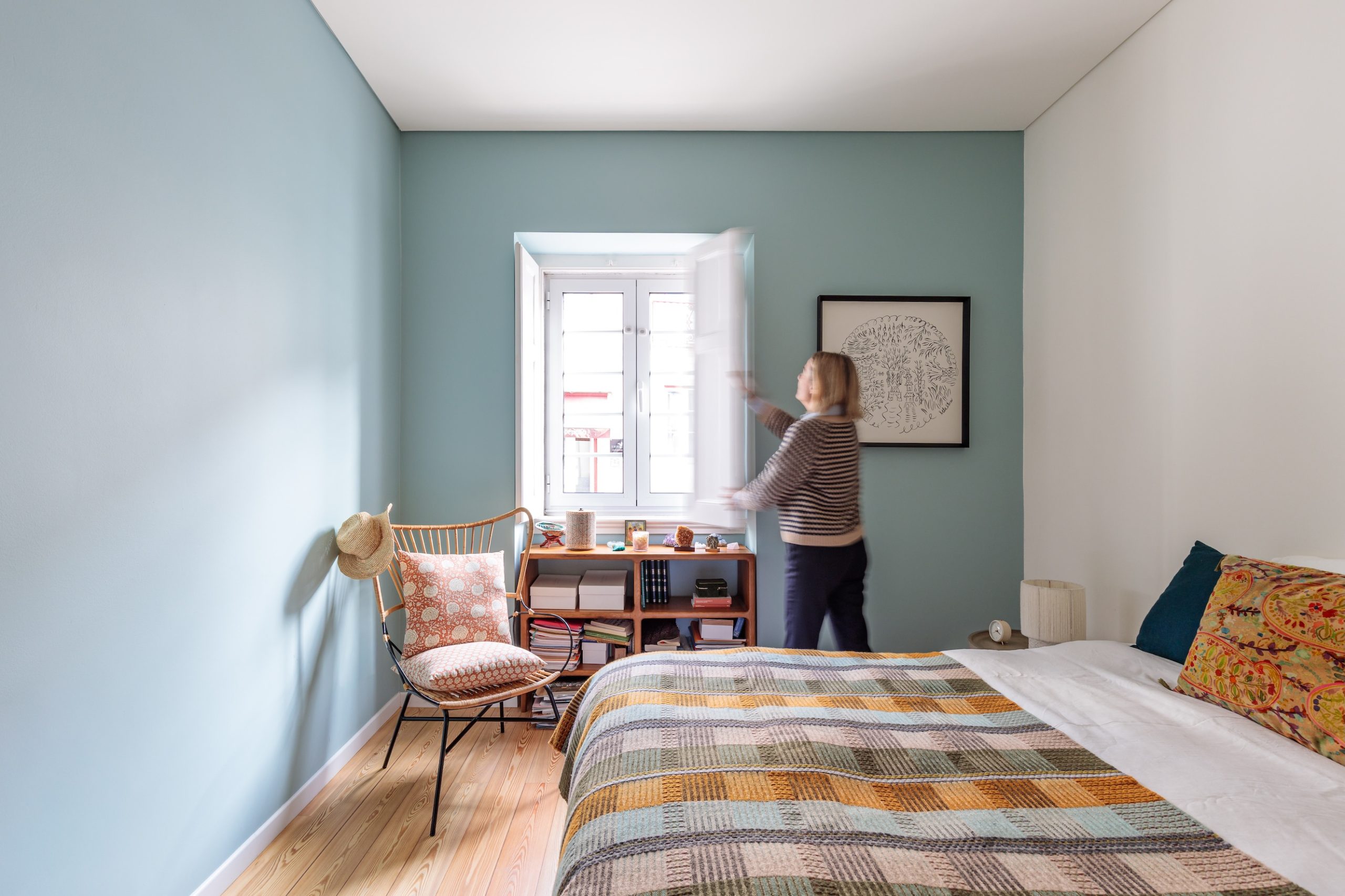
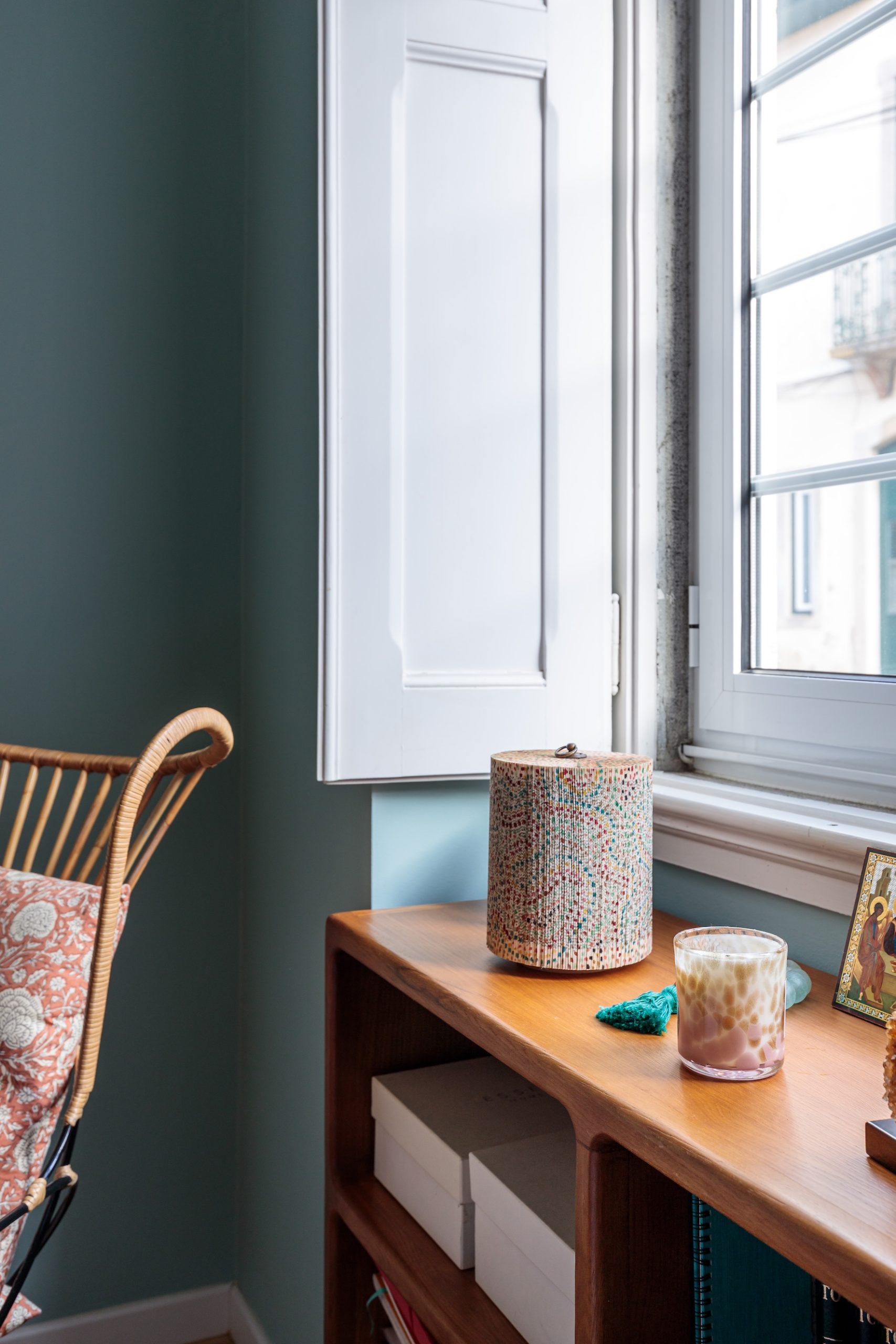
Scroll the photos →
The brief
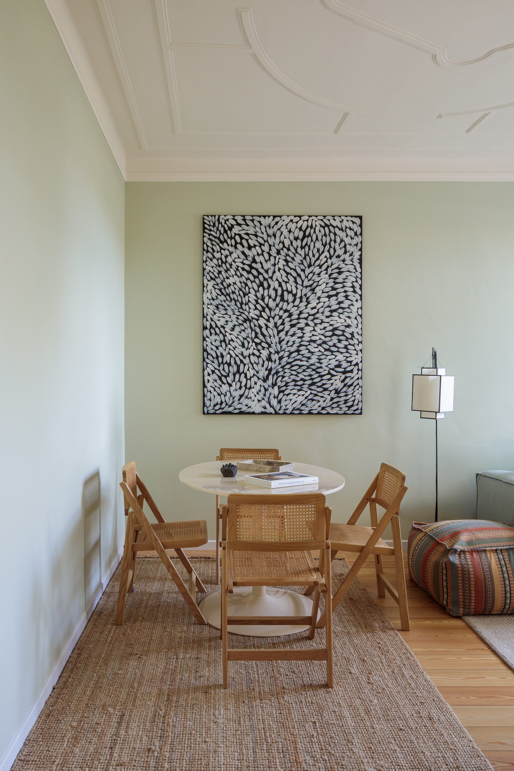
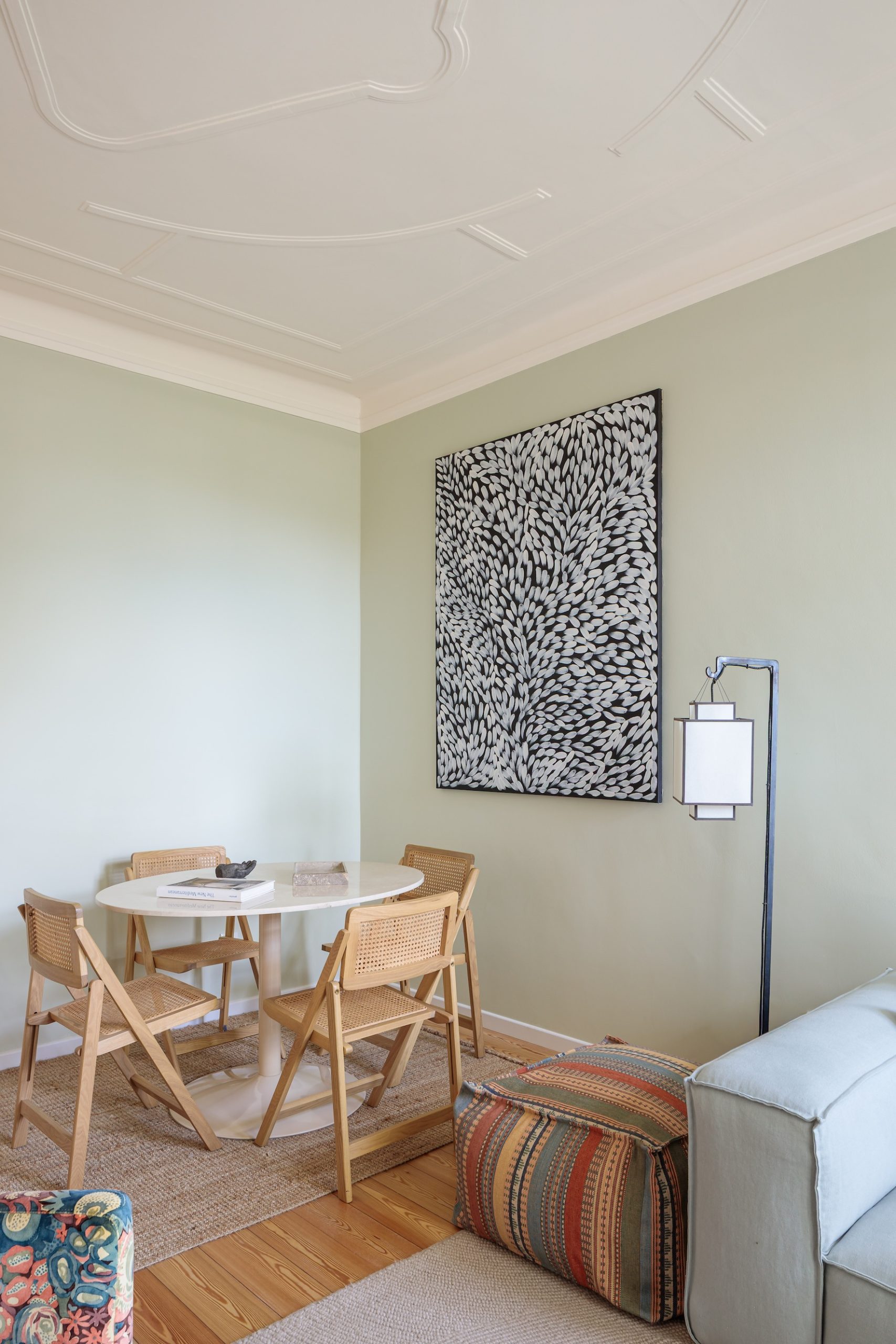
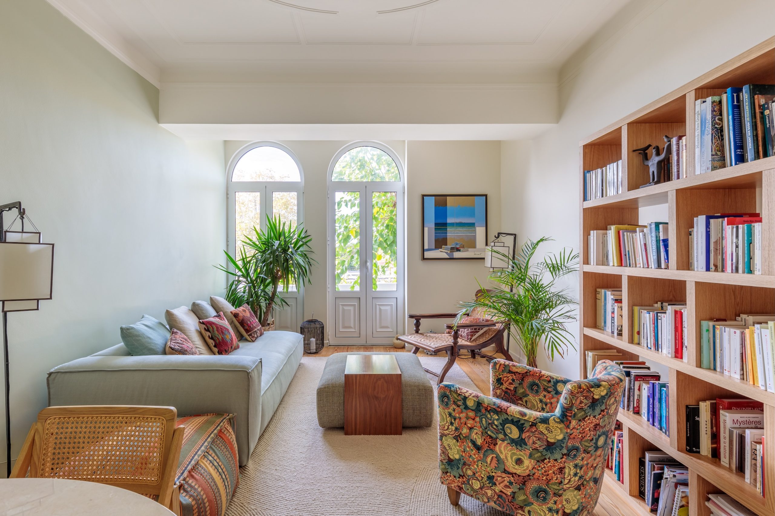
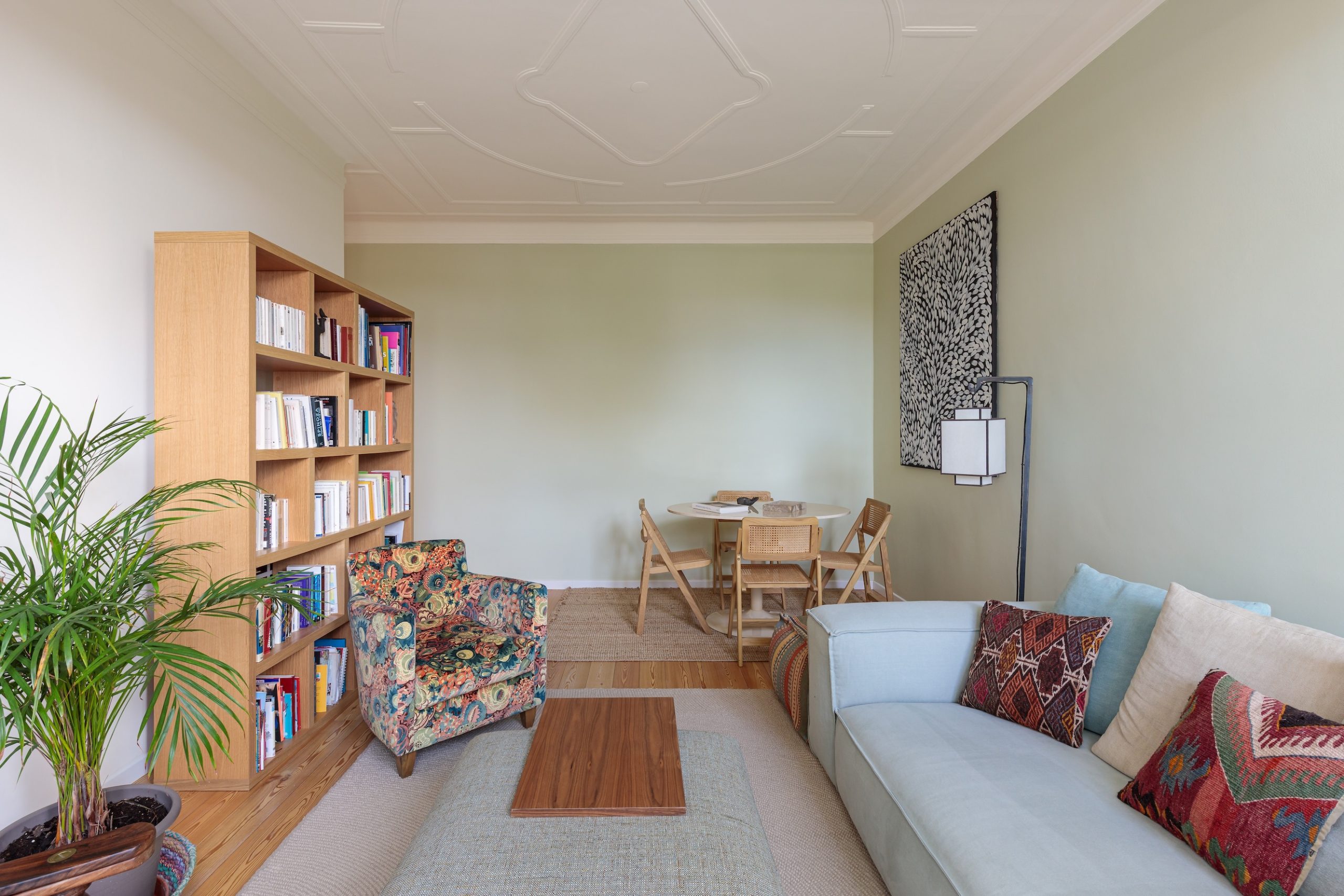
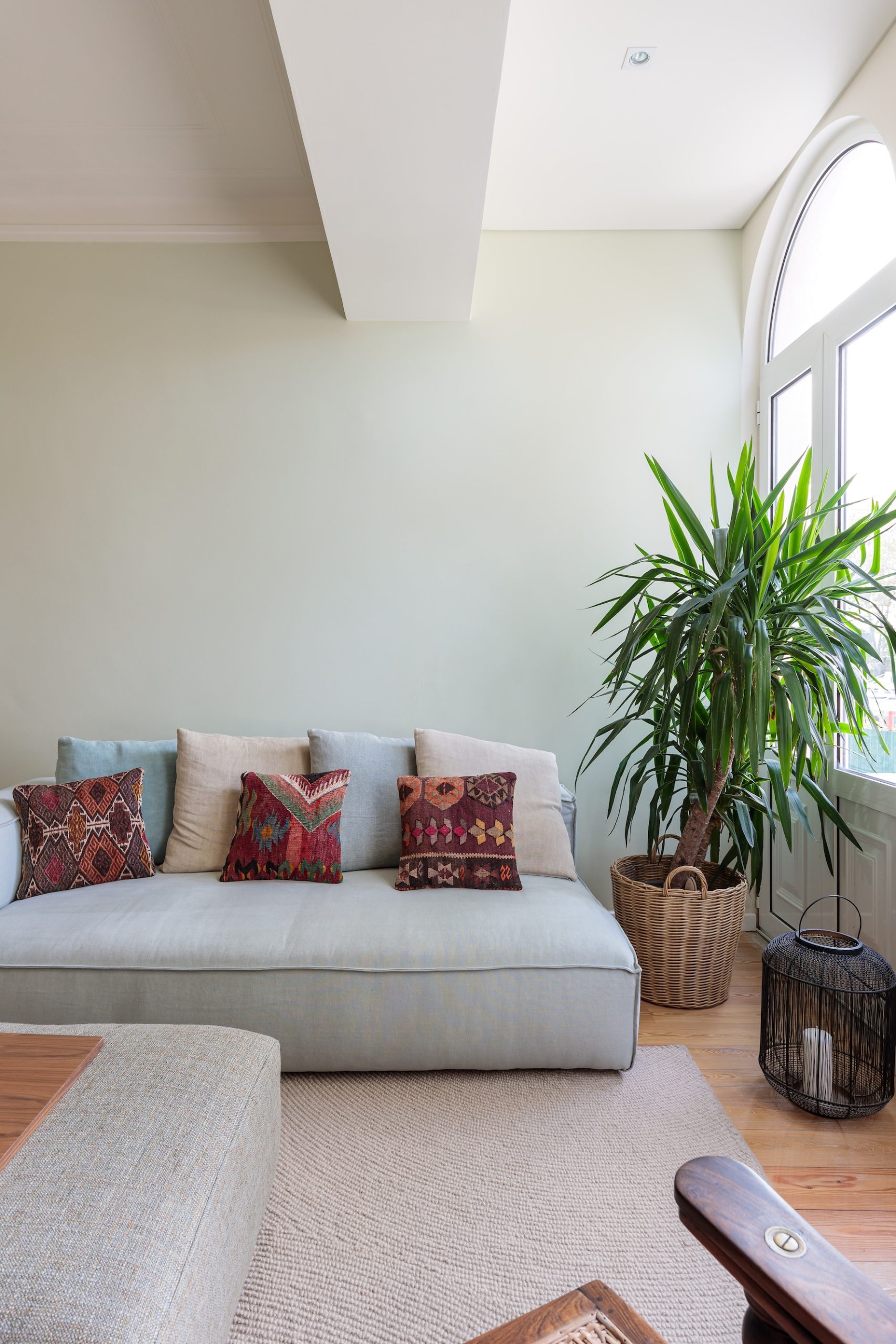
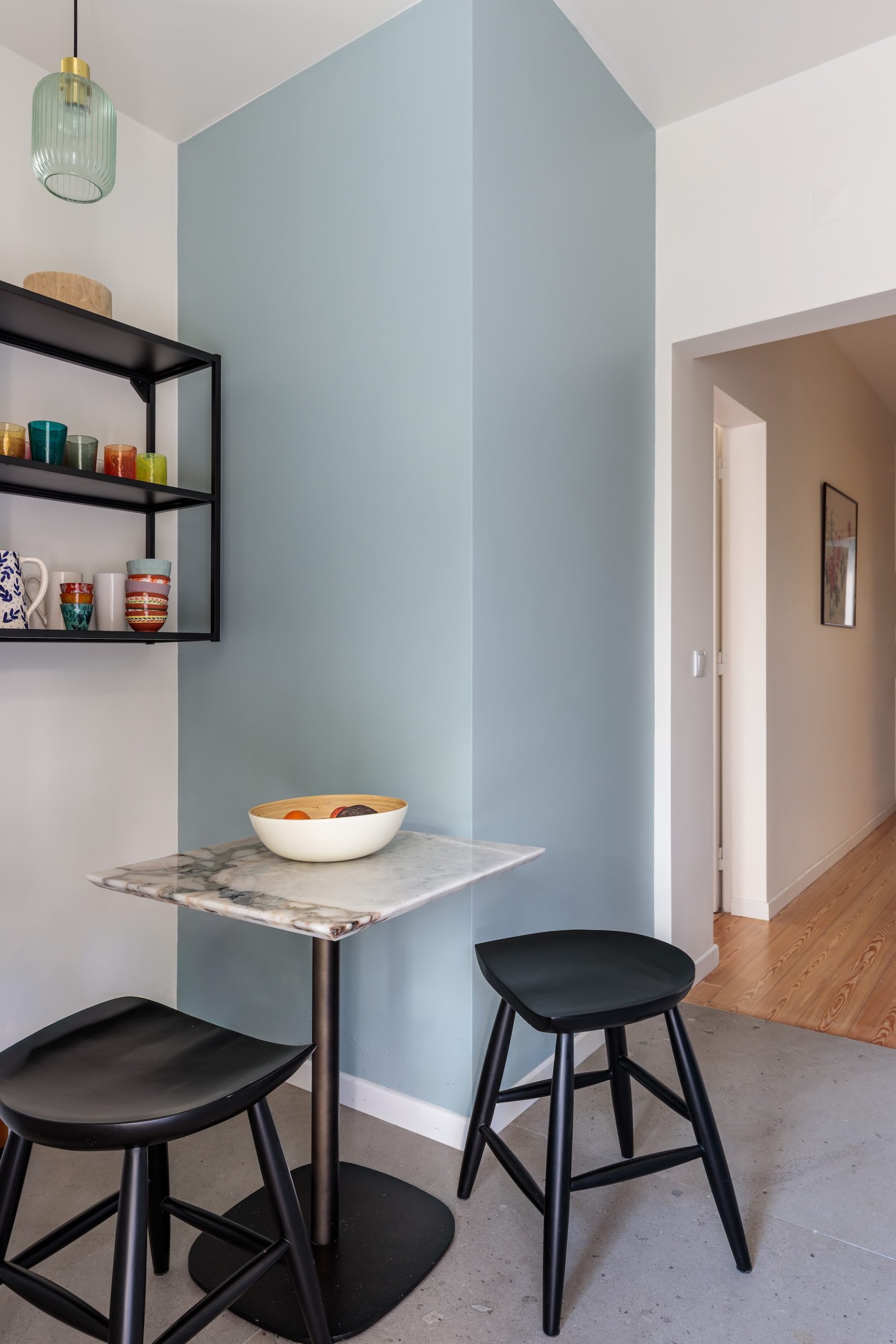
For this home in Sintra, the client works in the sustainability sector, which naturally inspired a calm, nature-led color palette.
The color story
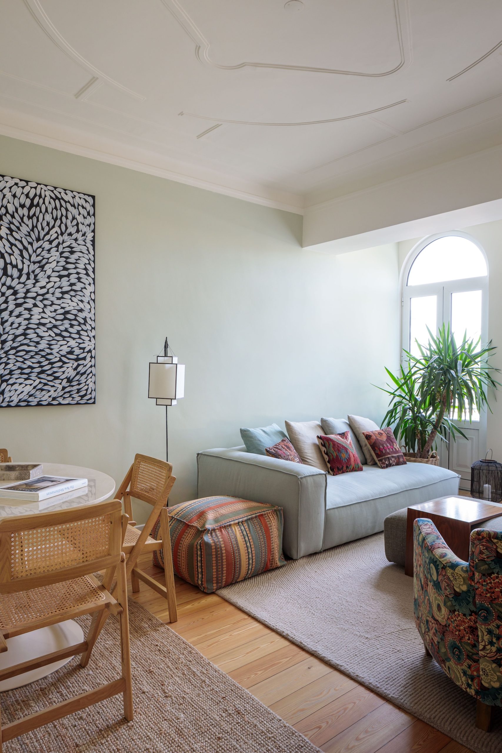
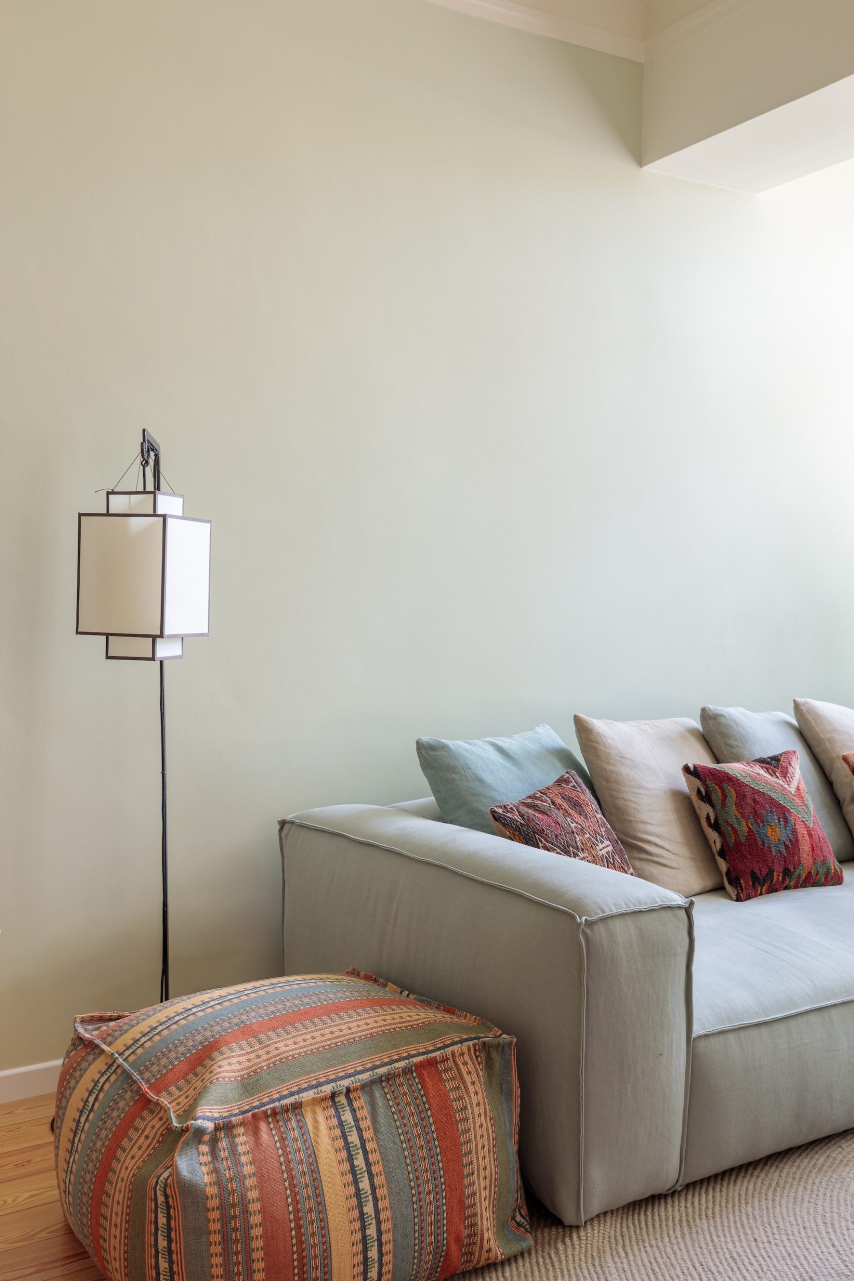
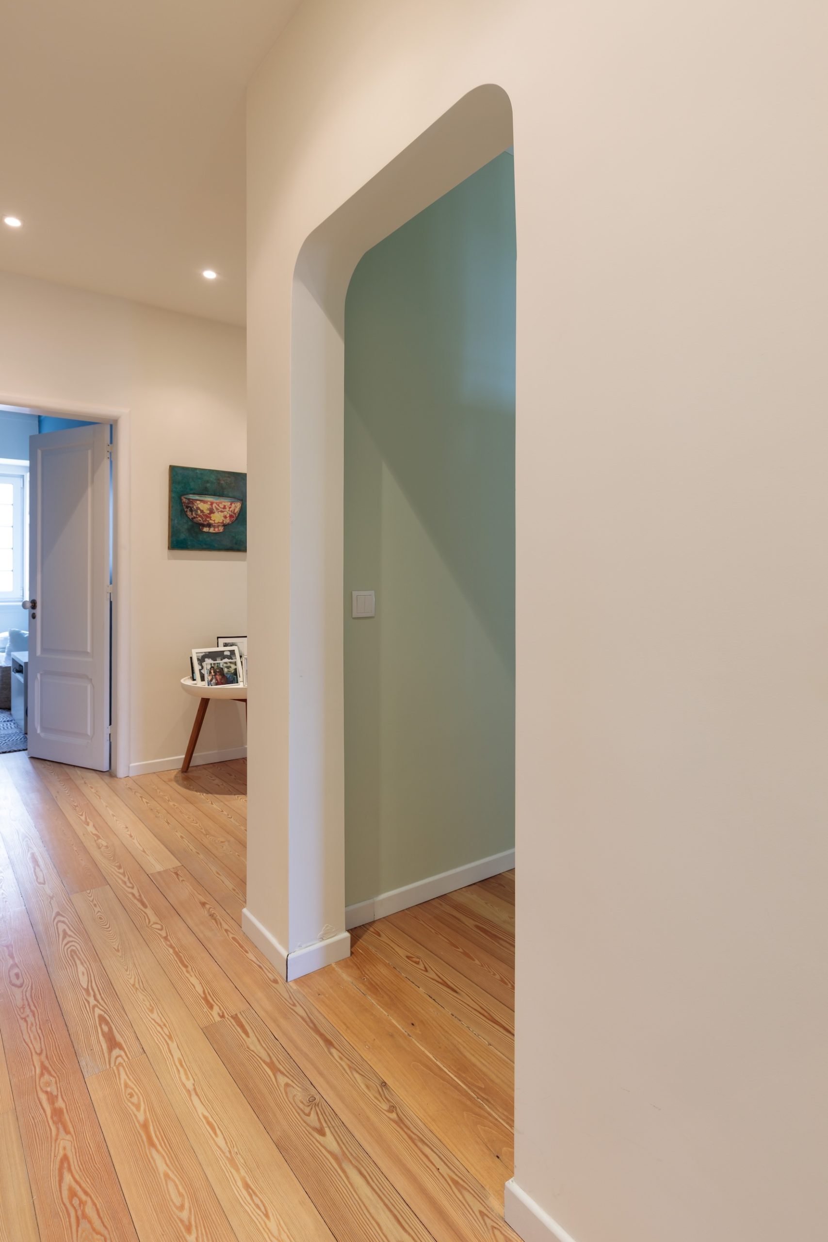
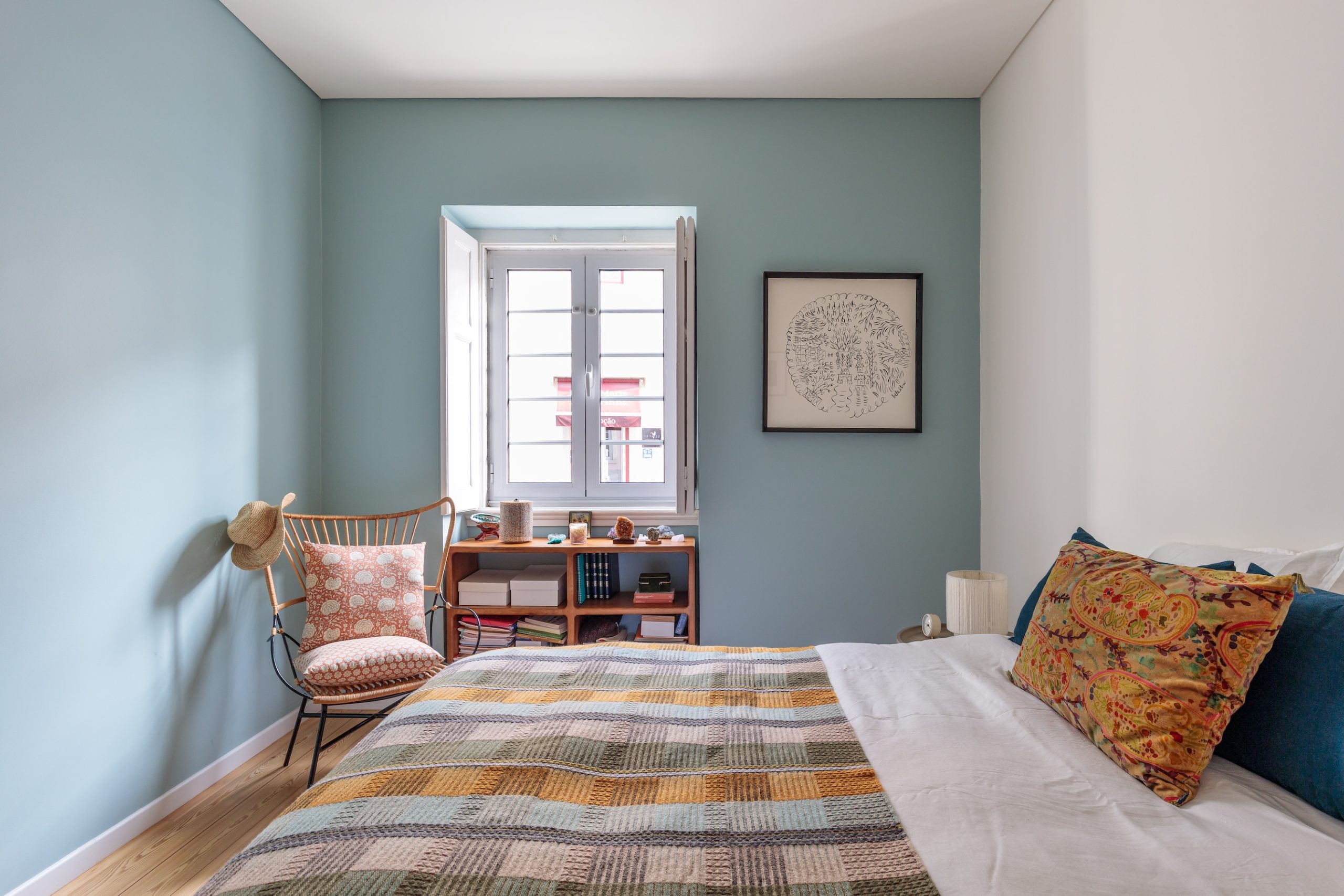
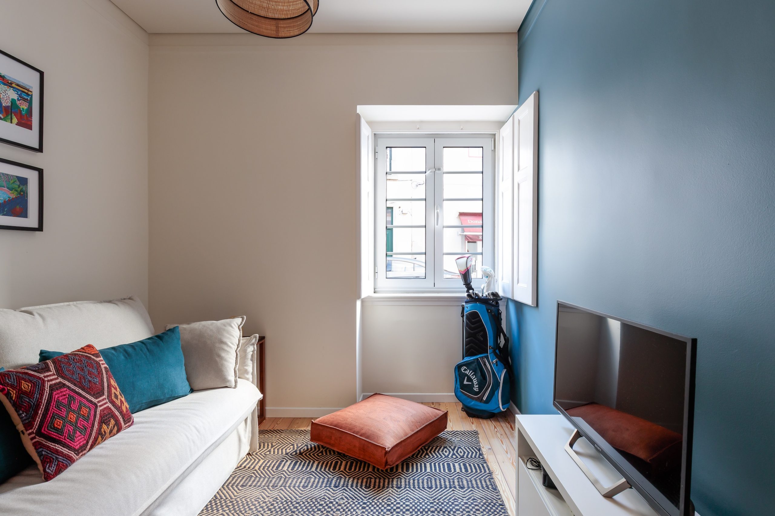
We began with the living room, introducing a soft green that complements the wooden floors and sets a grounded, organic tone. In the kitchen, a gentle blue creates continuity with the living space while adding a subtle freshness.
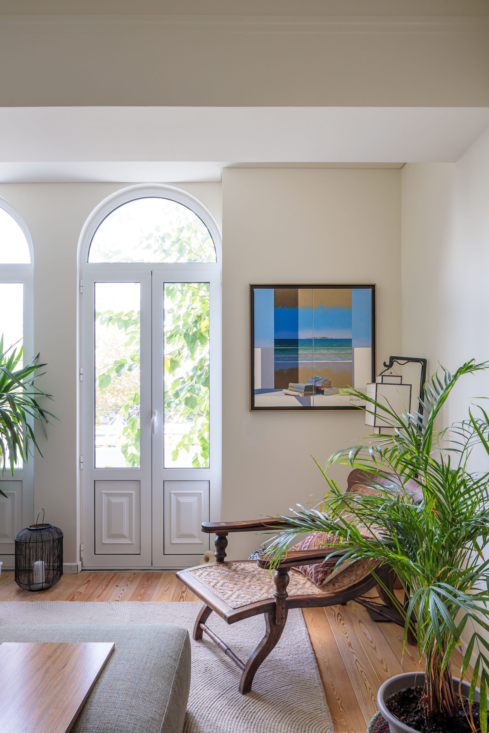
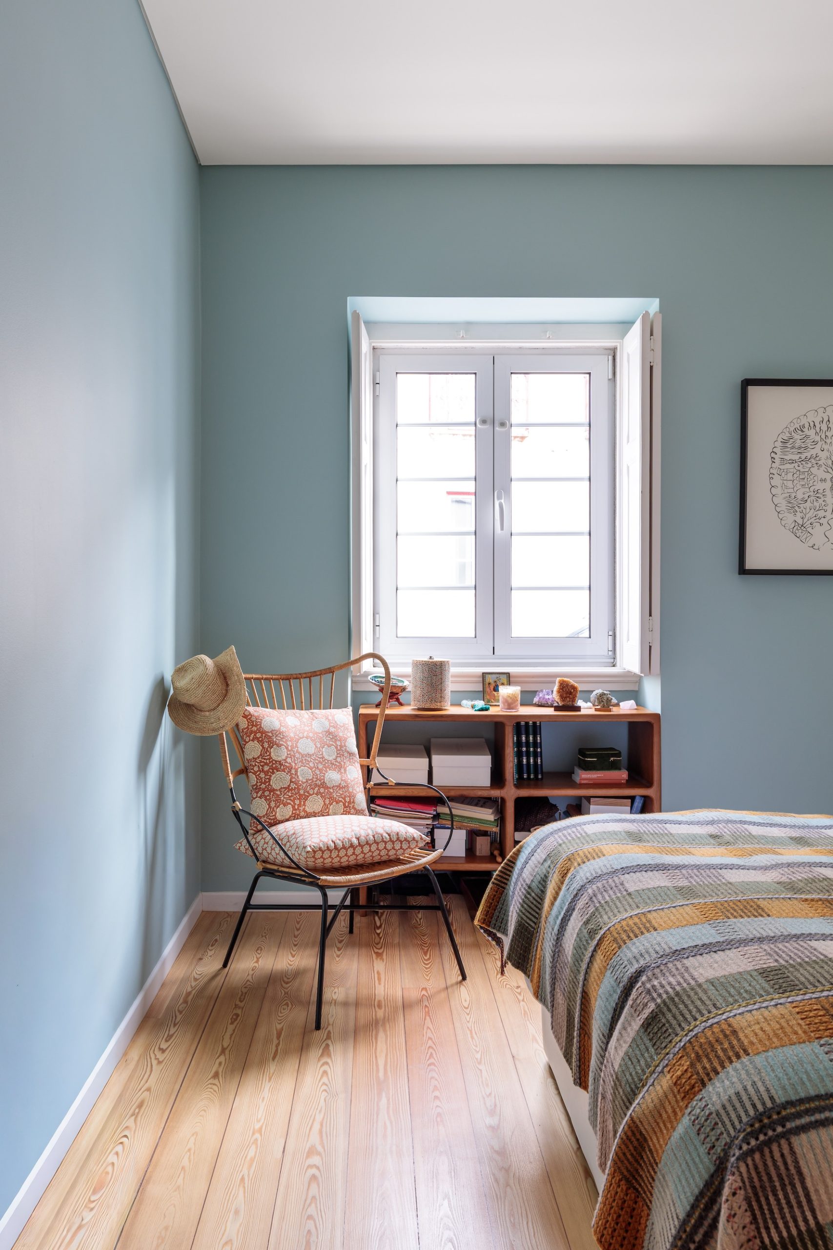
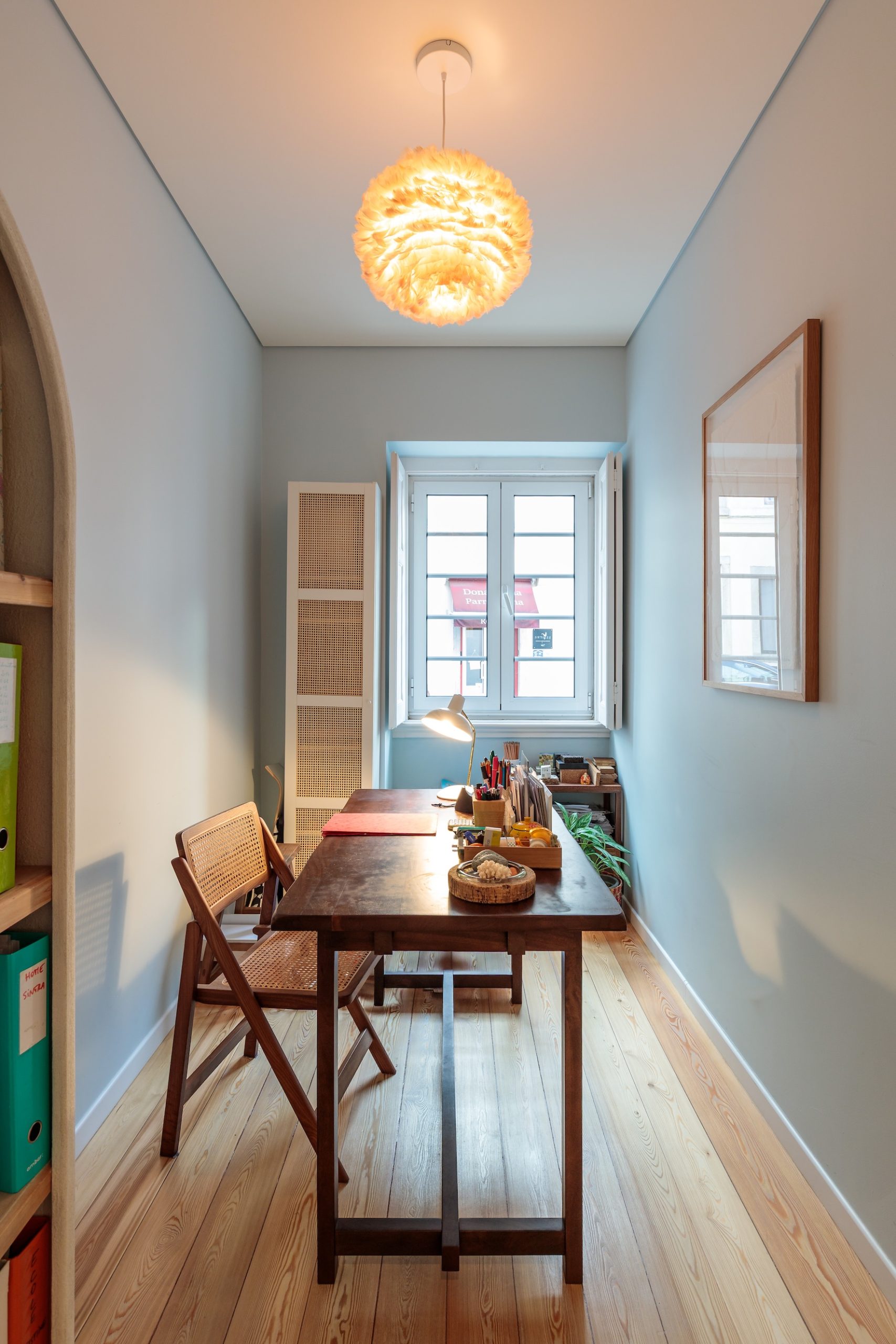
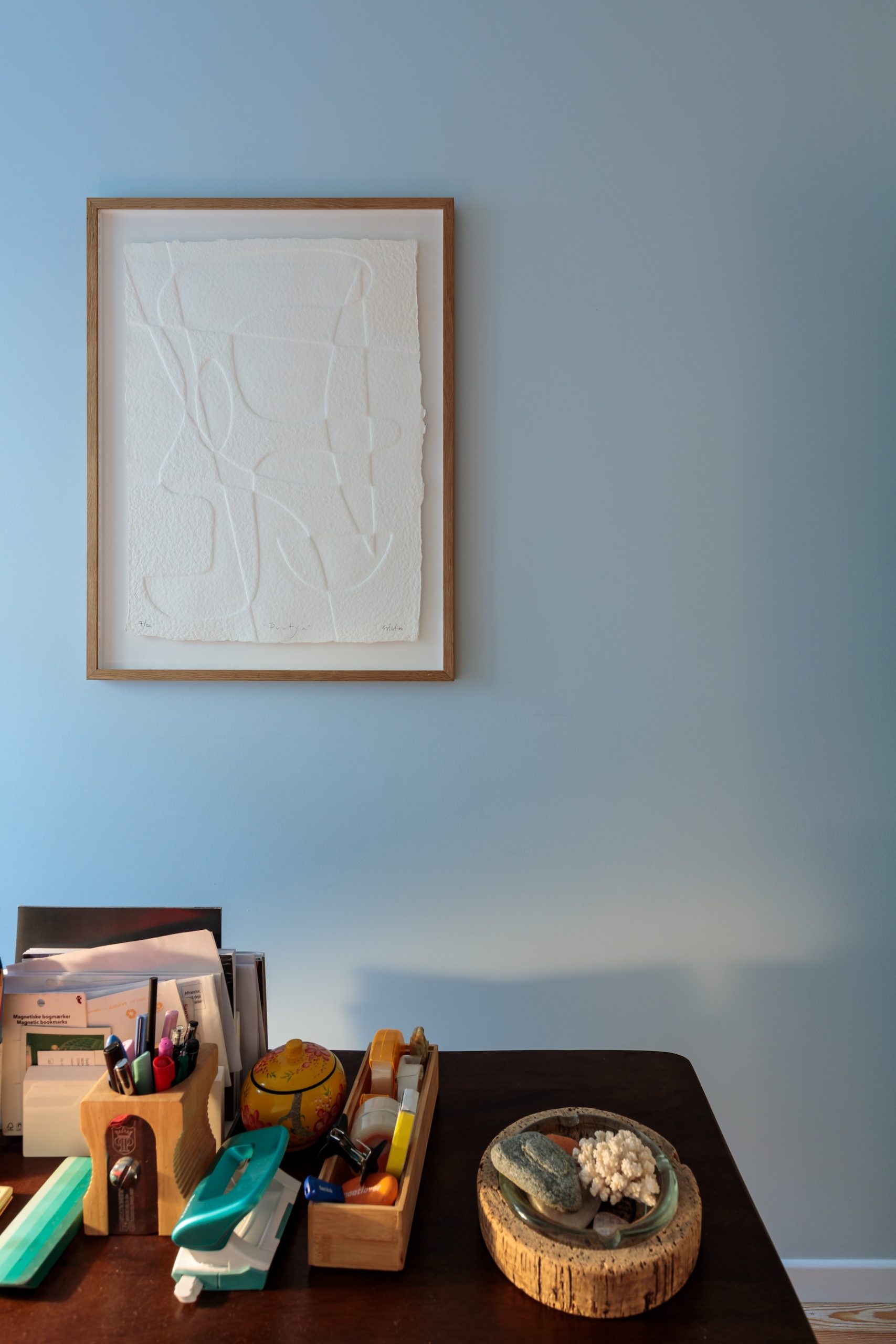
This language of blues continues through the bedrooms and home office in varying shades, keeping the home cohesive, soft and serene. A warm, natural white as the background brings balance and lets the palette feel light, timeless and harmonious.
Bahú Kids
Scroll the photos →
The brief
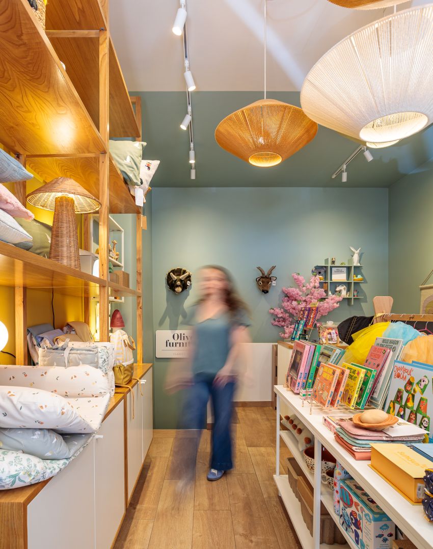
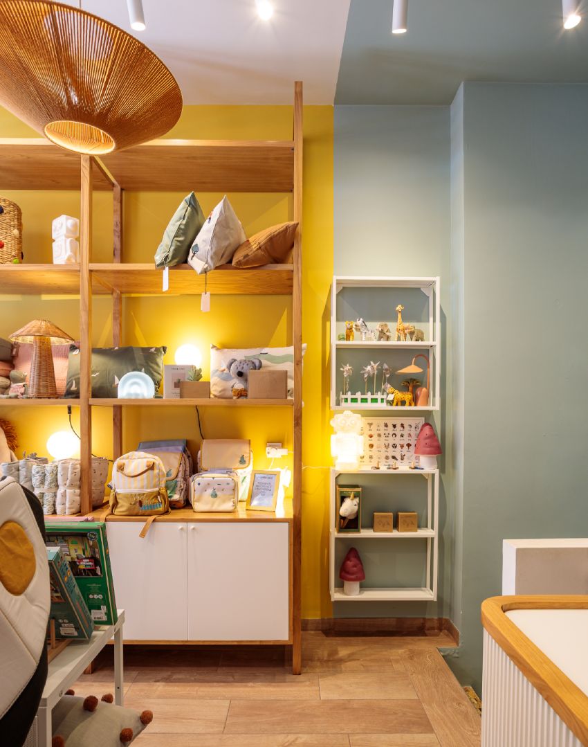
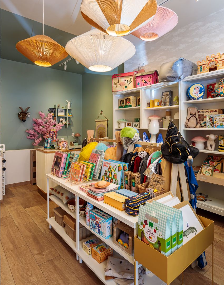
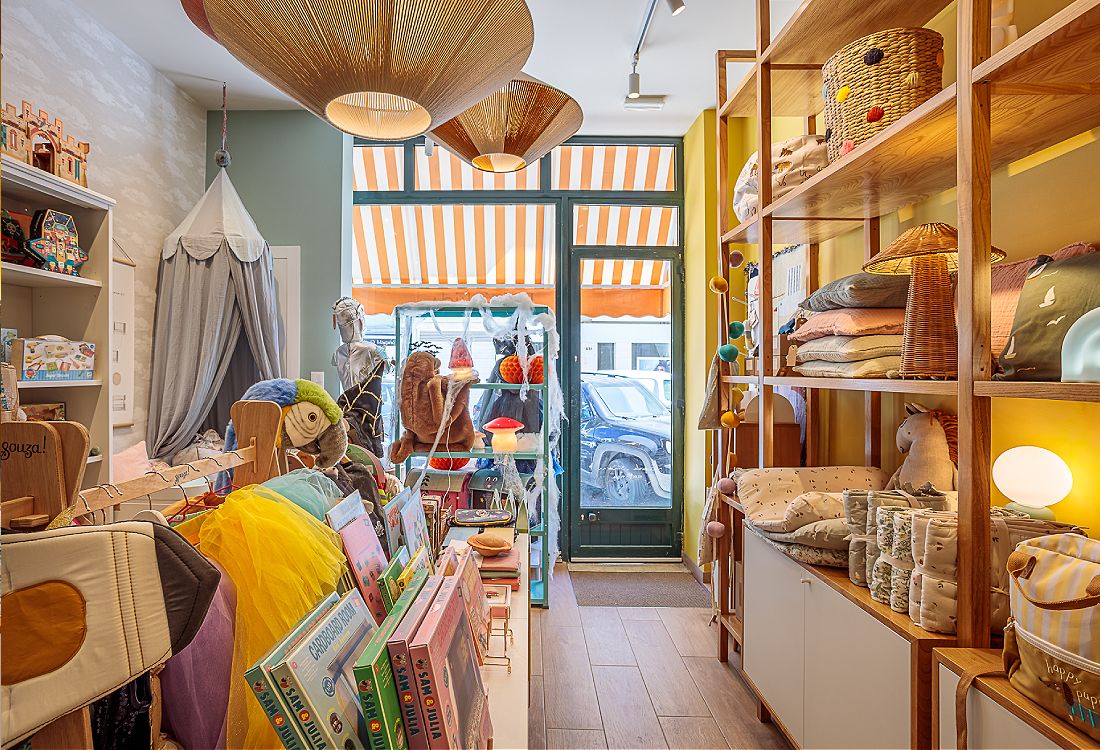
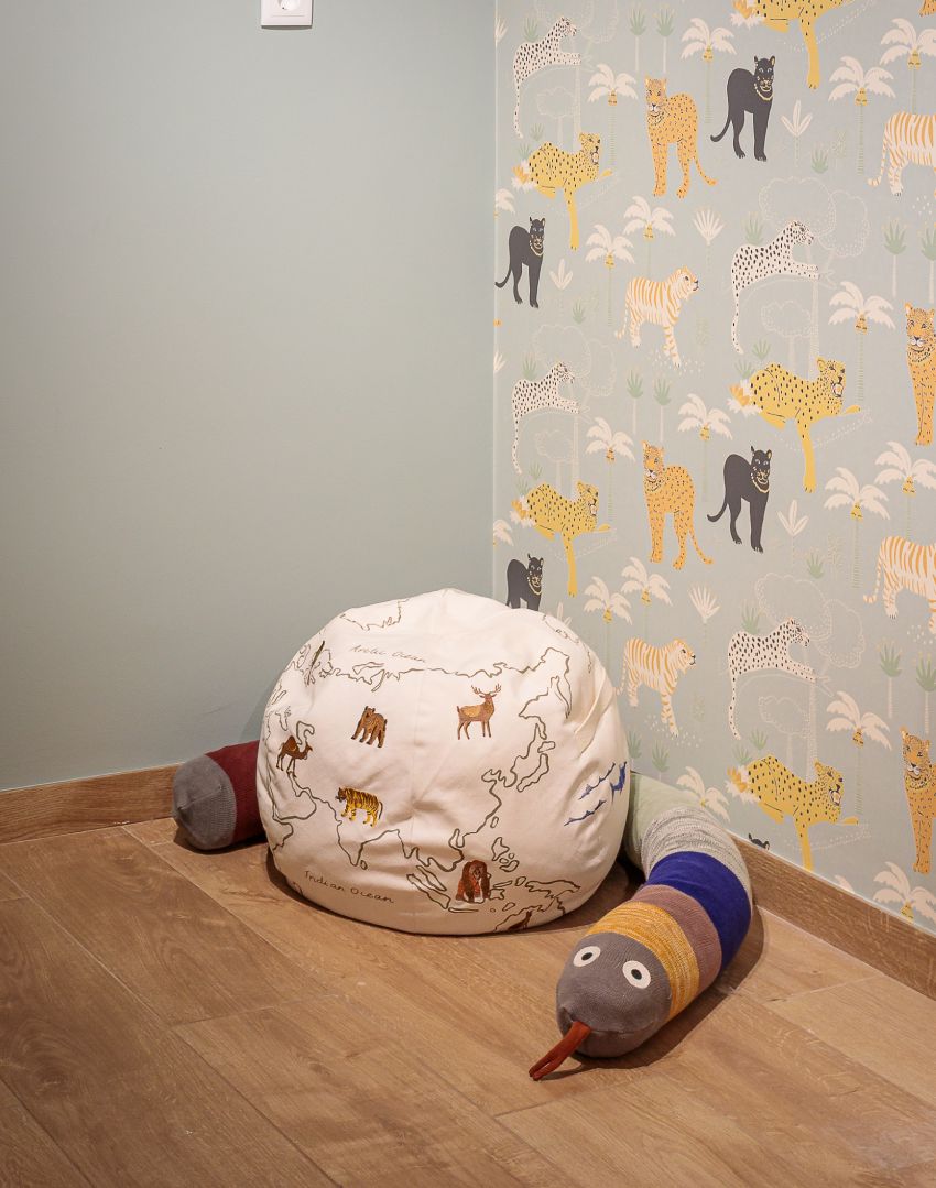
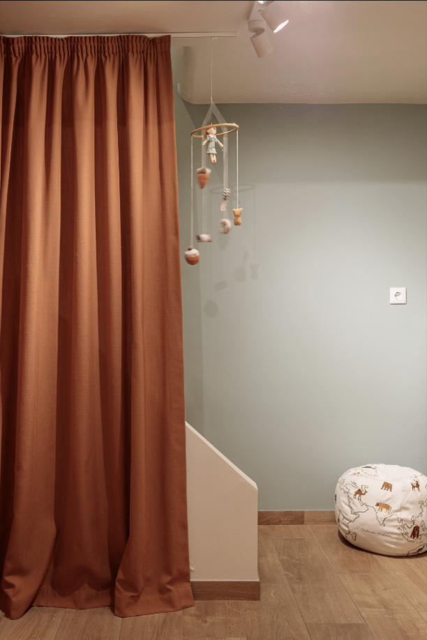
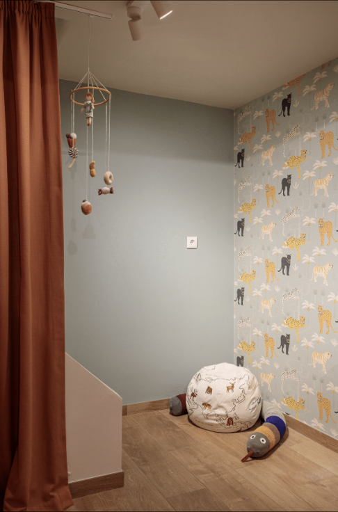
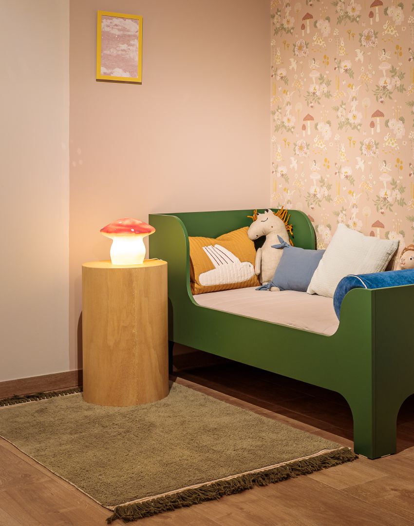
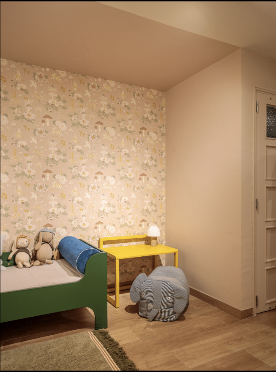
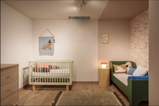
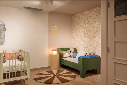
Choose the colors for a children’s decoration shop in Campo de Ourique, Lisbon: use color blocking to define the different areas, and make it playful, but soft.
The color story
A soft sage green wraps the main shop floor, while a block of sunny yellow gives one corner its own identity. Further in, a blush-pink children’s room and a sage play corner each feel like a little world of their own.
The result is a store where color sparks curiosity and joy, playful, but never loud.
Como Branco
Scroll the photos →
The brief
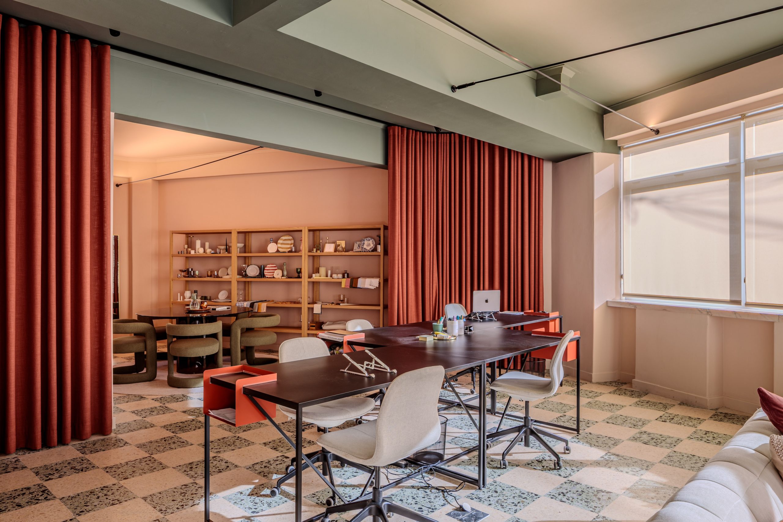
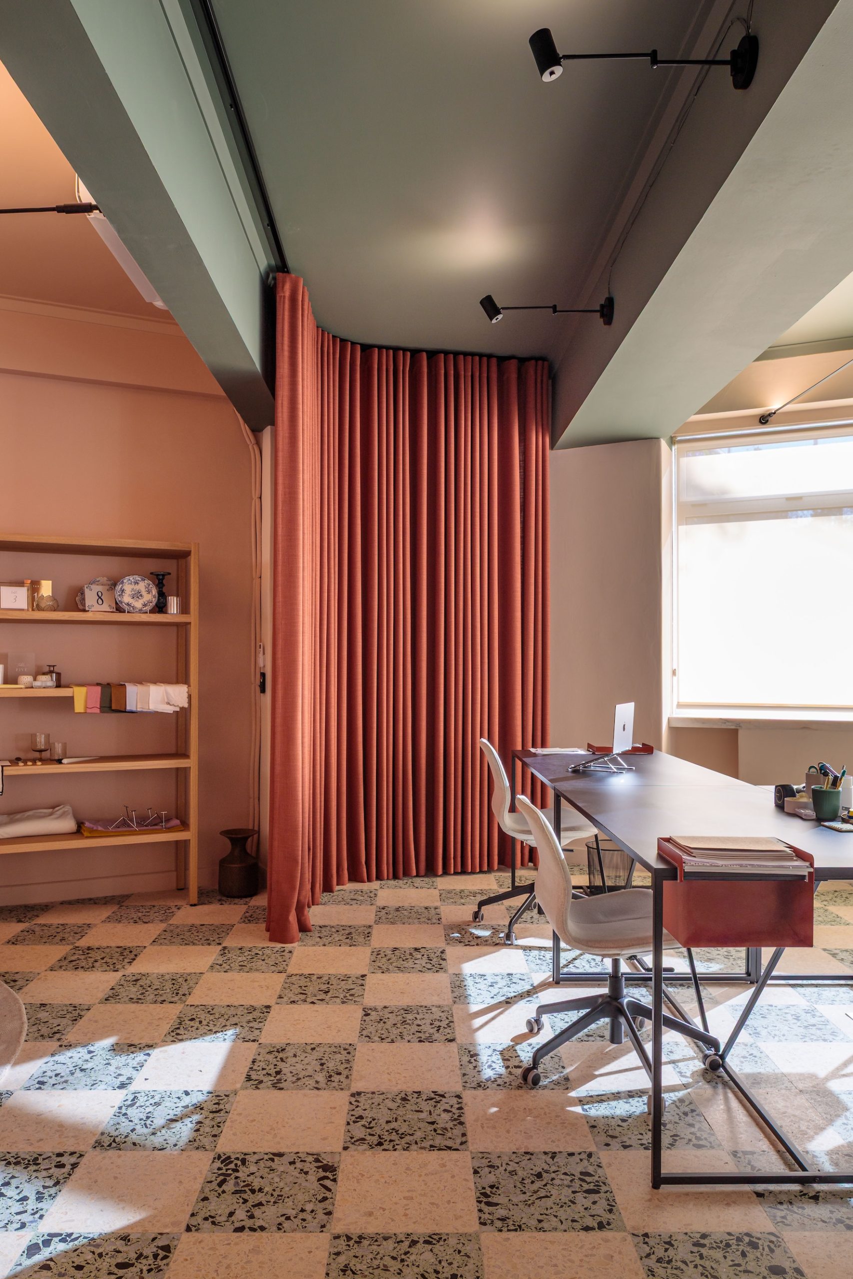
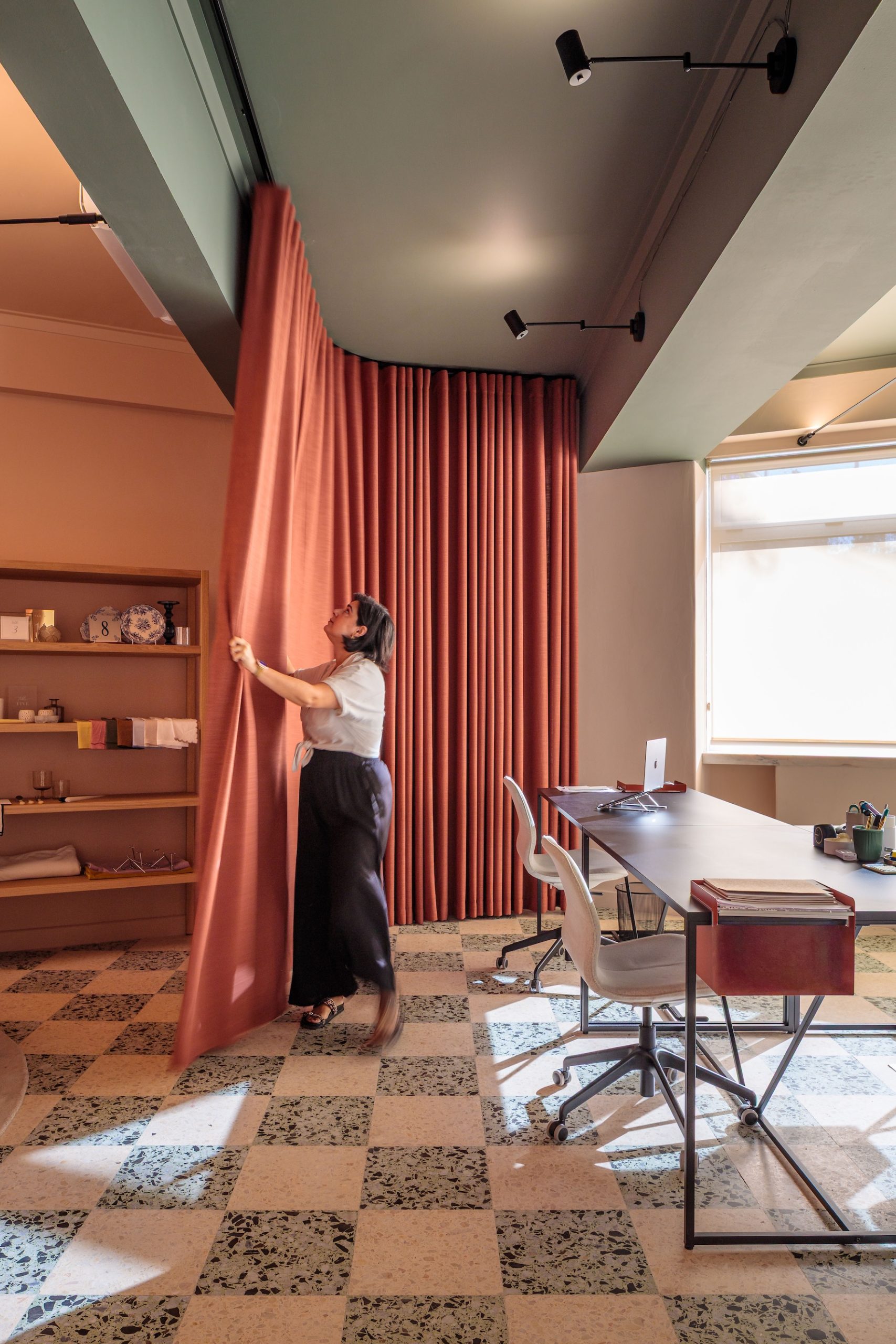
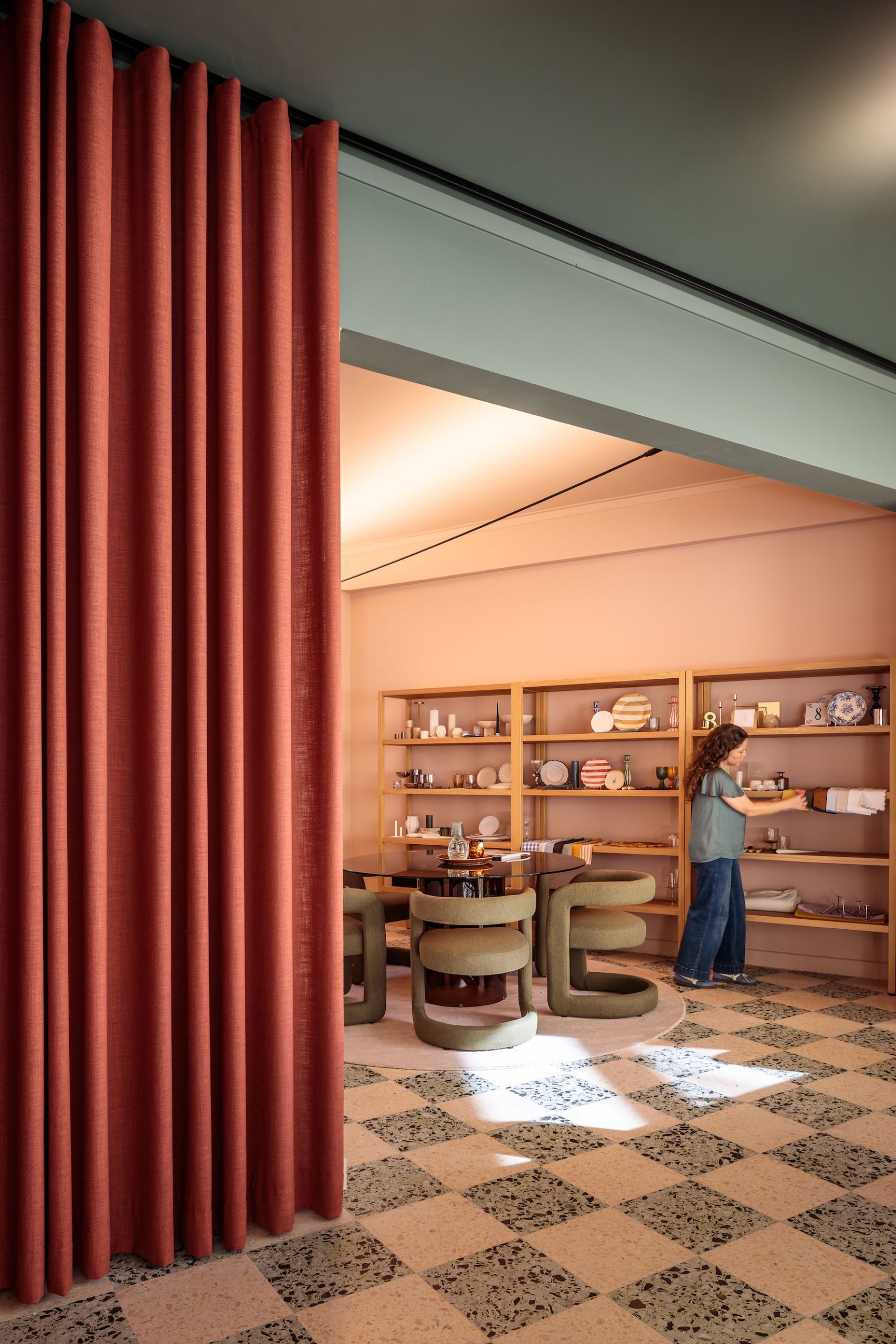
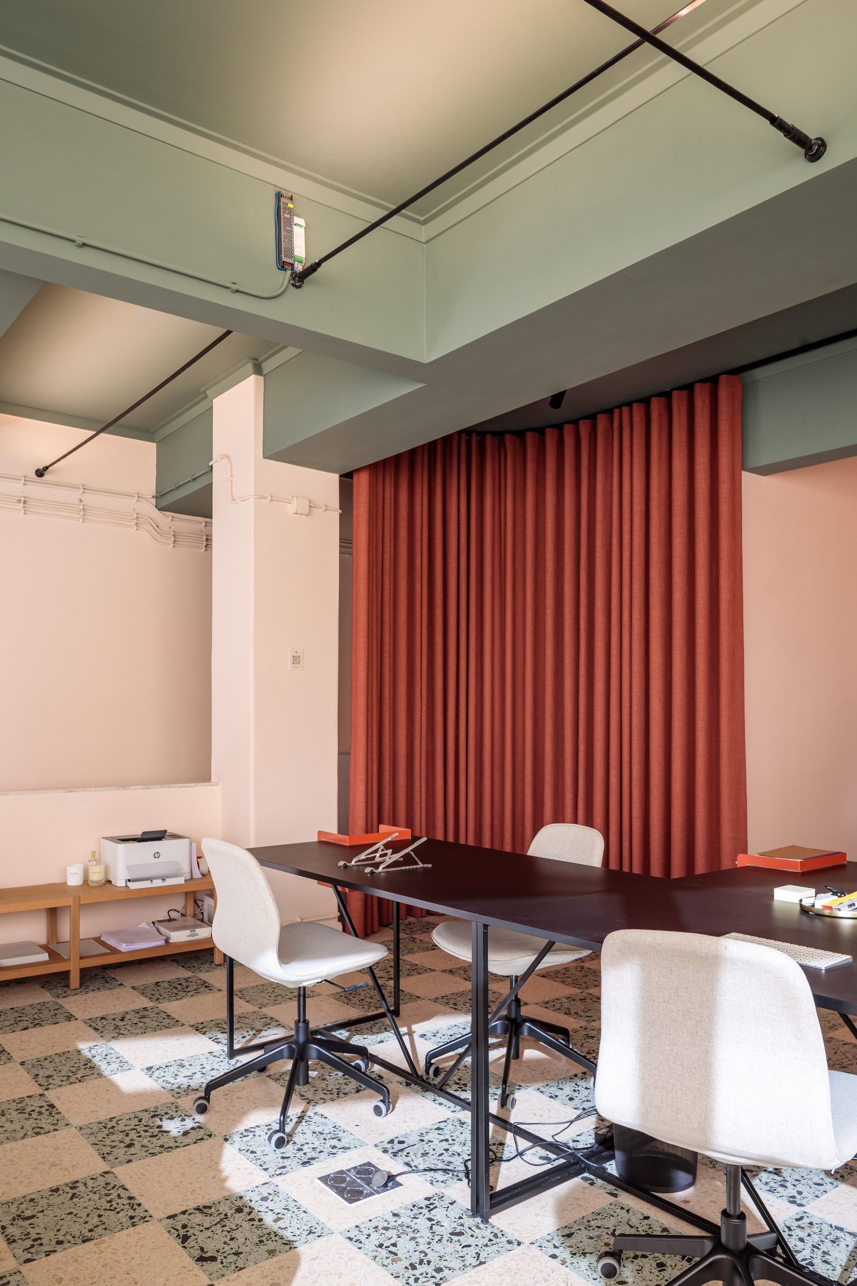
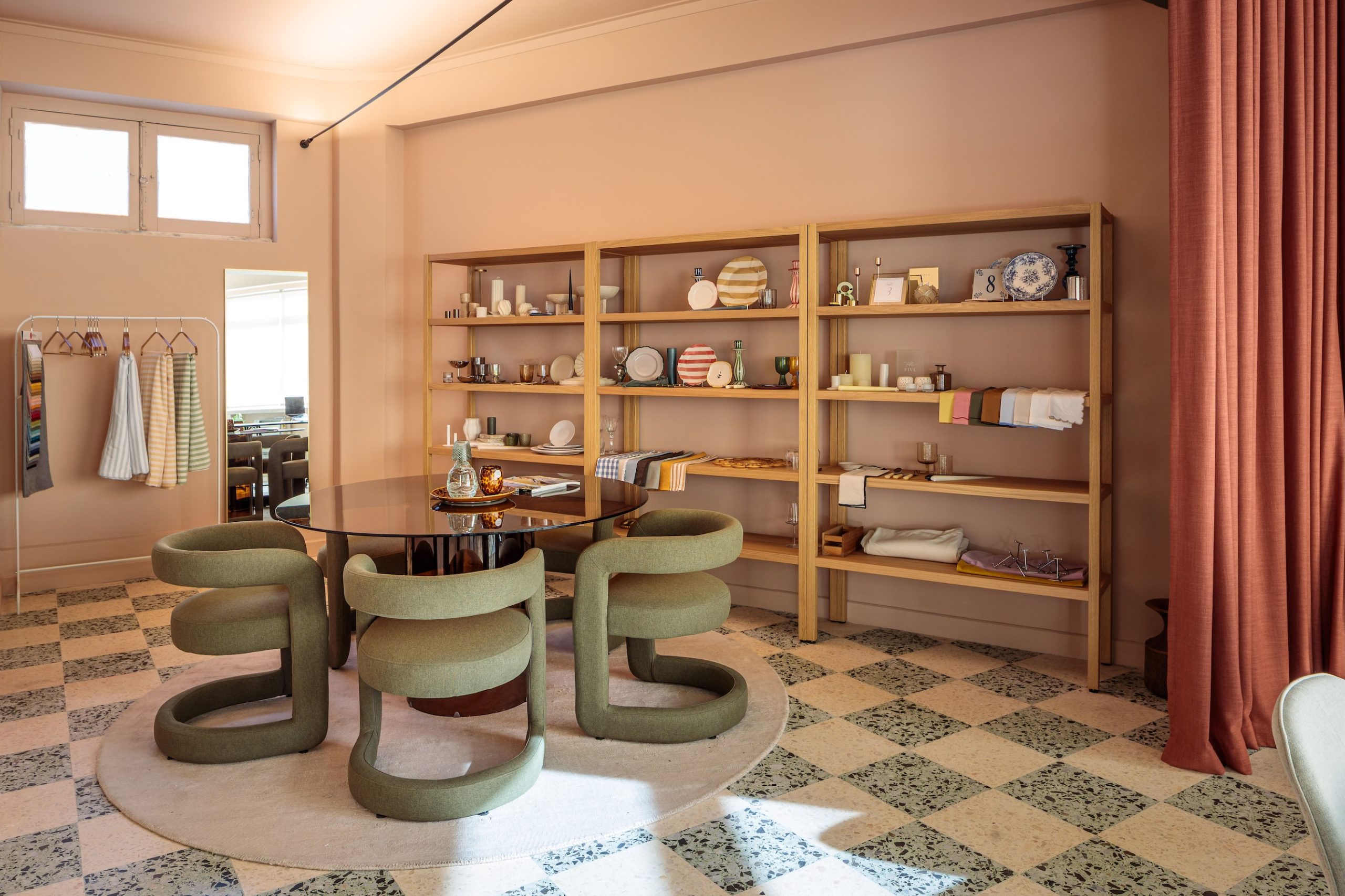
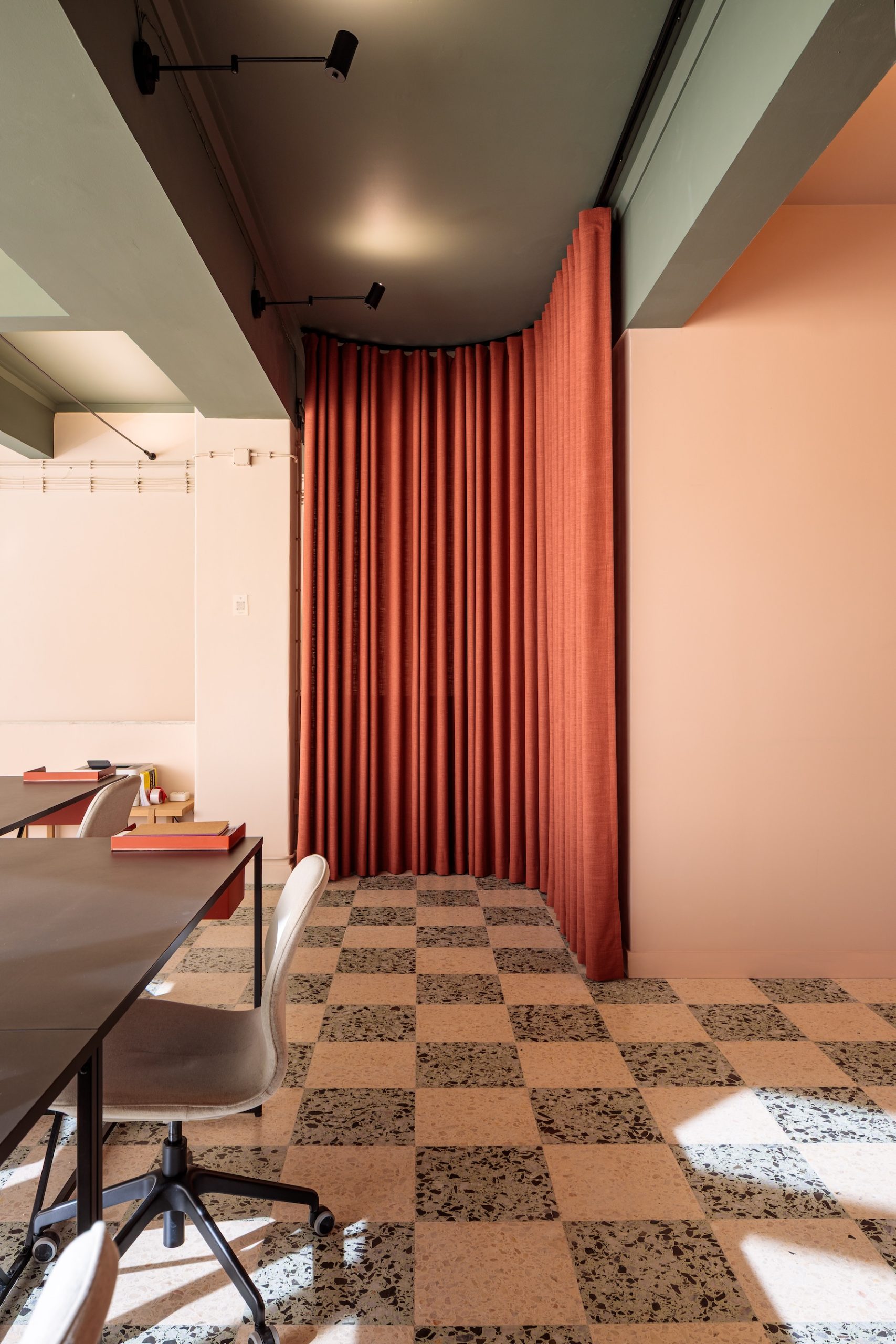
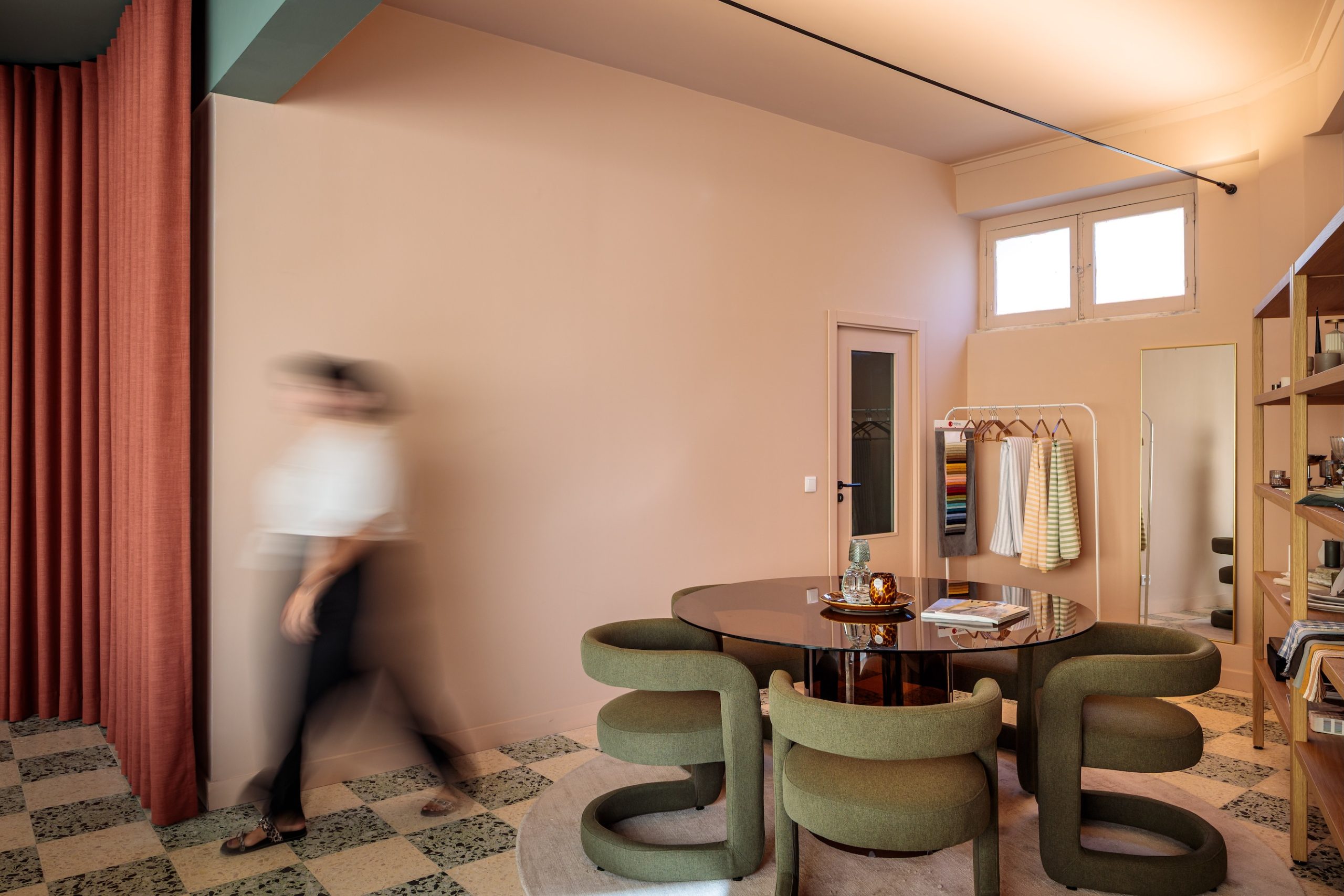
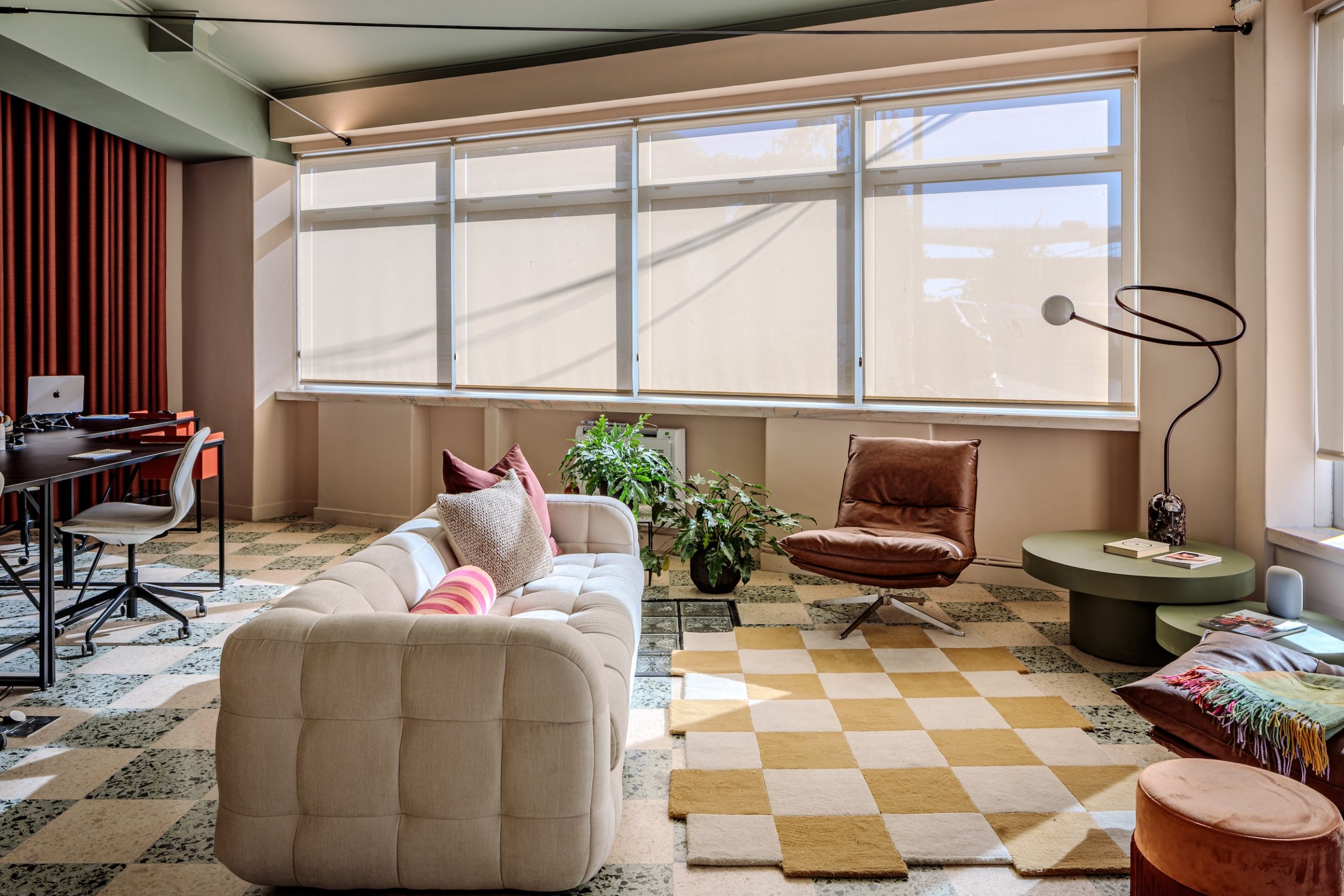
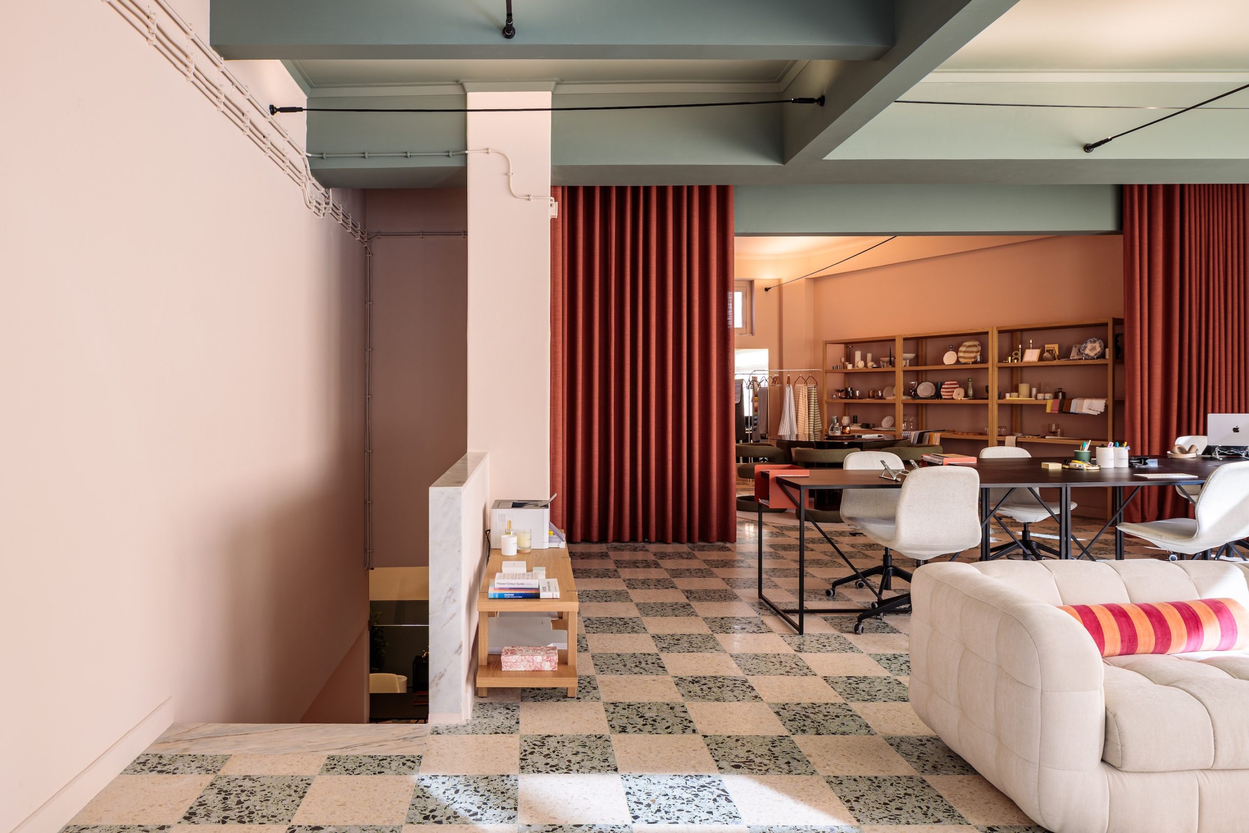
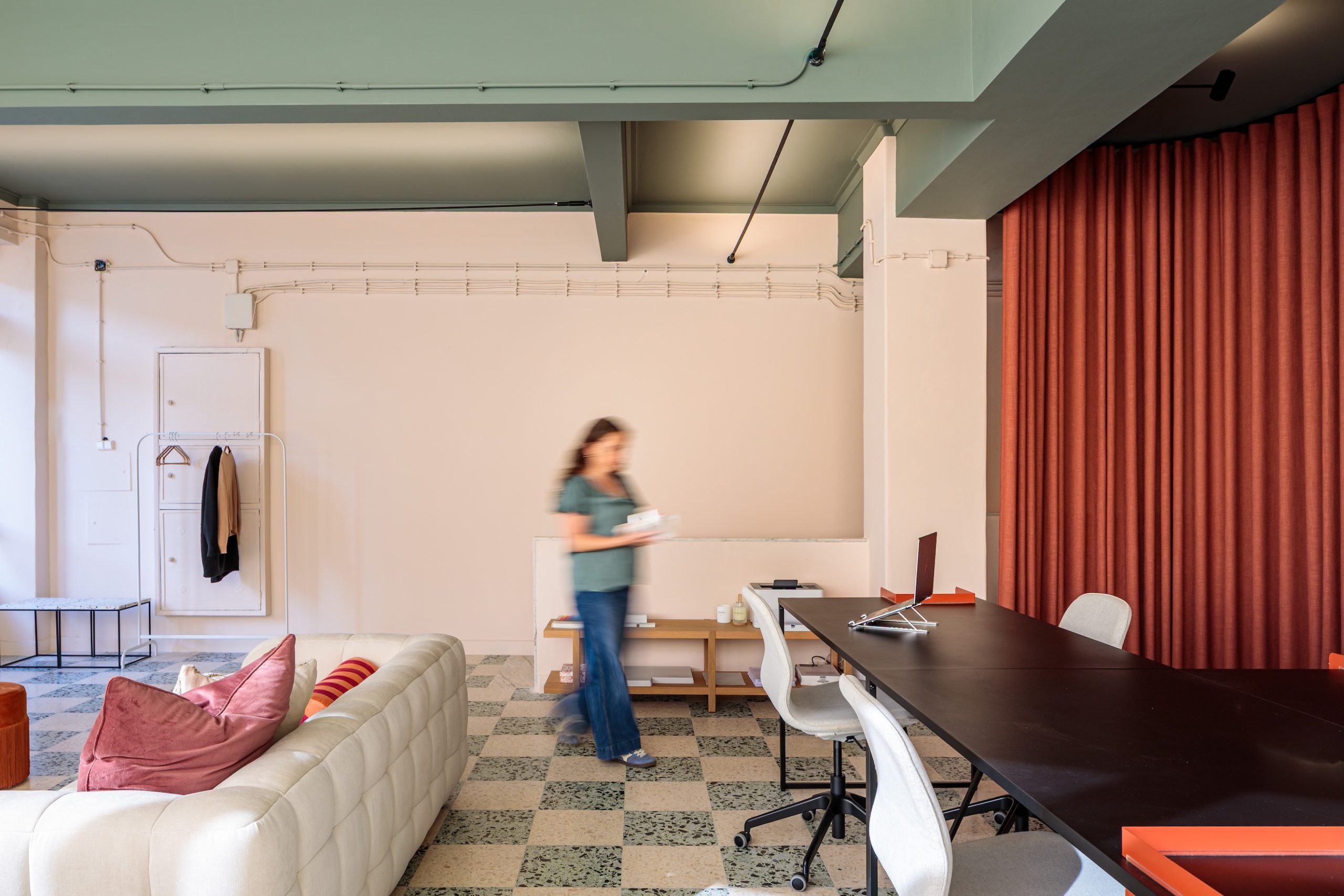
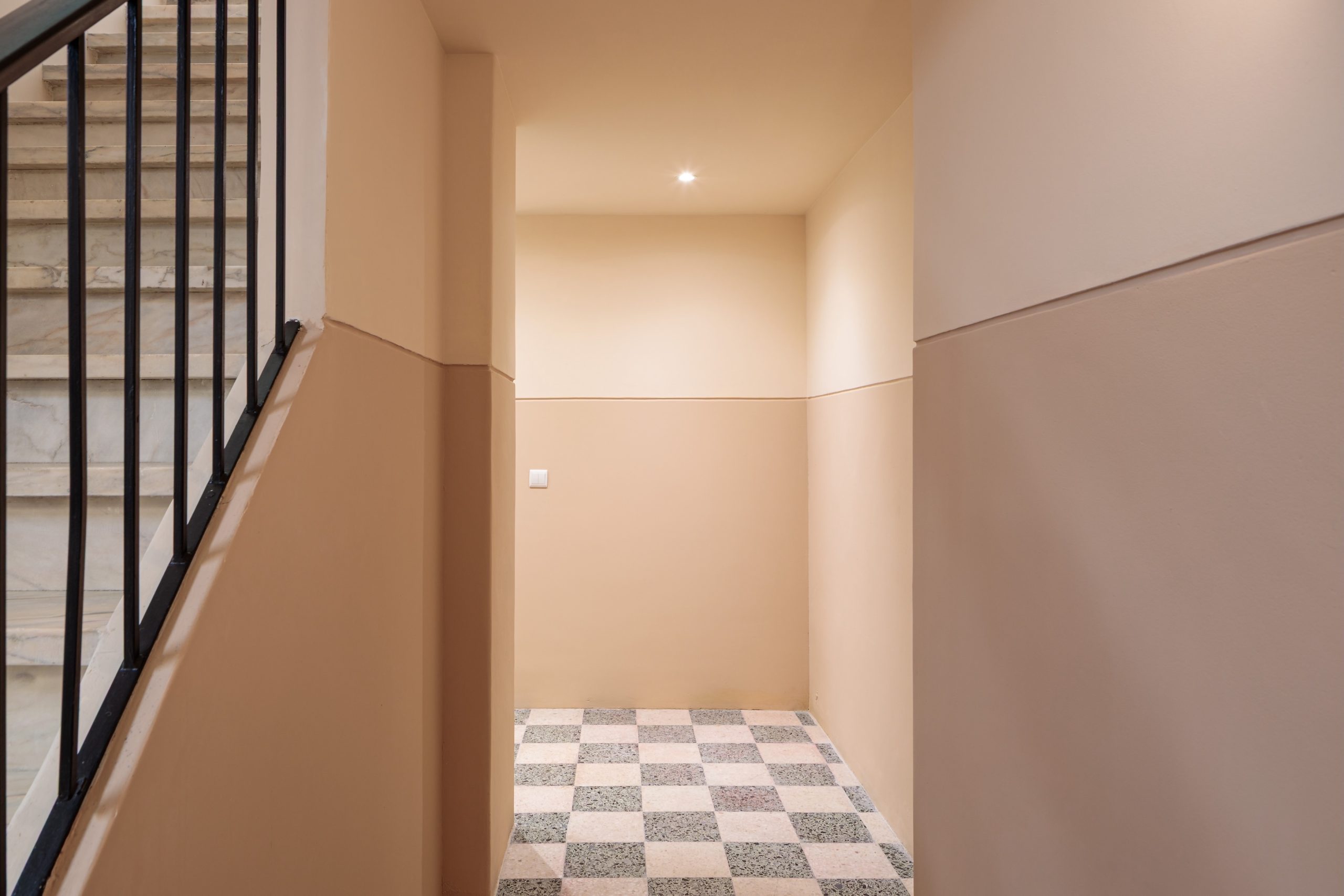
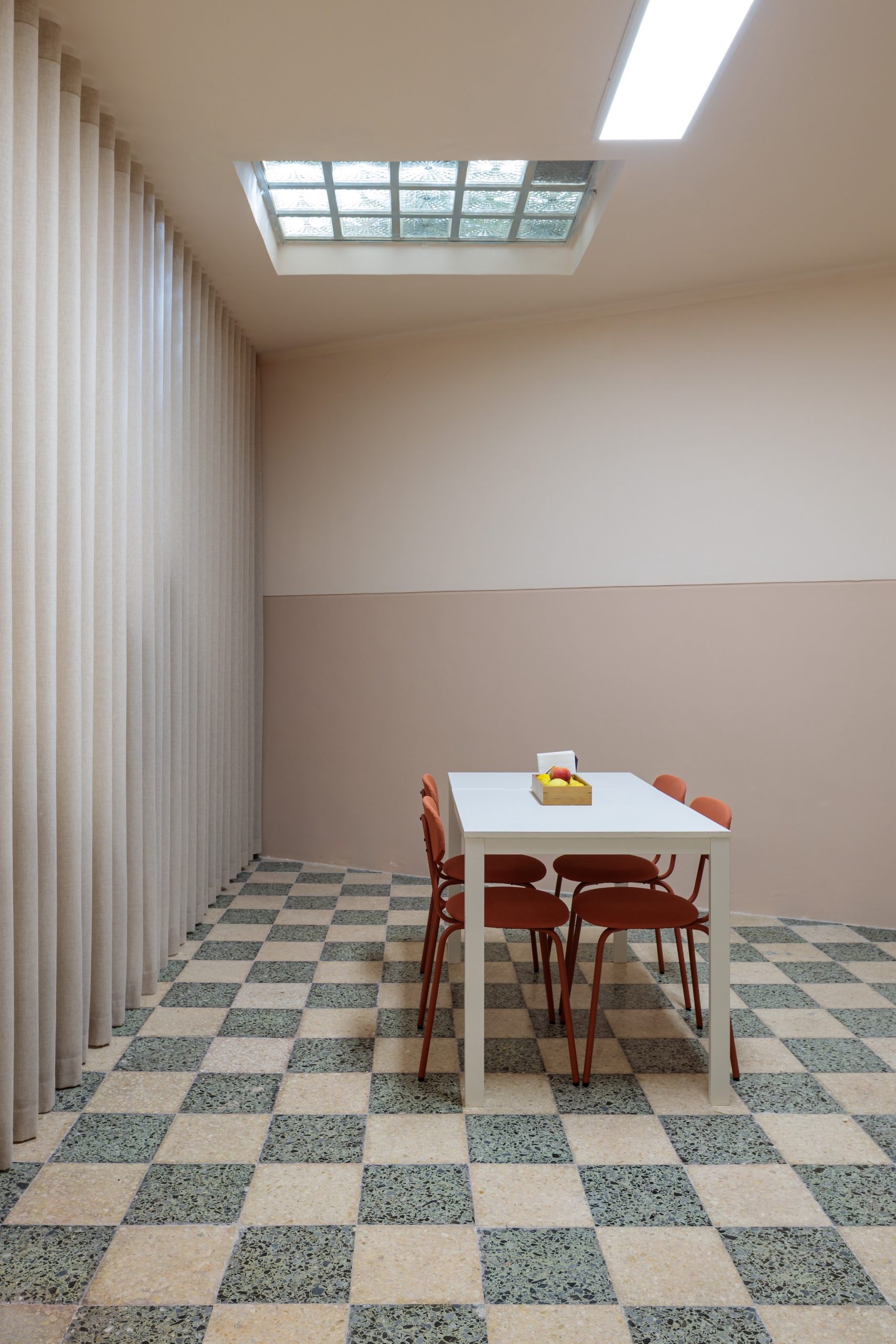
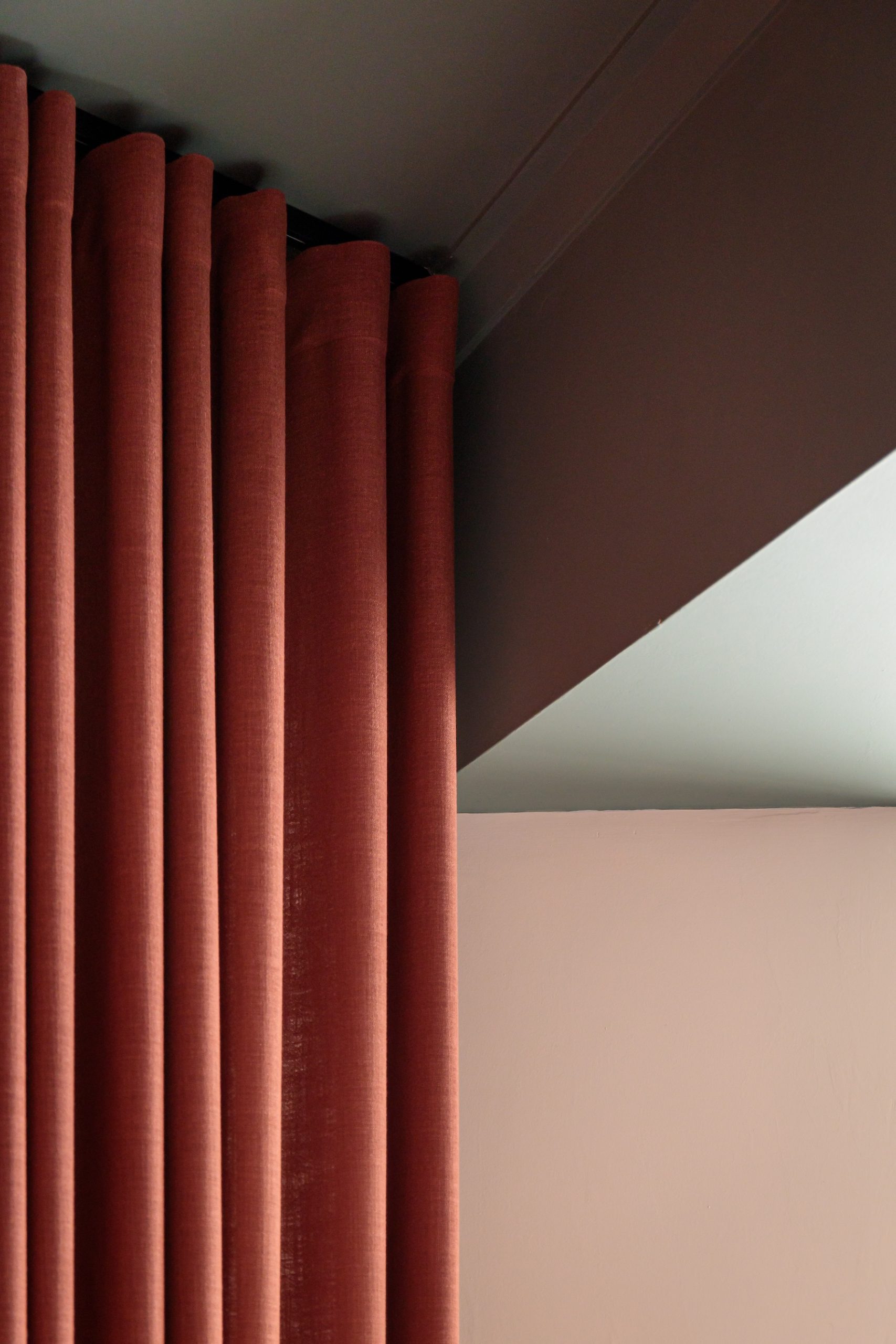
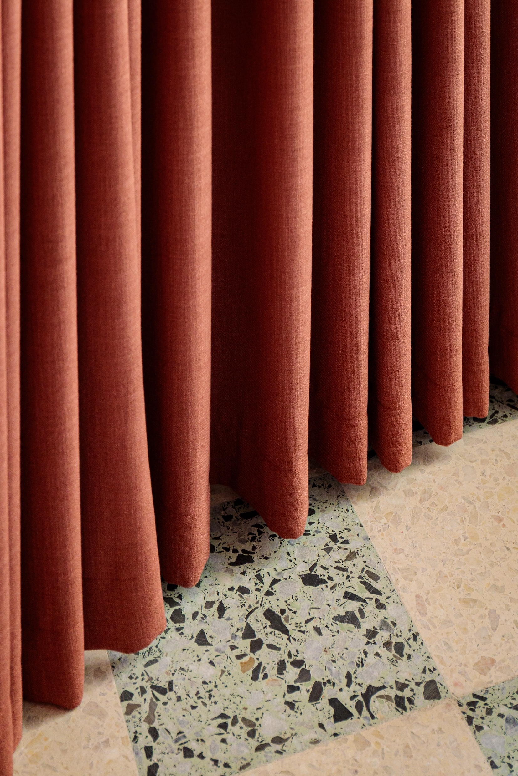
Como Branco is a Lisbon-based wedding and events planning agency, known for its refined and poetic visual language. Their corporate identity includes a soft green, which became a key element of the palette — together with the existing stone floor, a delicate checkerboard of soft green and pale pink.
The color story
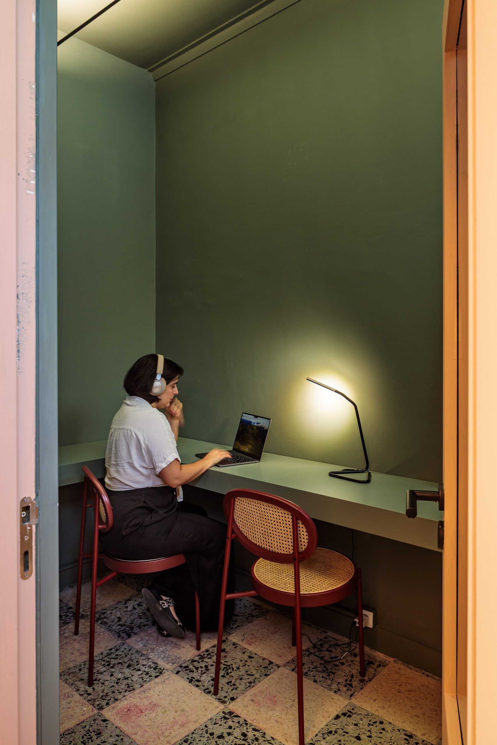
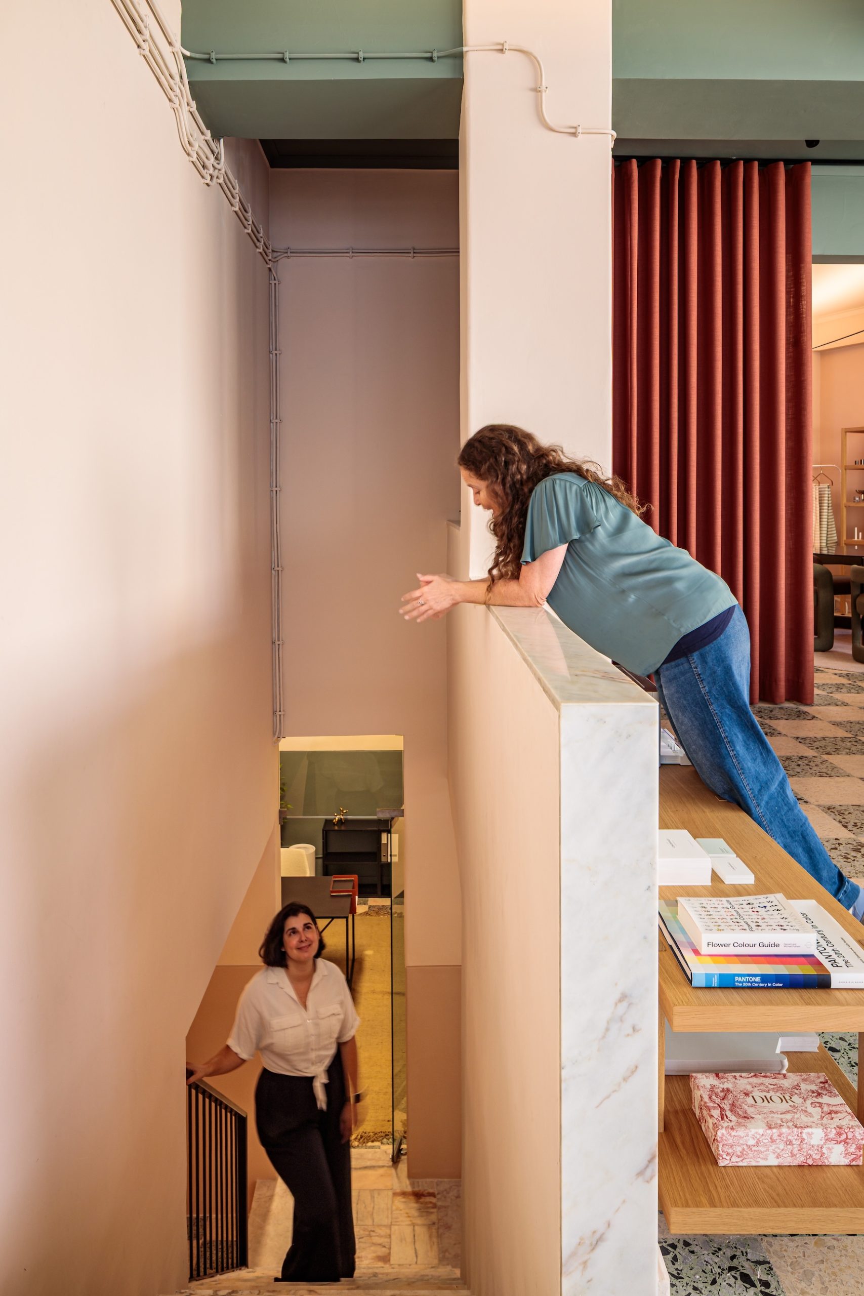
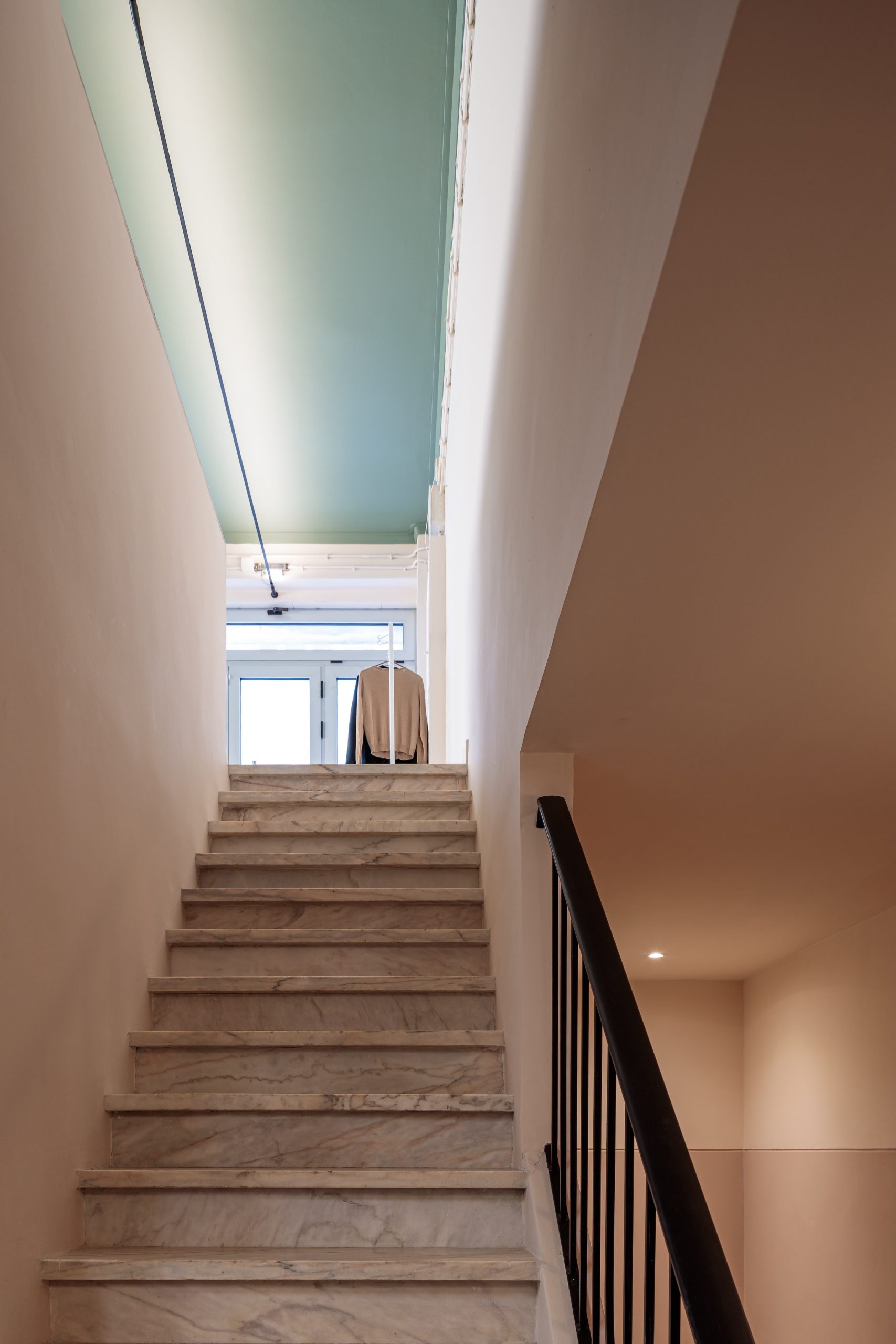
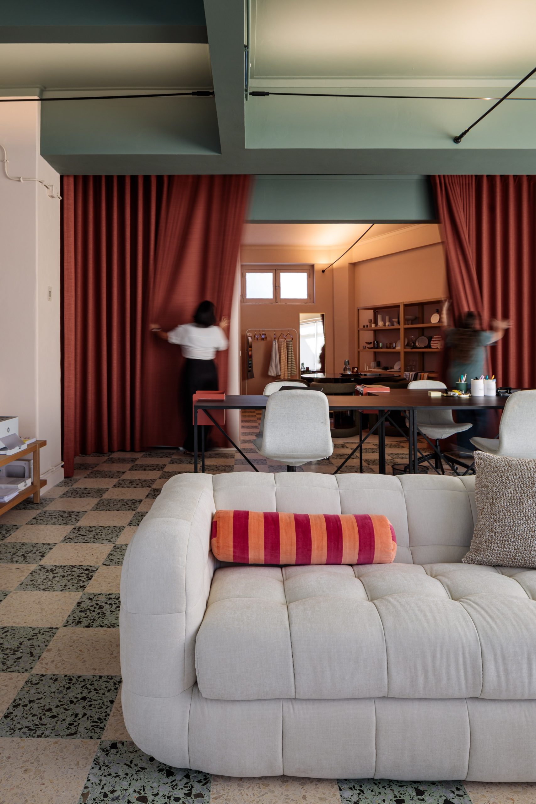
At the entrance, a very light blush pink is the background, and the eye is drawn up to a deeper green ceiling — a bold yet elegant gesture. A deeper pink defines the meeting room, while a rich green grounds the Zoom room, with rust curtains that can separate areas when needed.
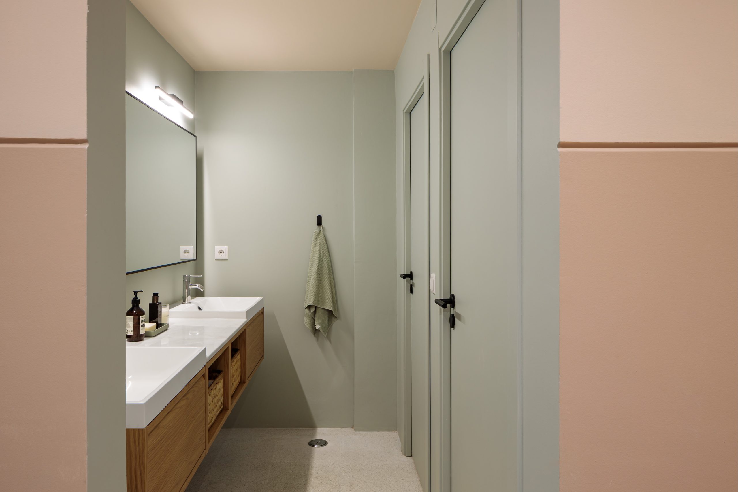
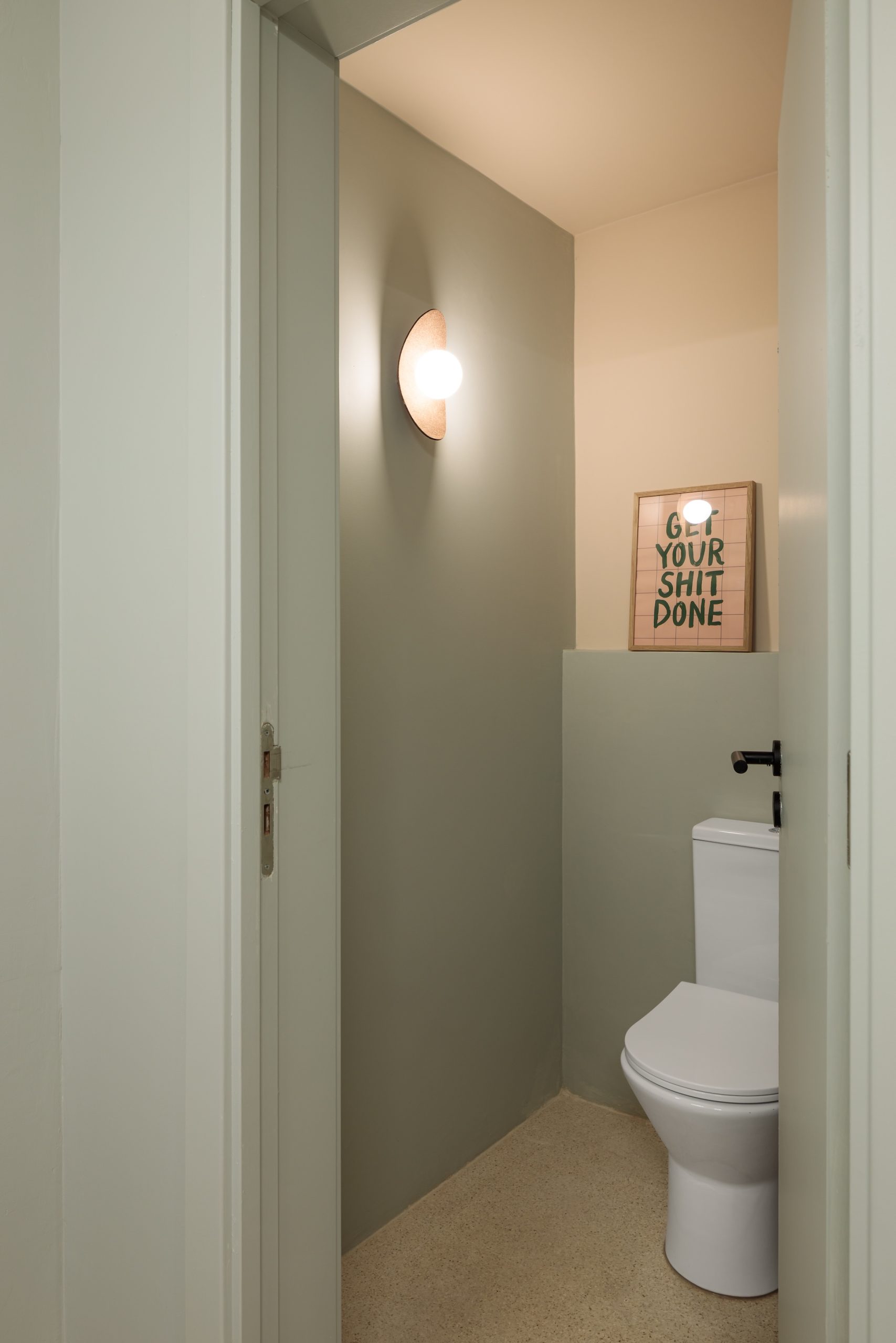
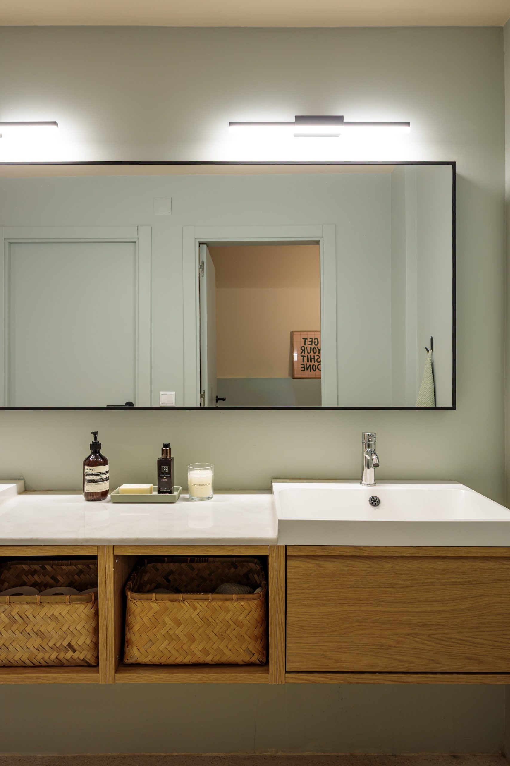
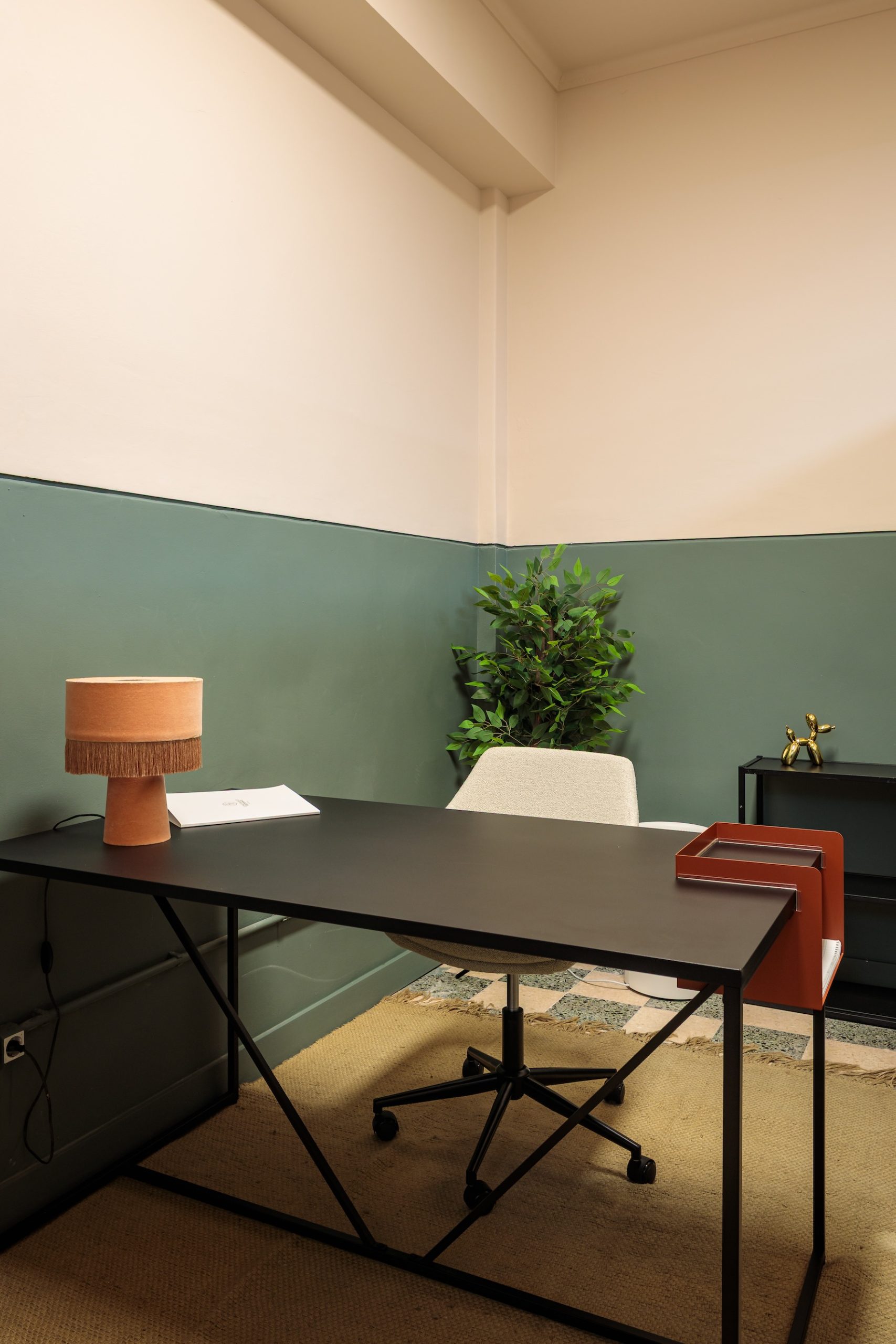
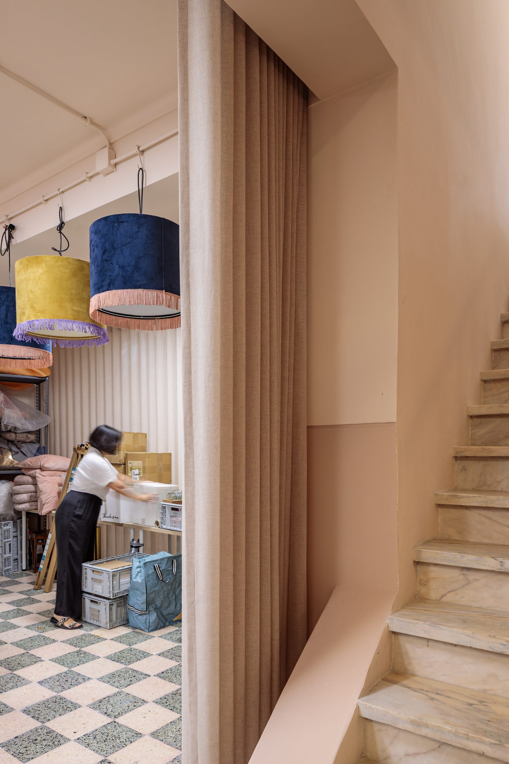
Downstairs, the soft pink deepens along the corridor and working areas. A color-blocked “box” in the bathroom echoes the green of the stone floor, and the deep green ceiling carries down into an adjacent office, tying the whole space together.
Lagos Apartment
Scroll the photos →
The brief
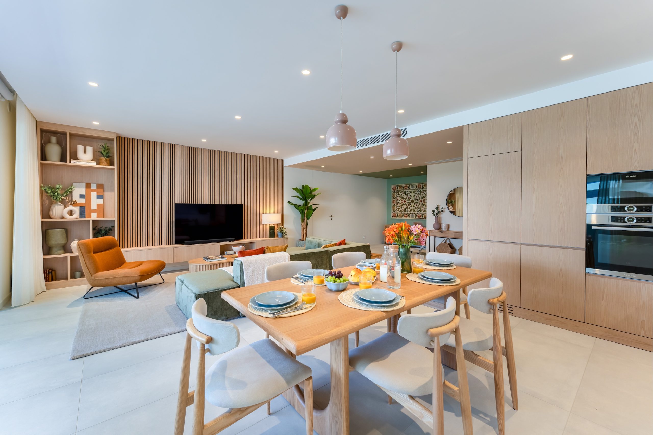
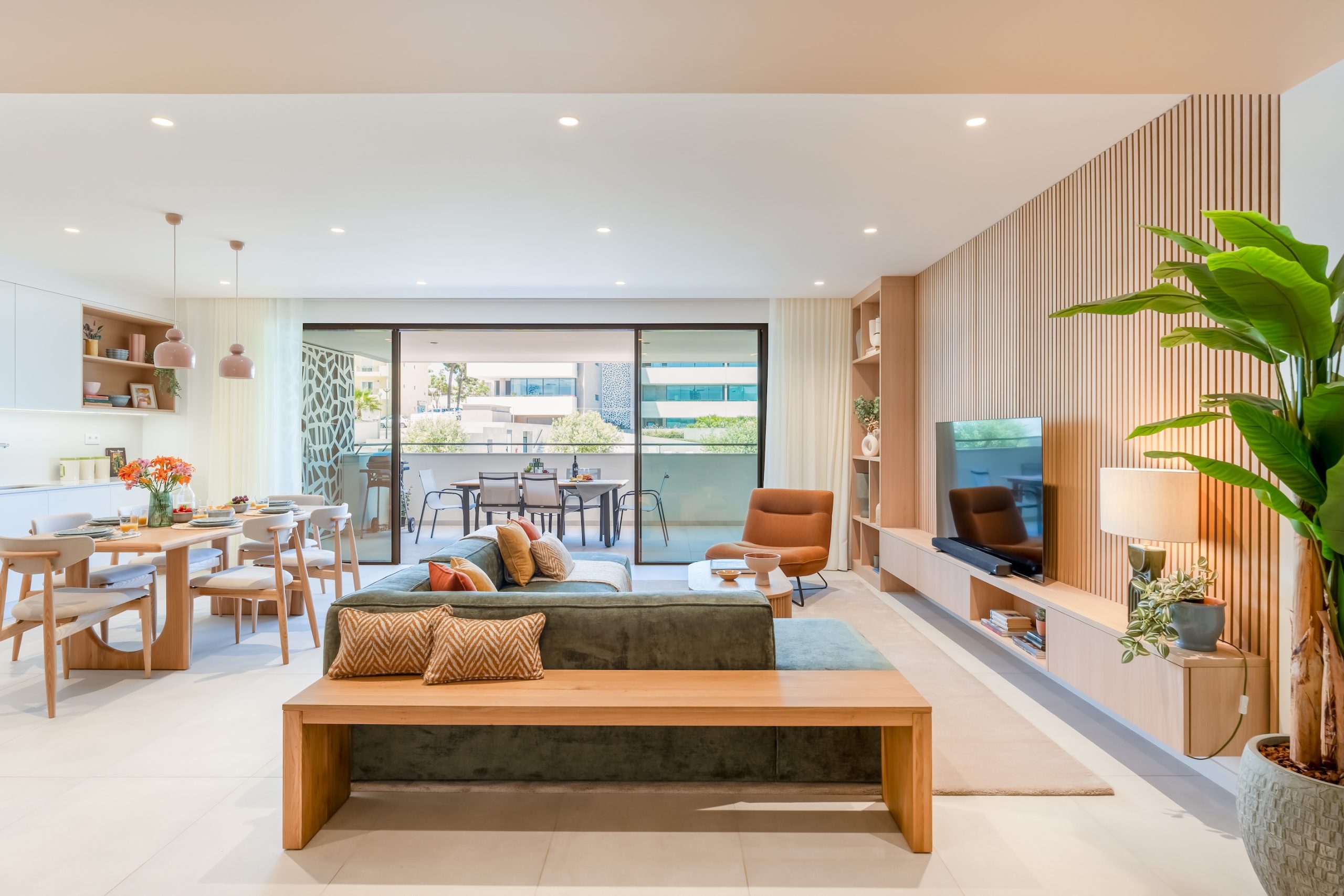
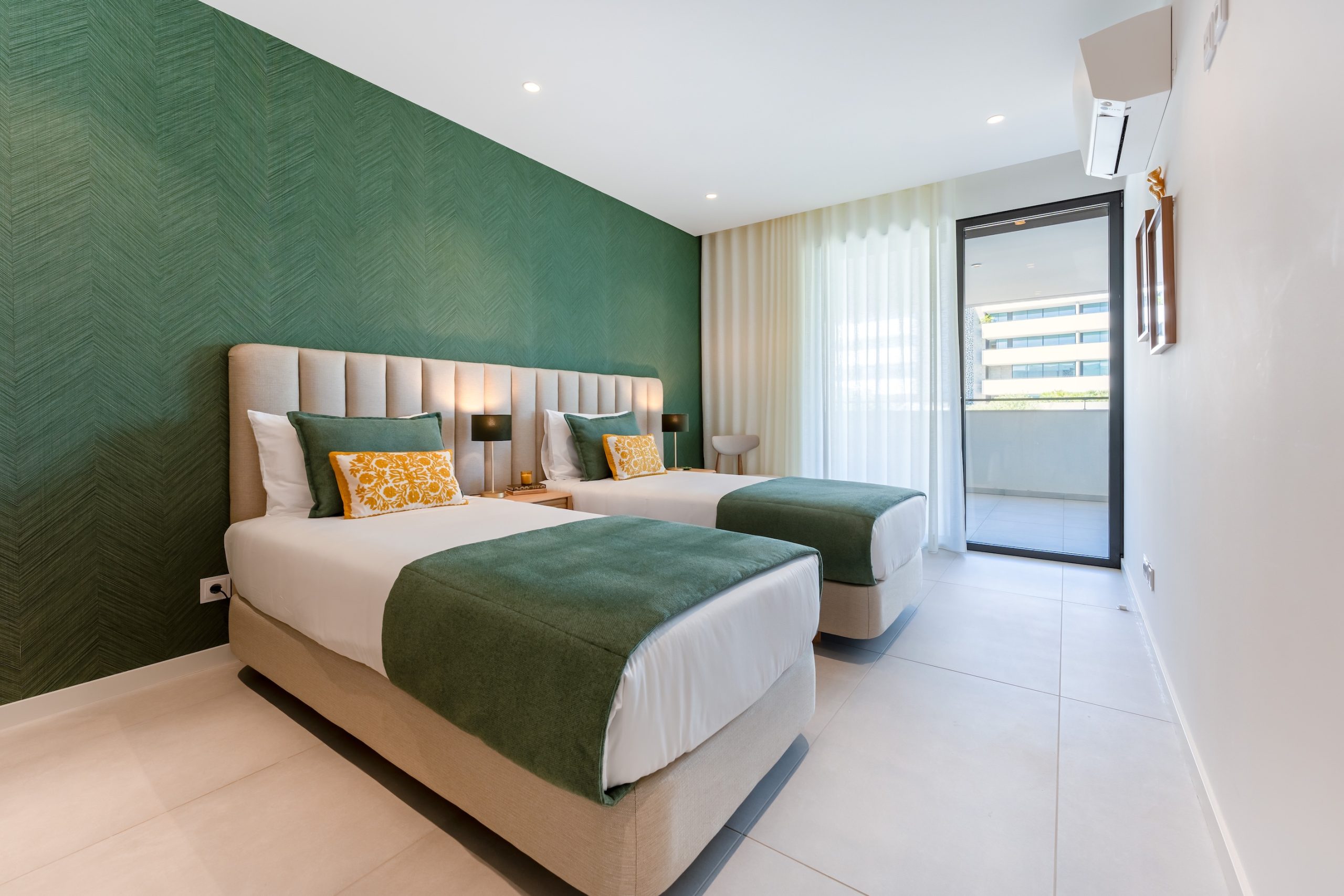
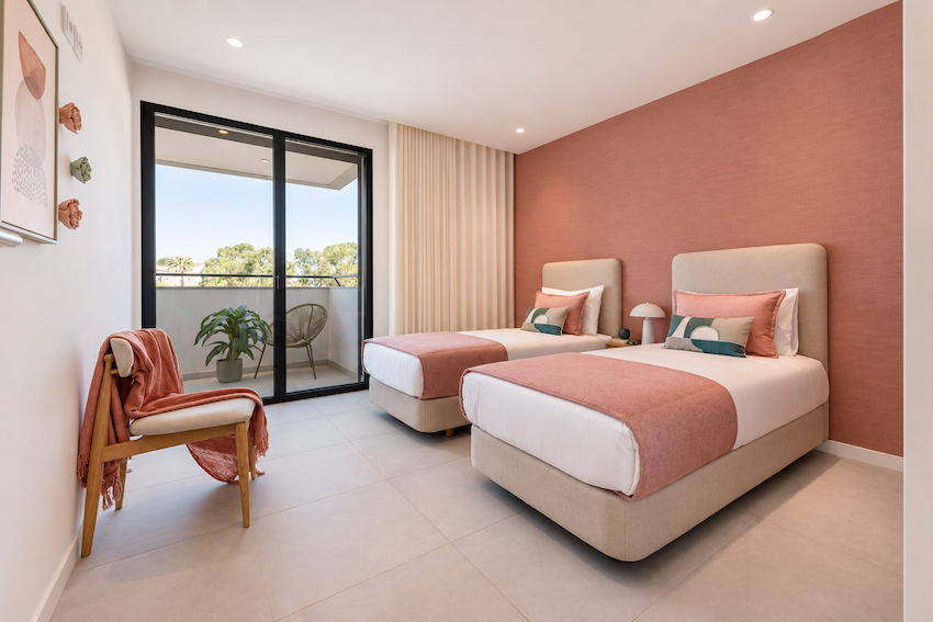
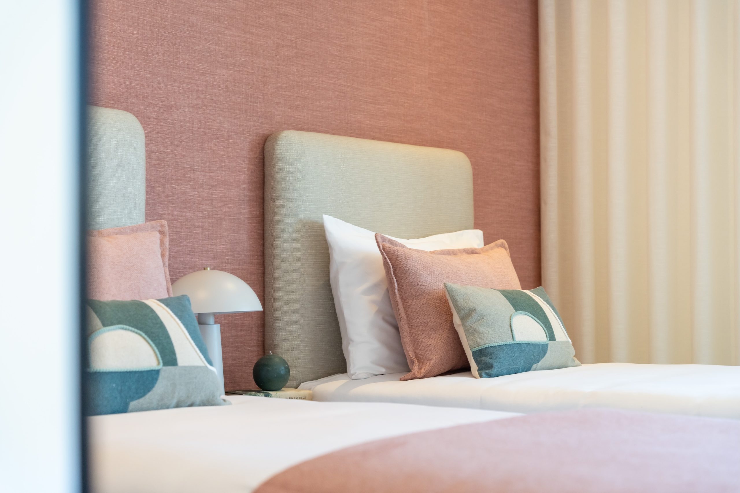
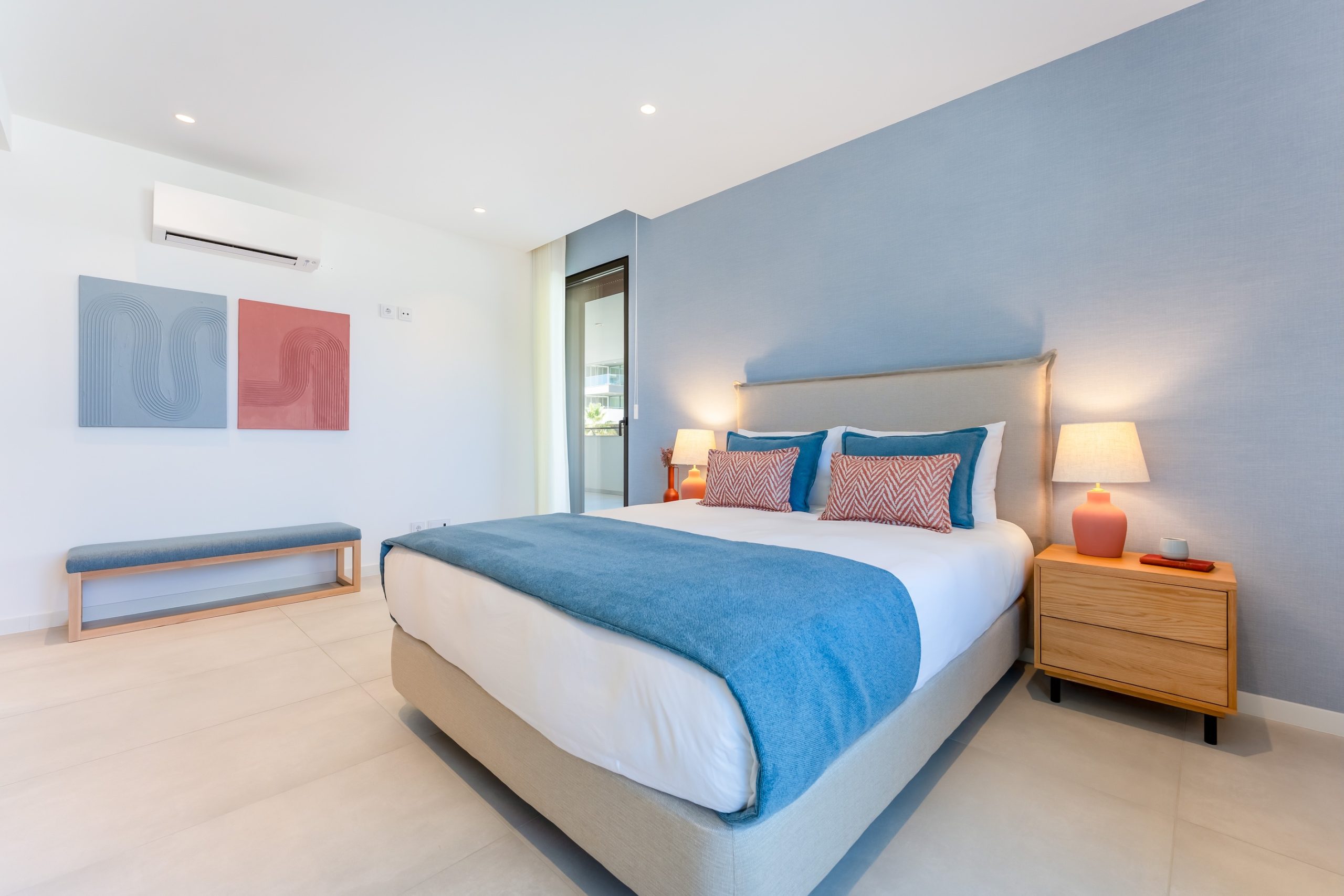
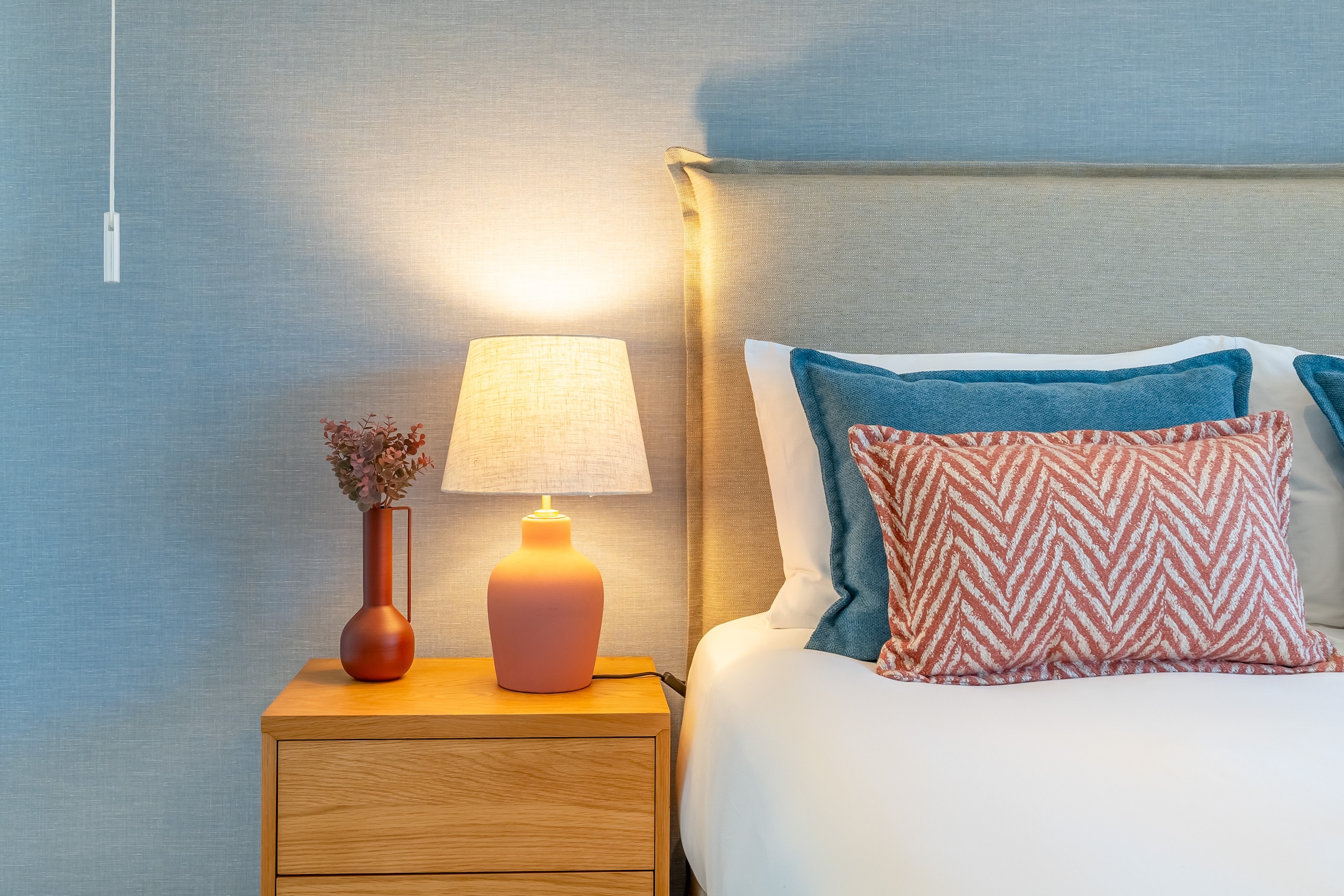
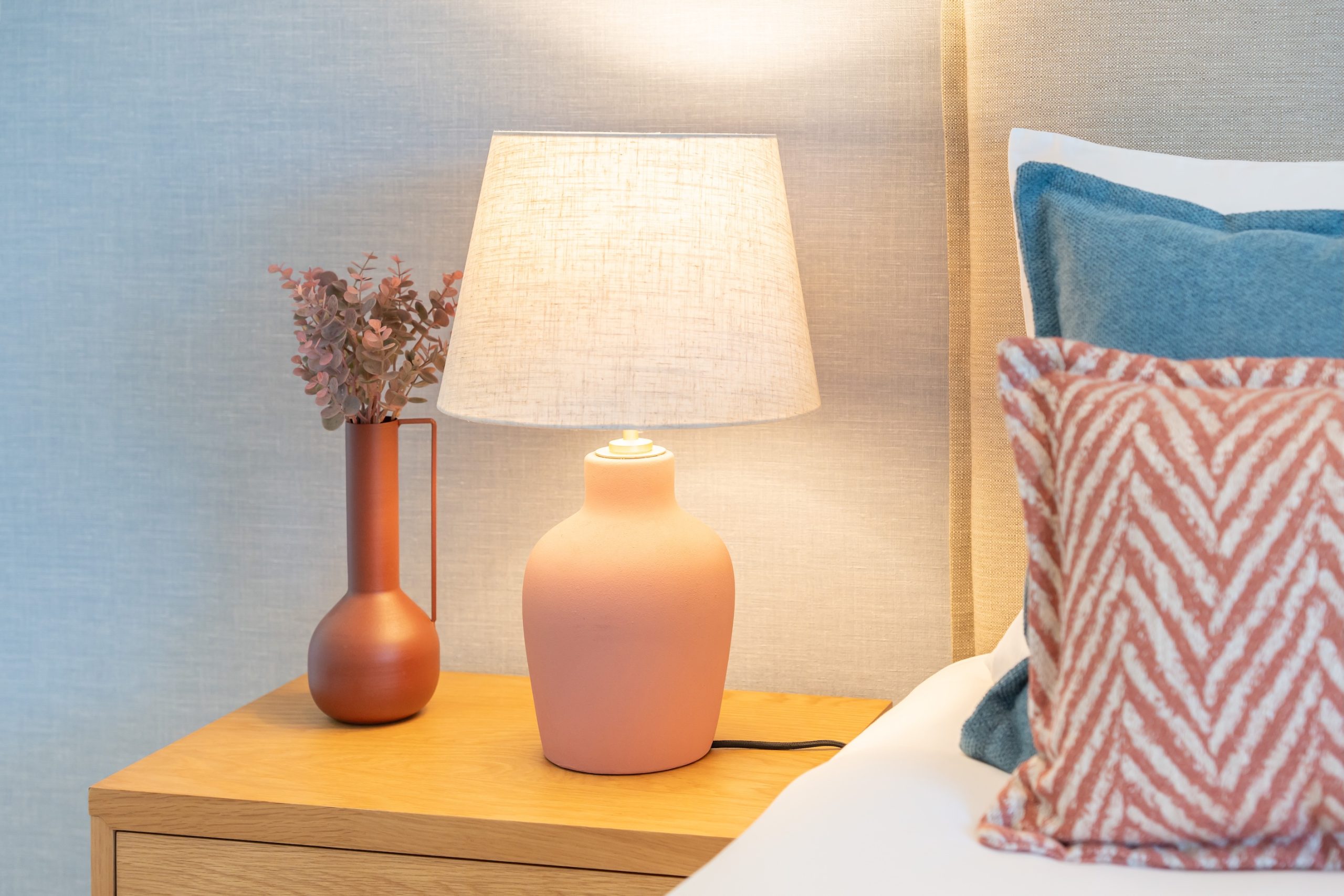
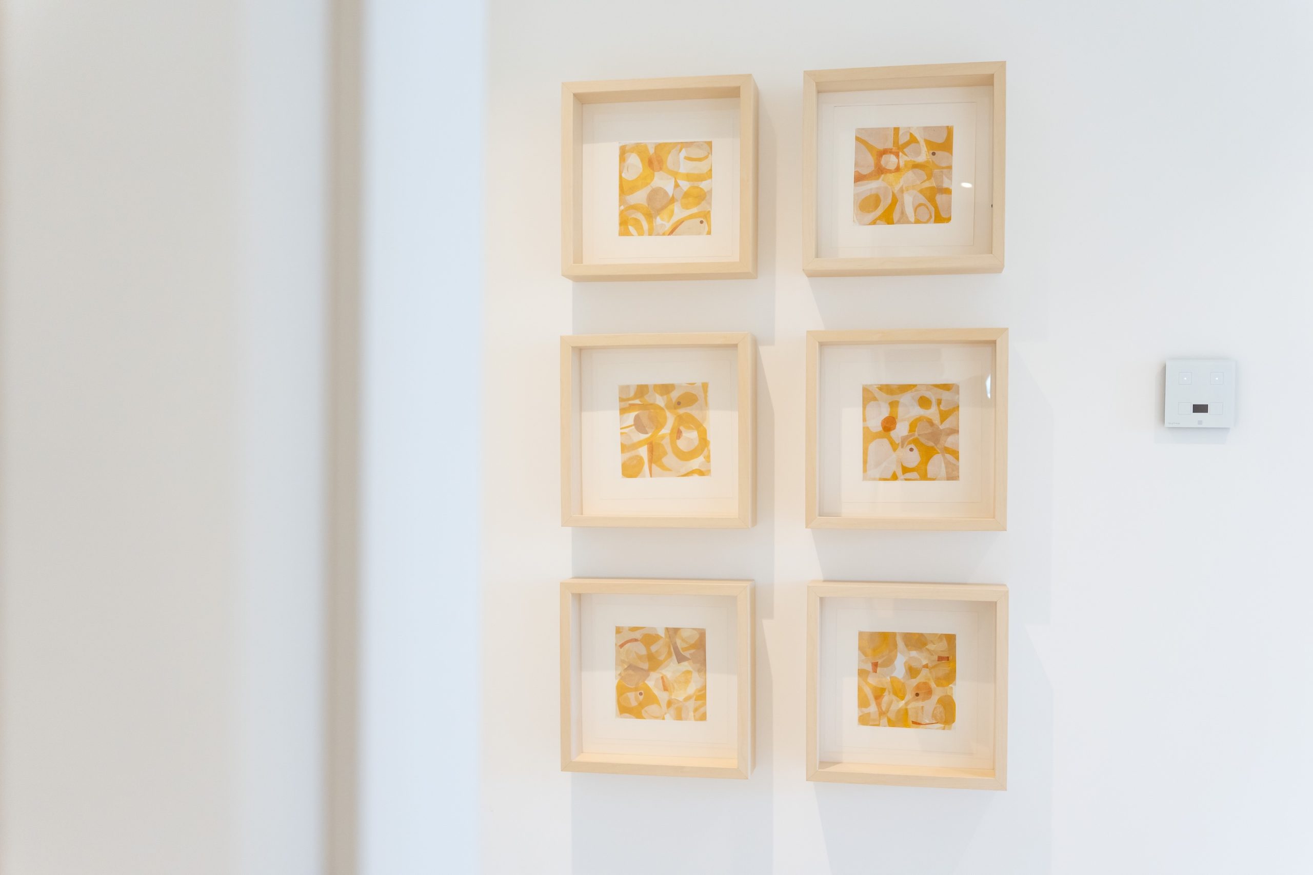
A newly built holiday rental apartment in the Algarve that needed decorating: it had to stand out in publicity photos while staying practical and easy to maintain.
The color story
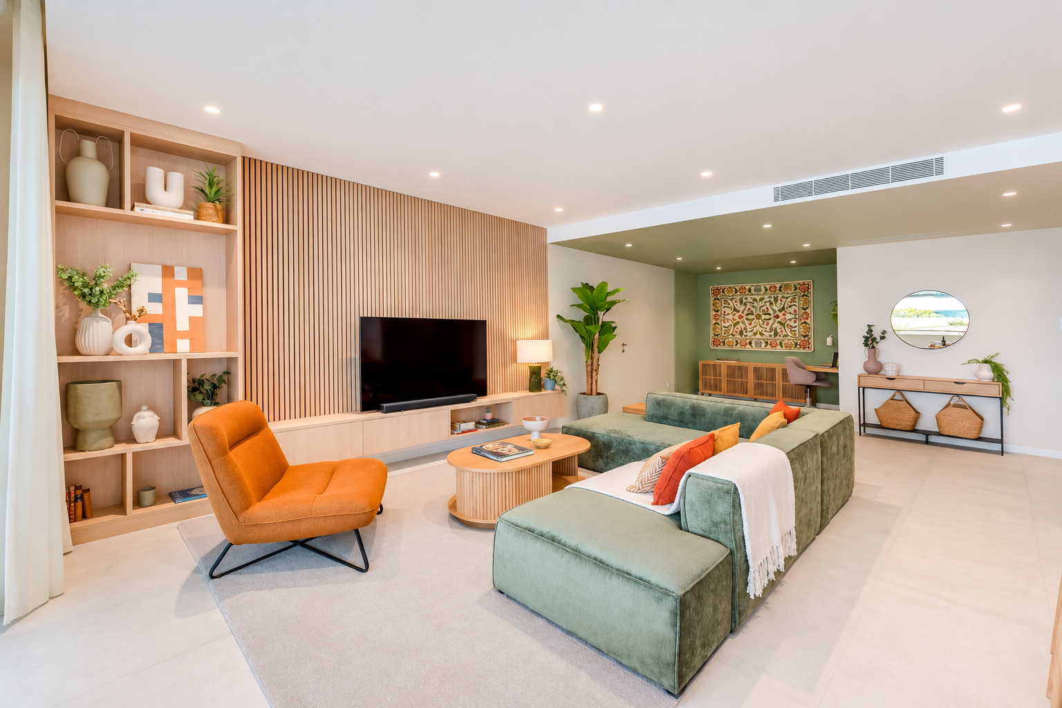
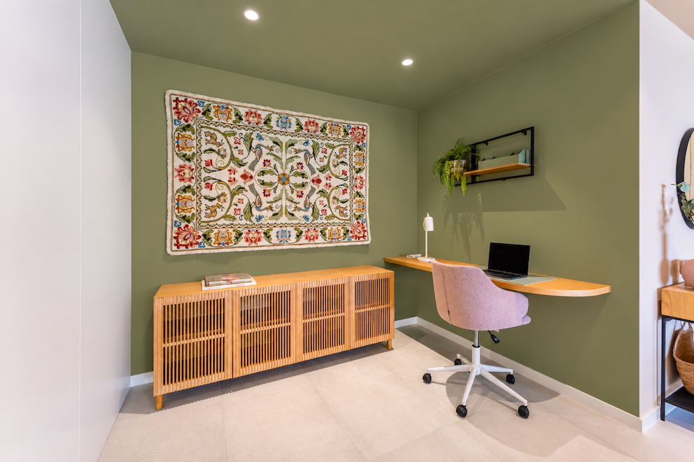
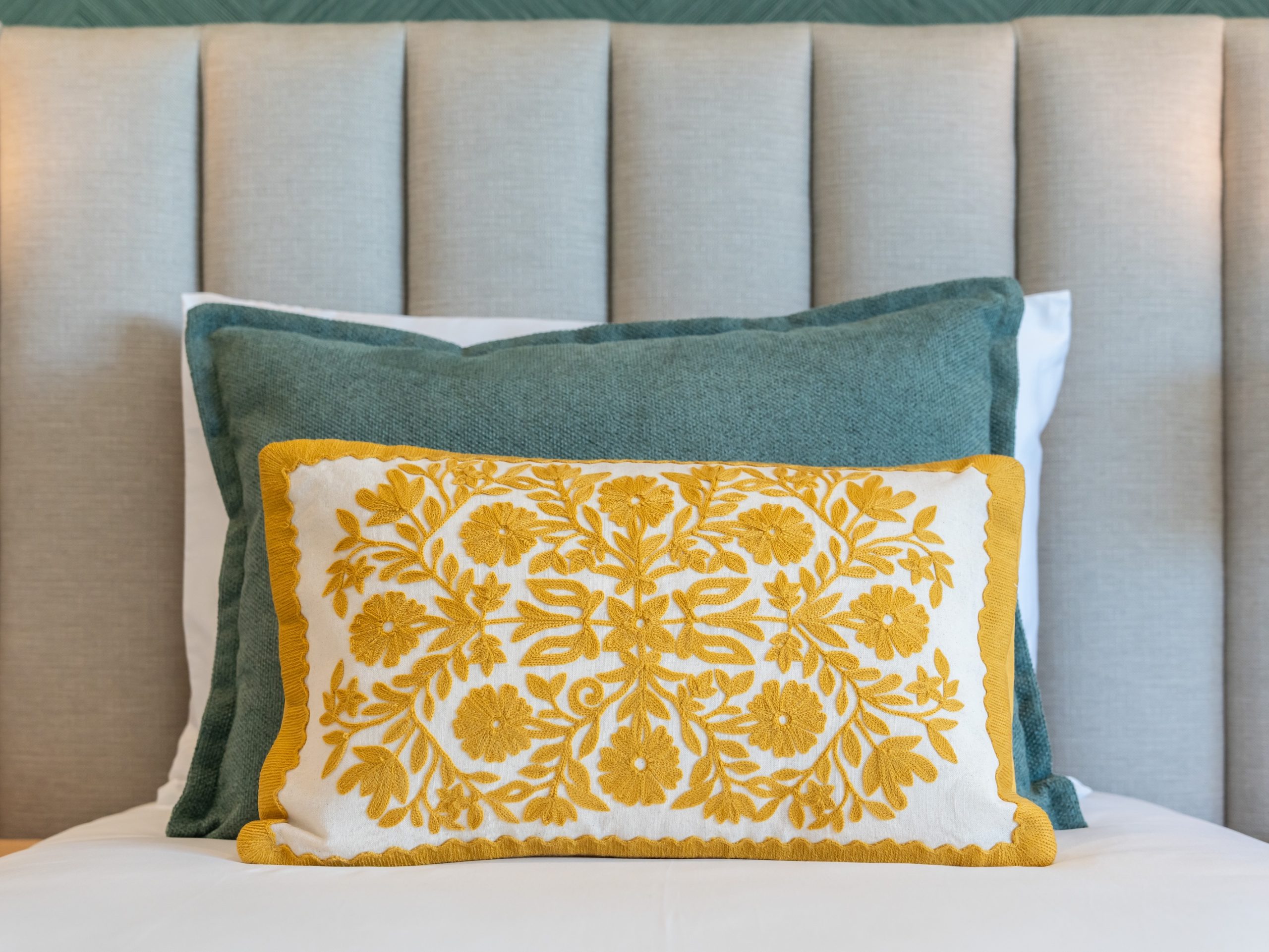
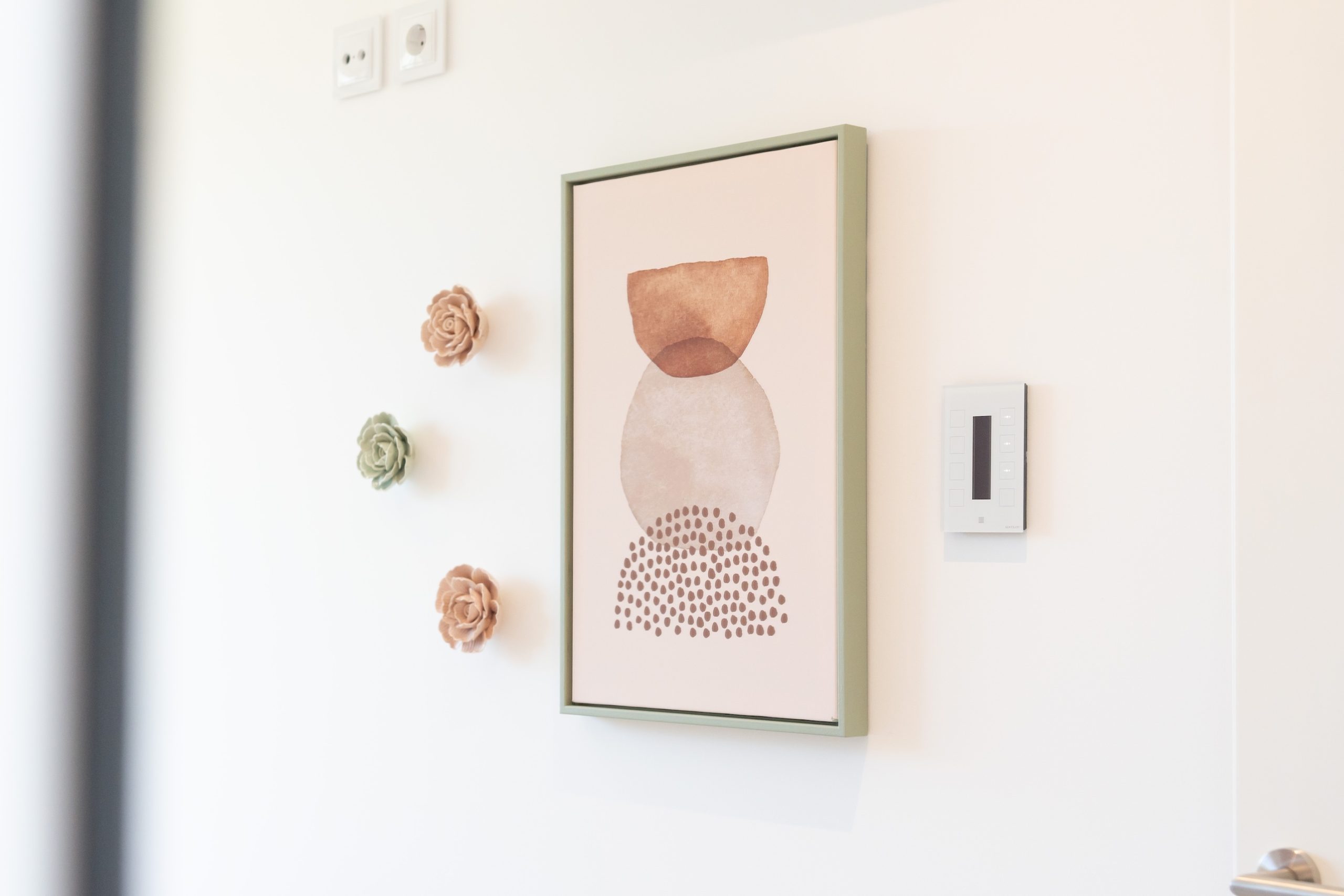
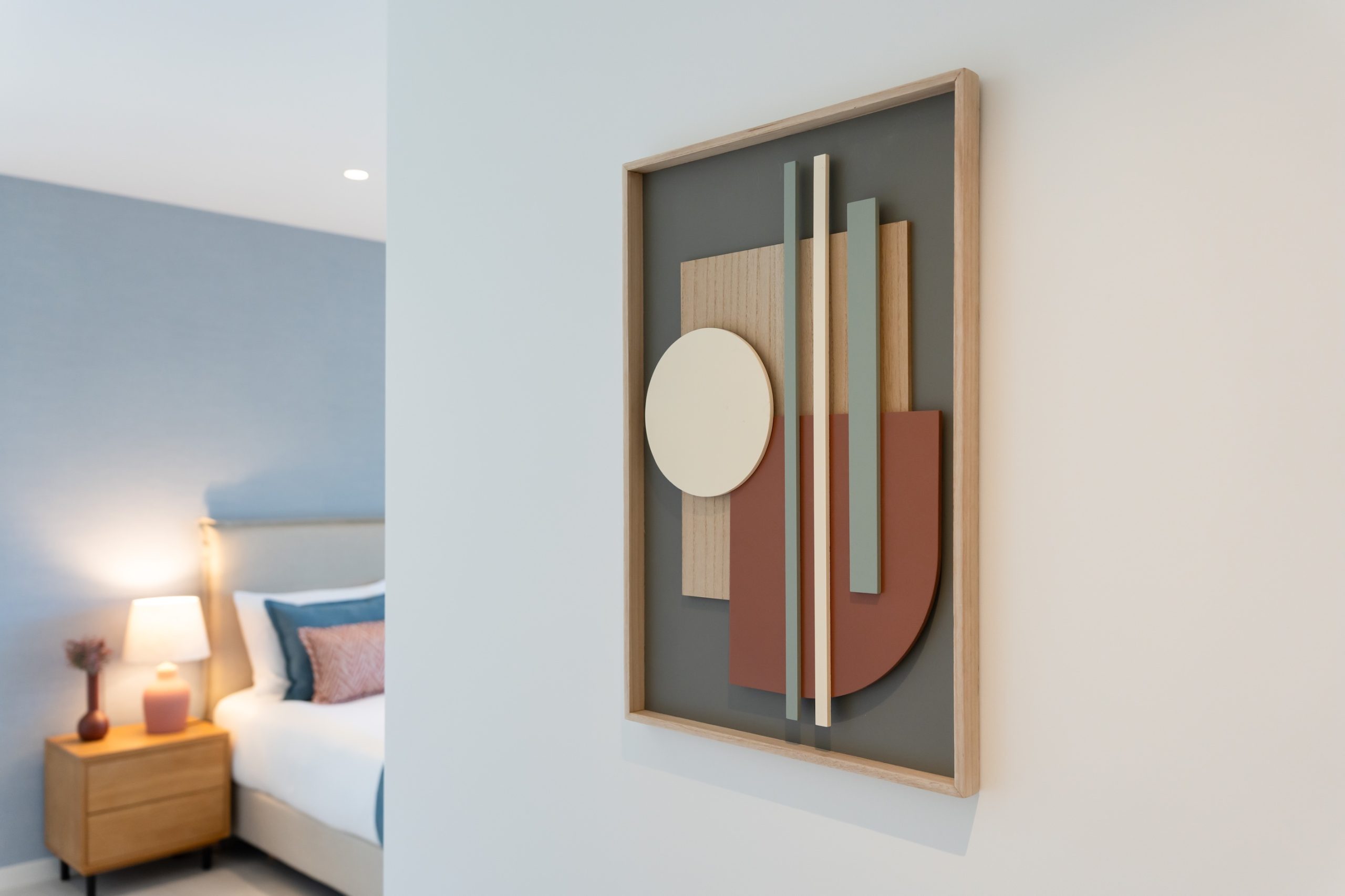
The owners suggested a traditional Portuguese Arraiolos carpet to celebrate Portugal. We found the perfect one and built the whole color scheme around it, carrying its colors through the bedrooms without overpowering the space.
Custom-built furniture made the living room even more special. A project with an Algarve-based decorator.
Adega
Scroll the photos →
The brief
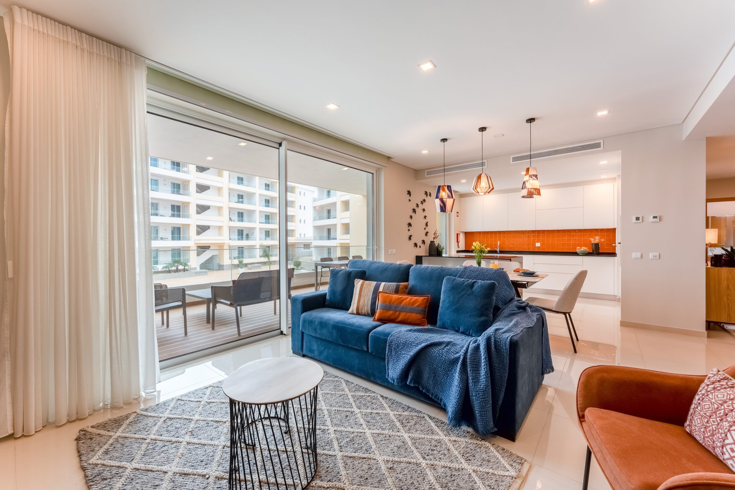
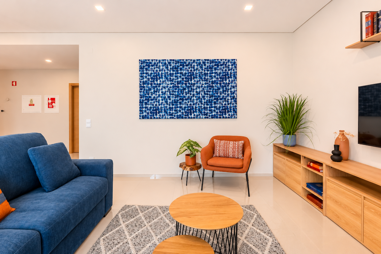
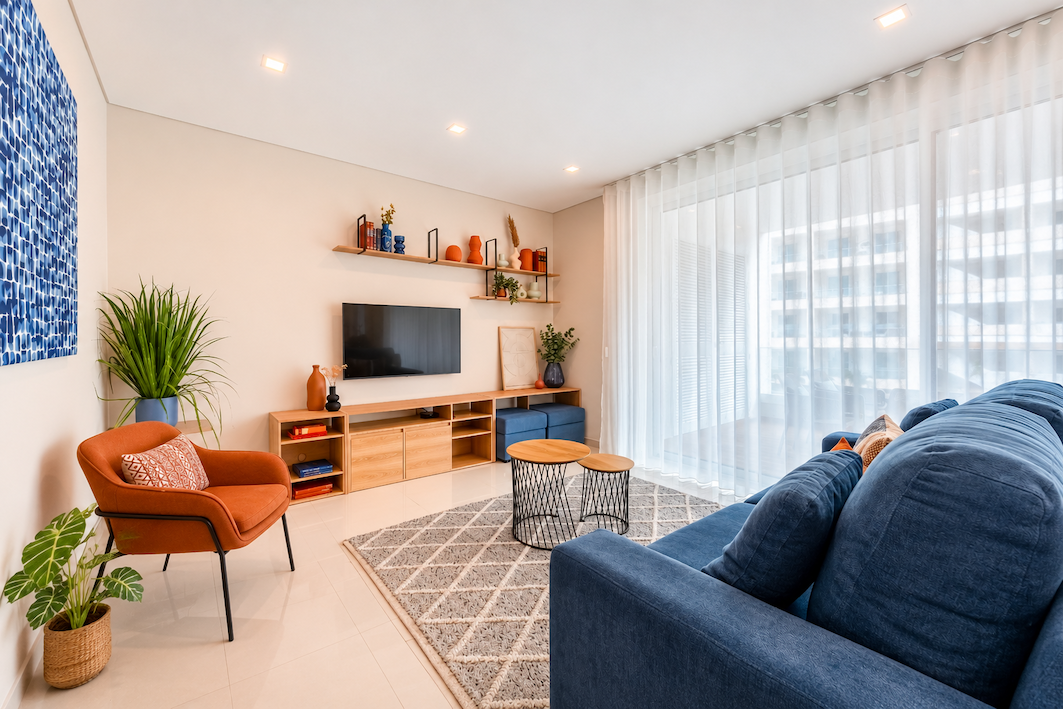
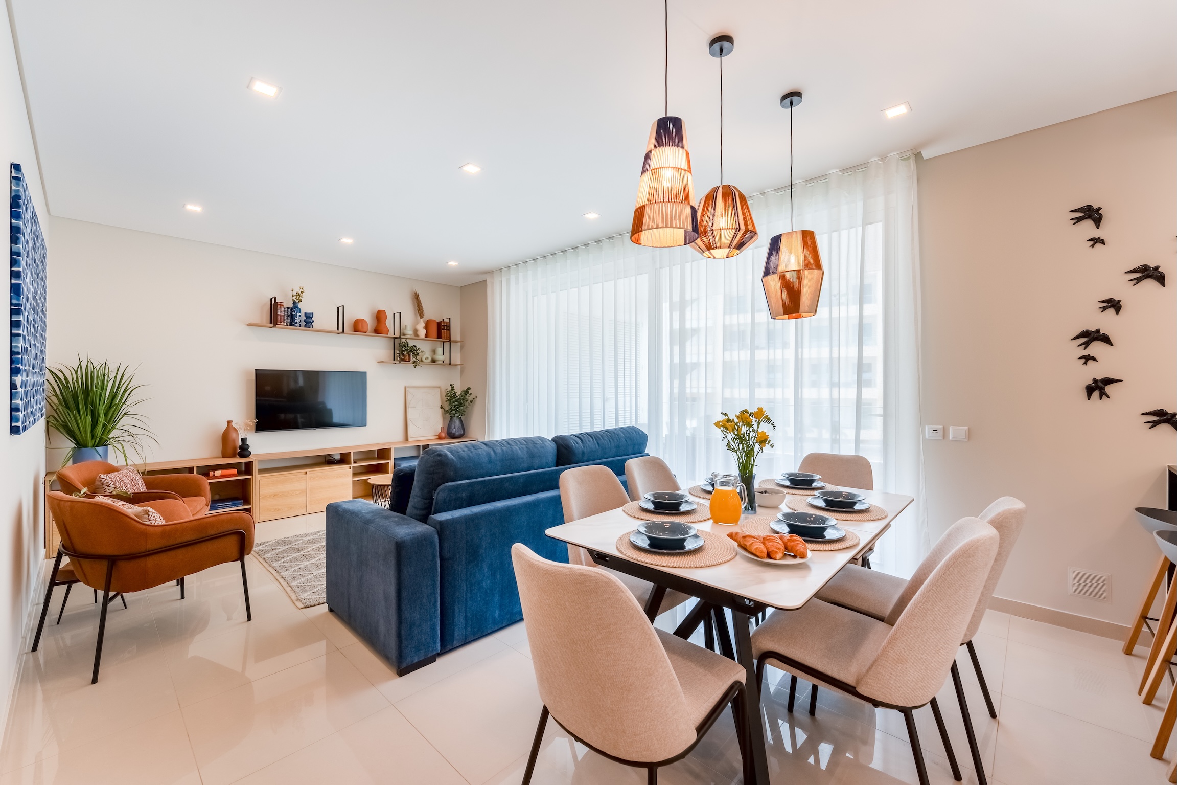
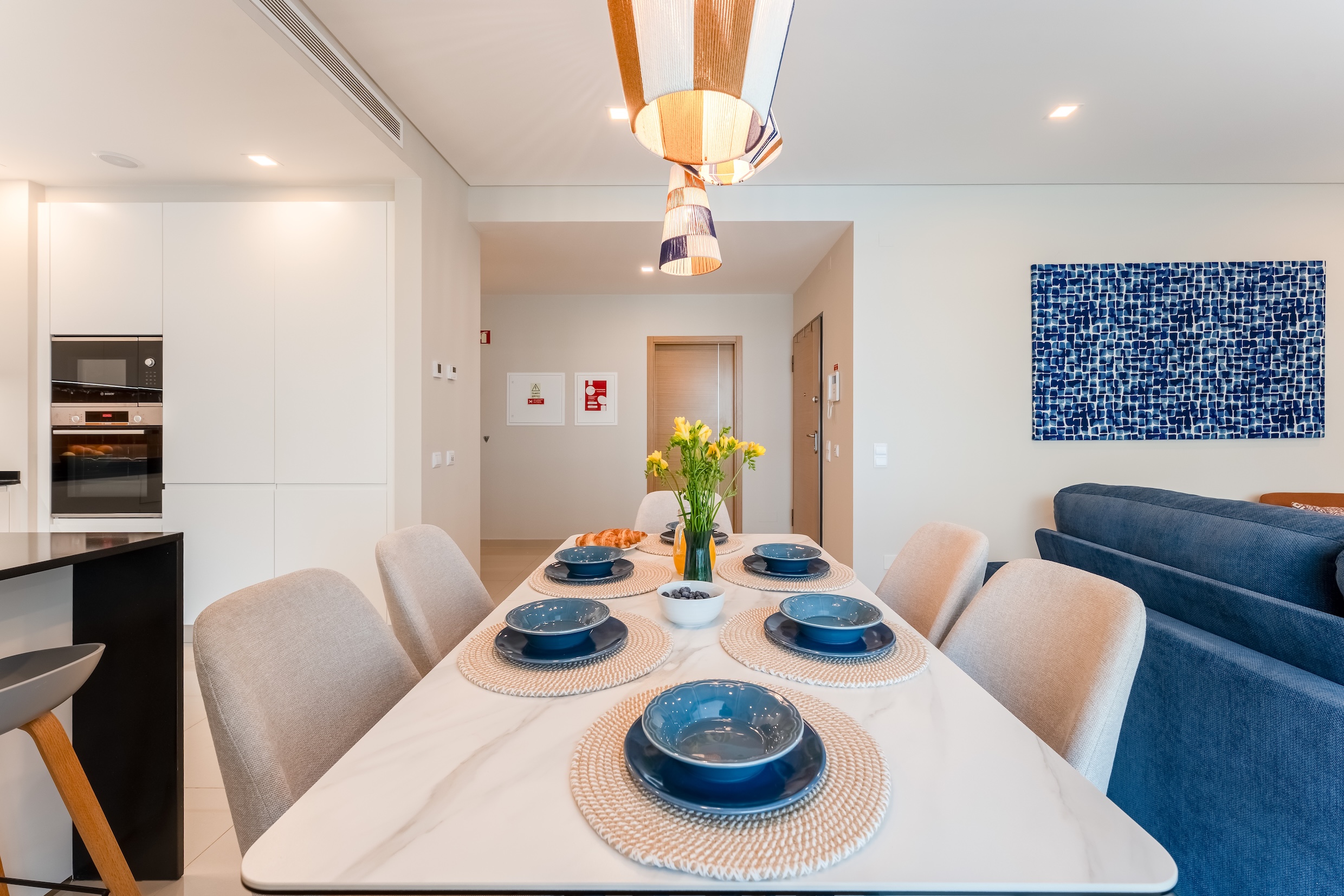
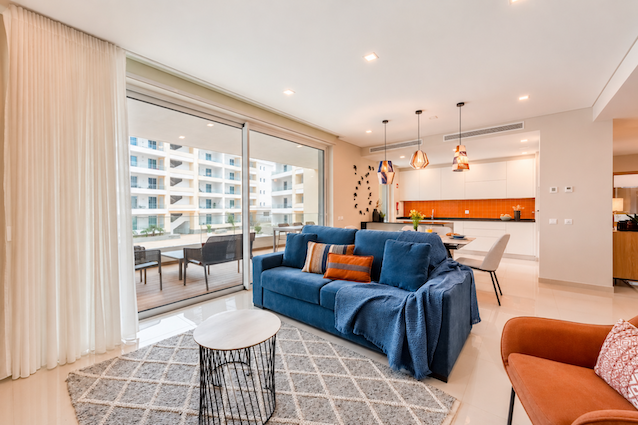
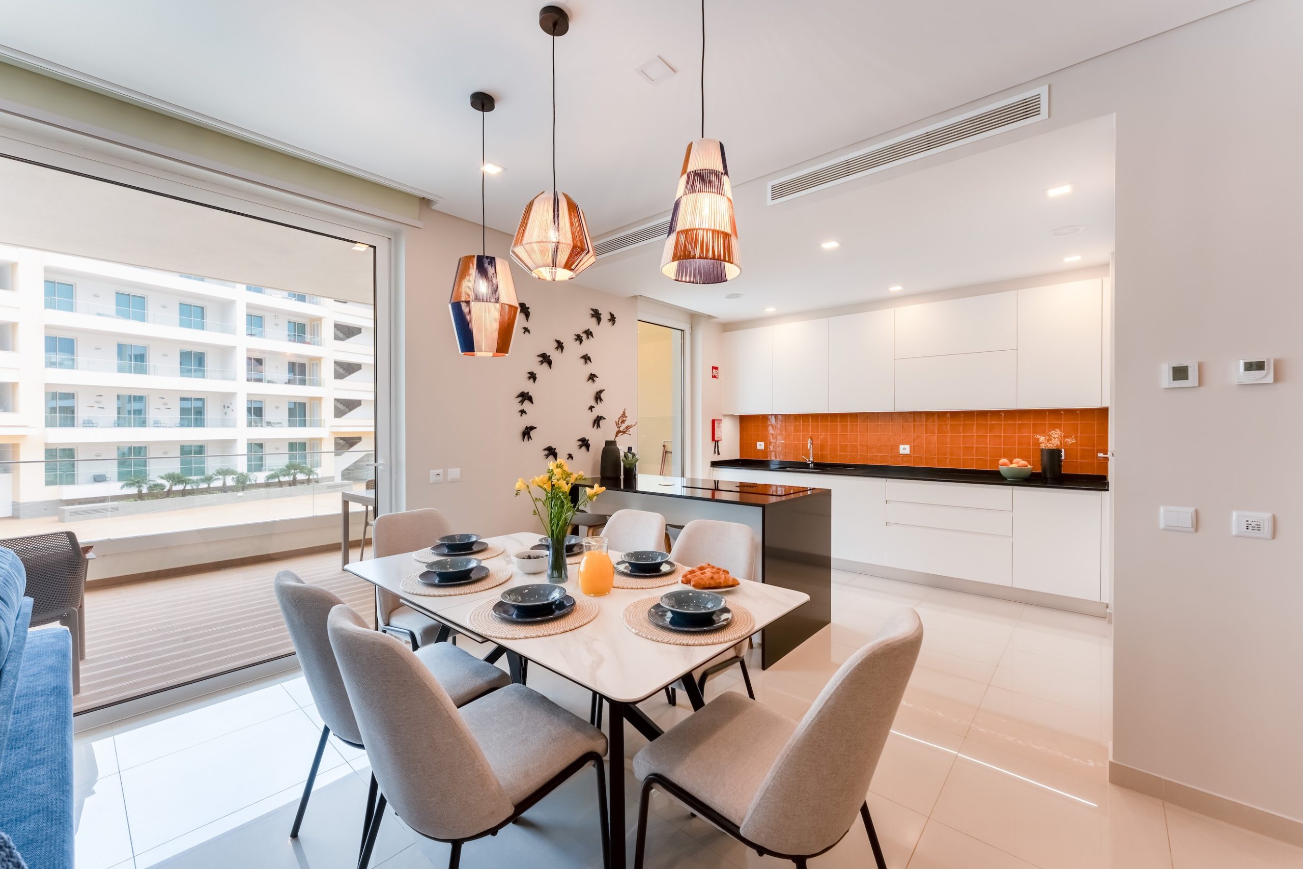
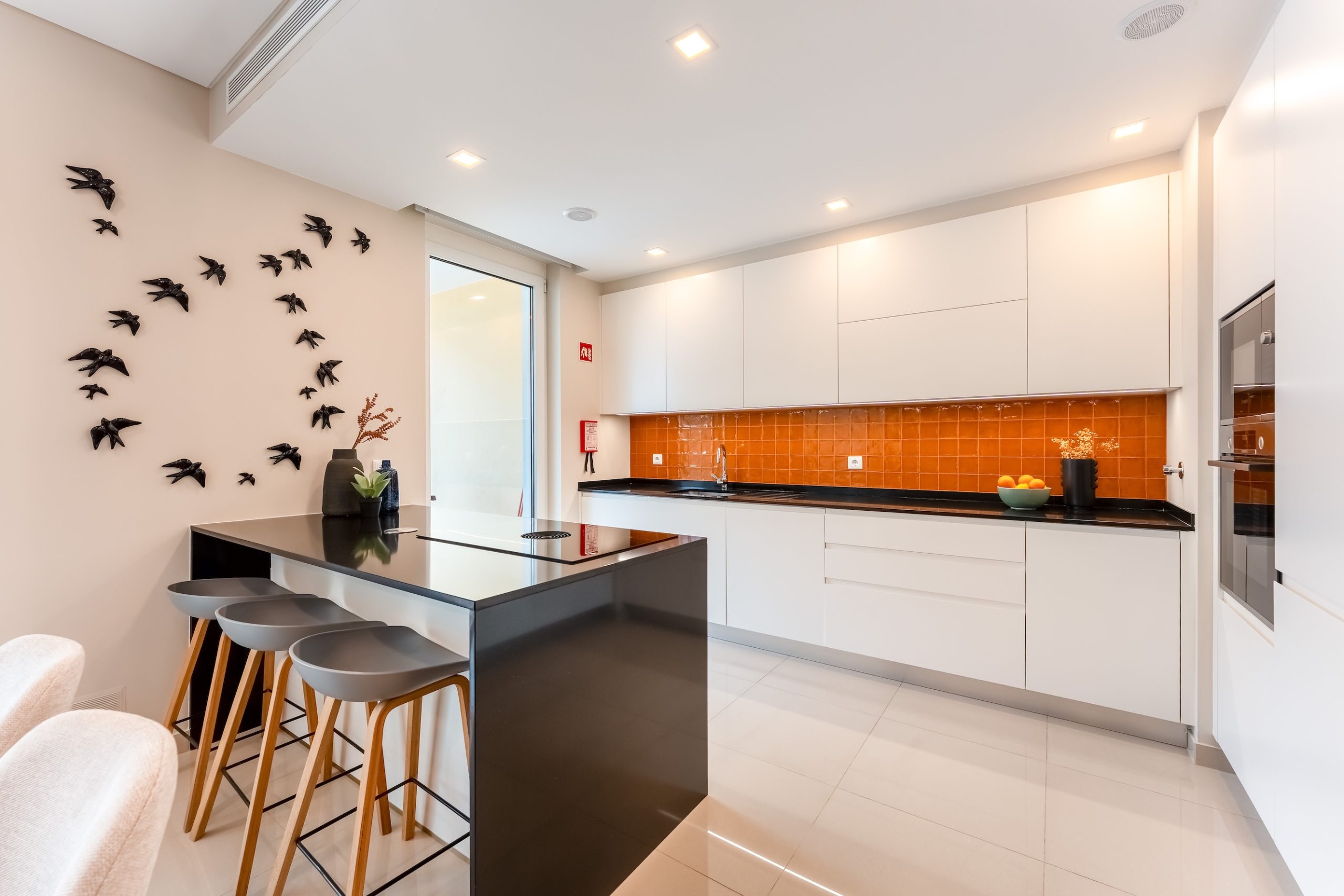
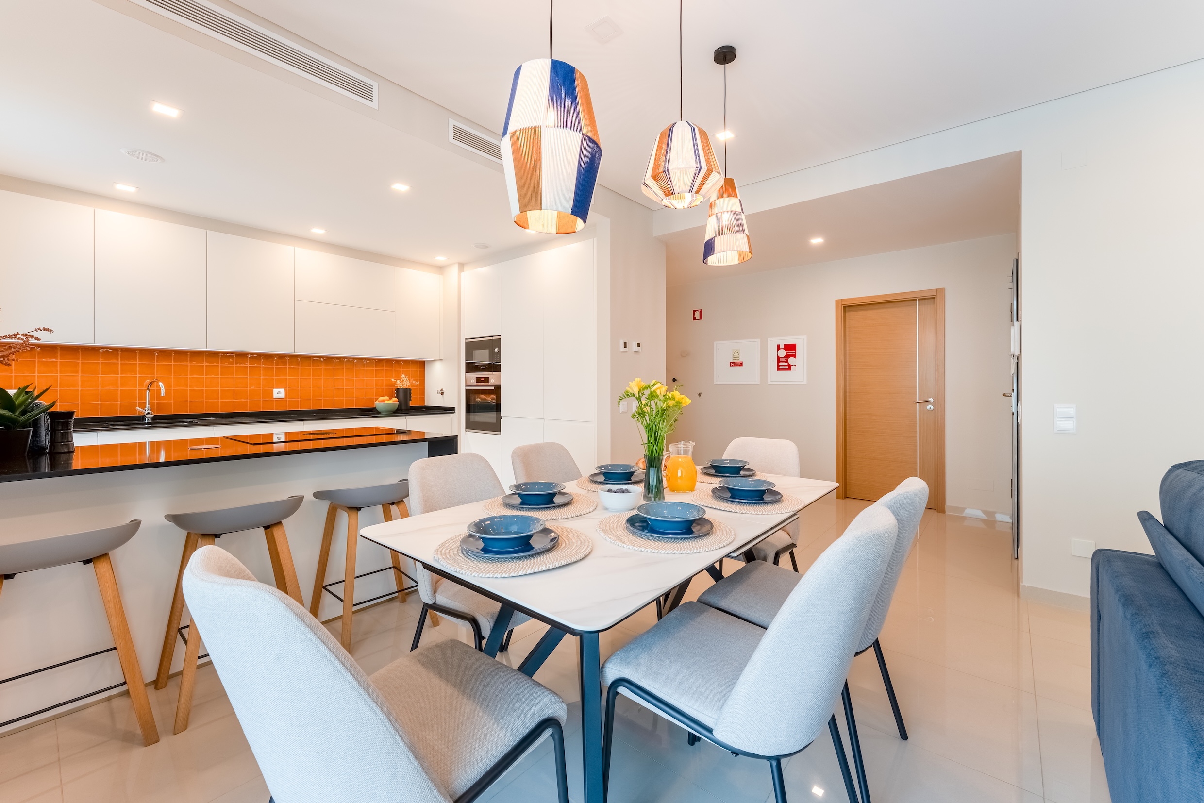
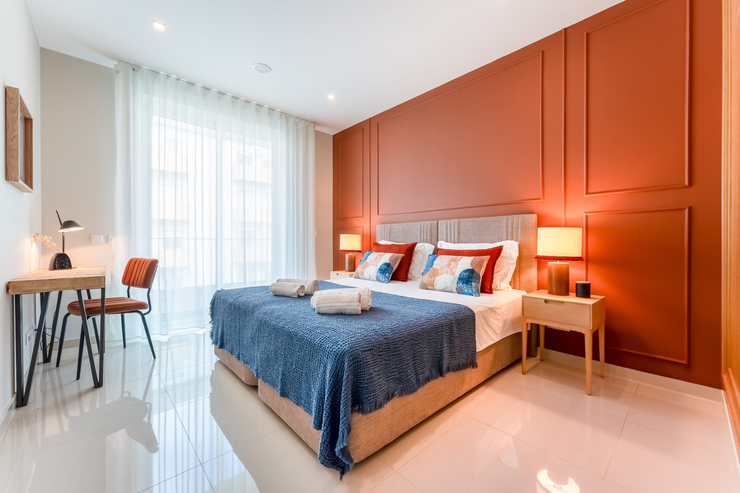
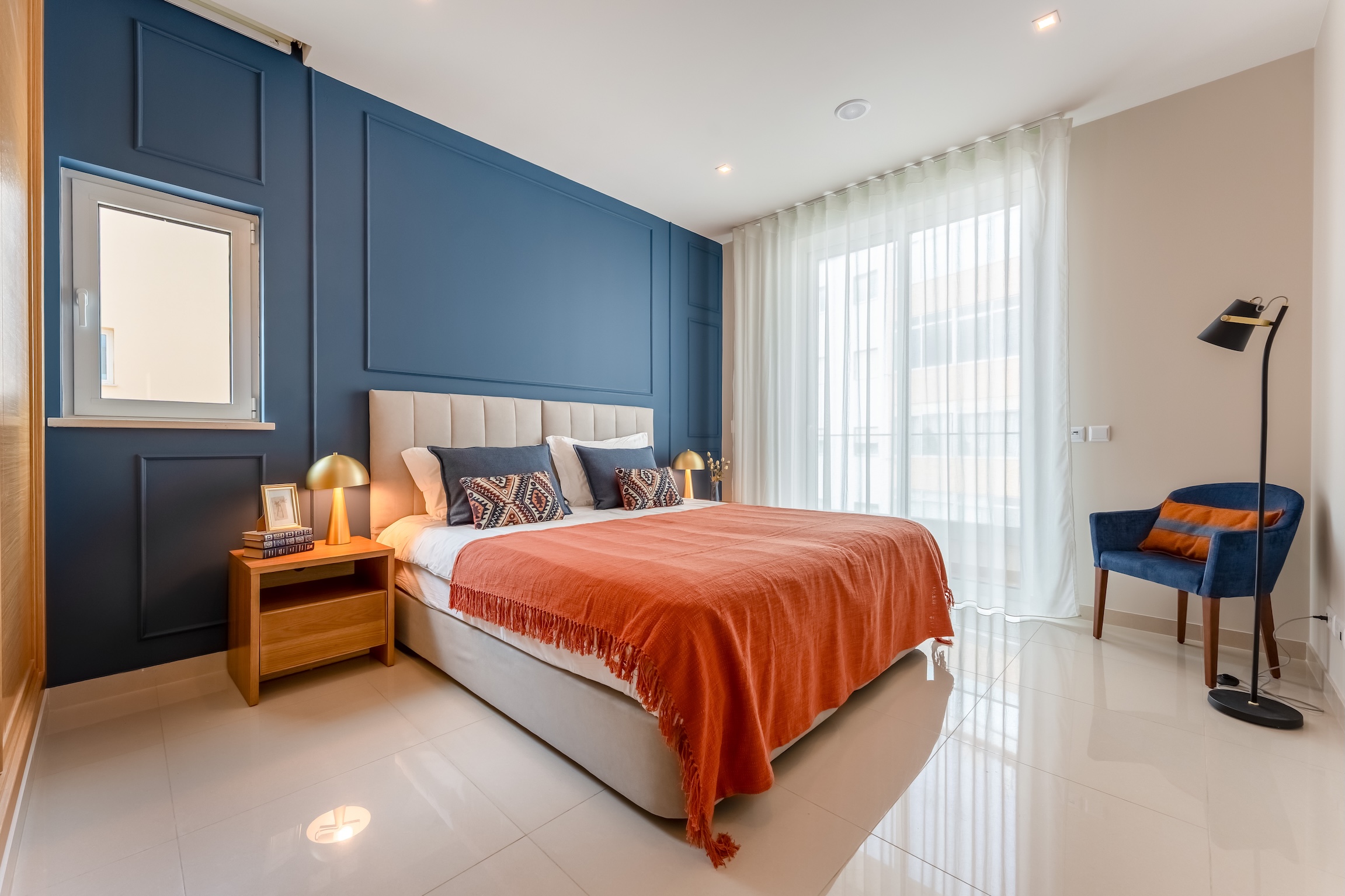
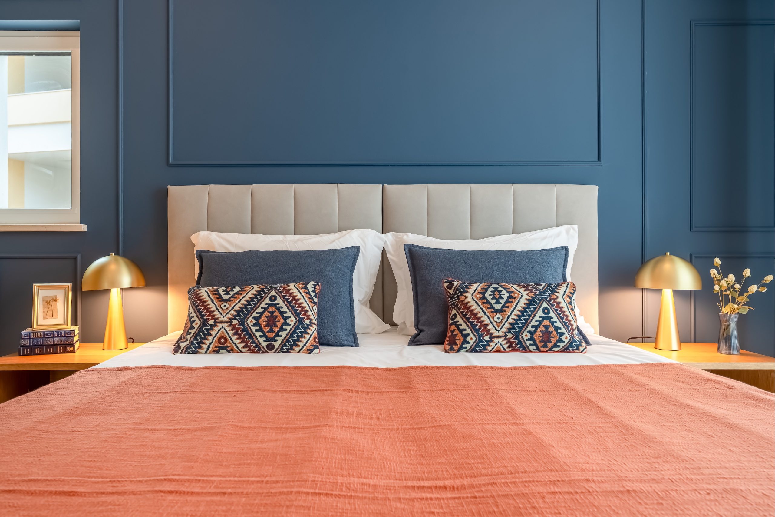
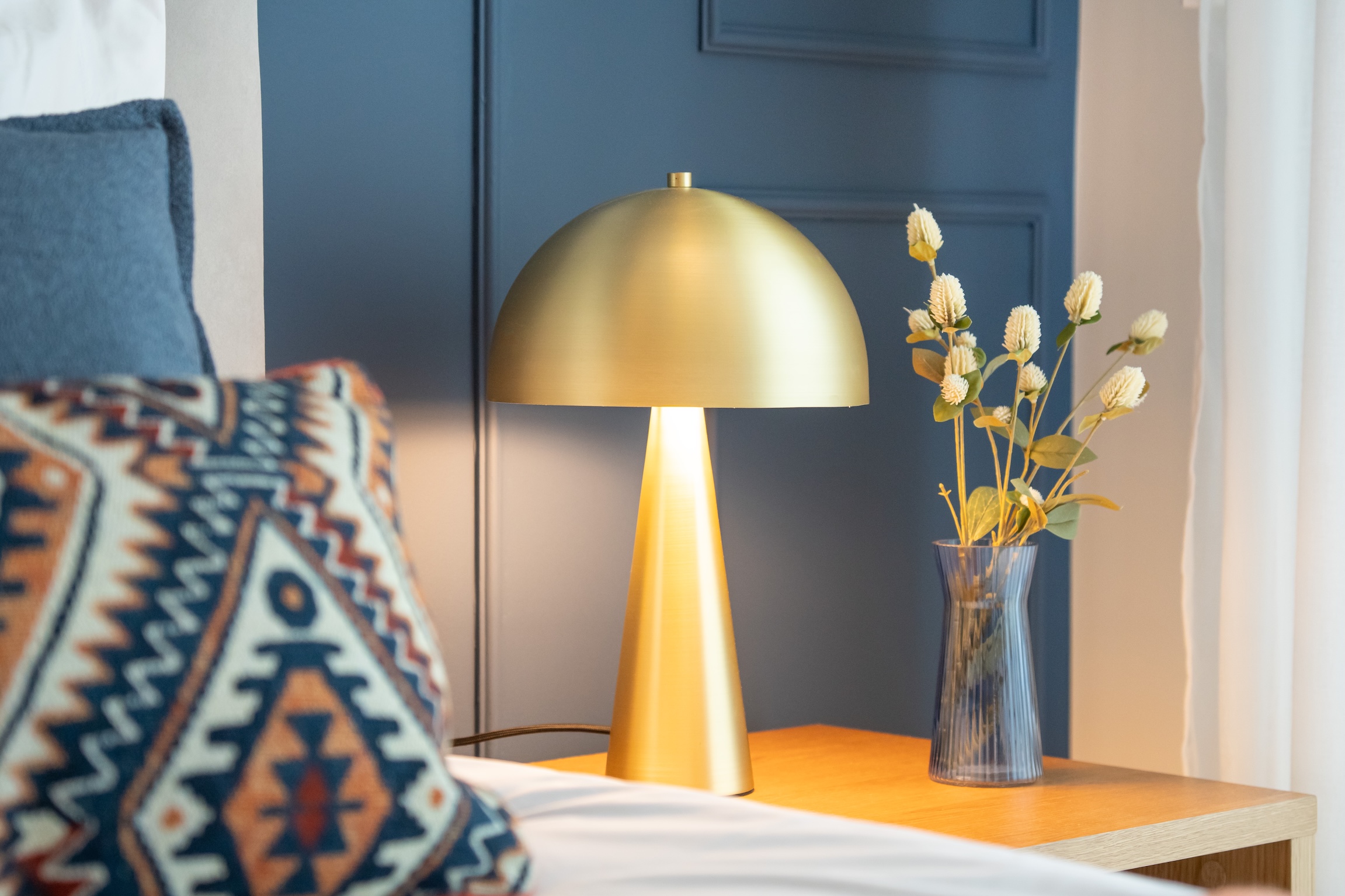
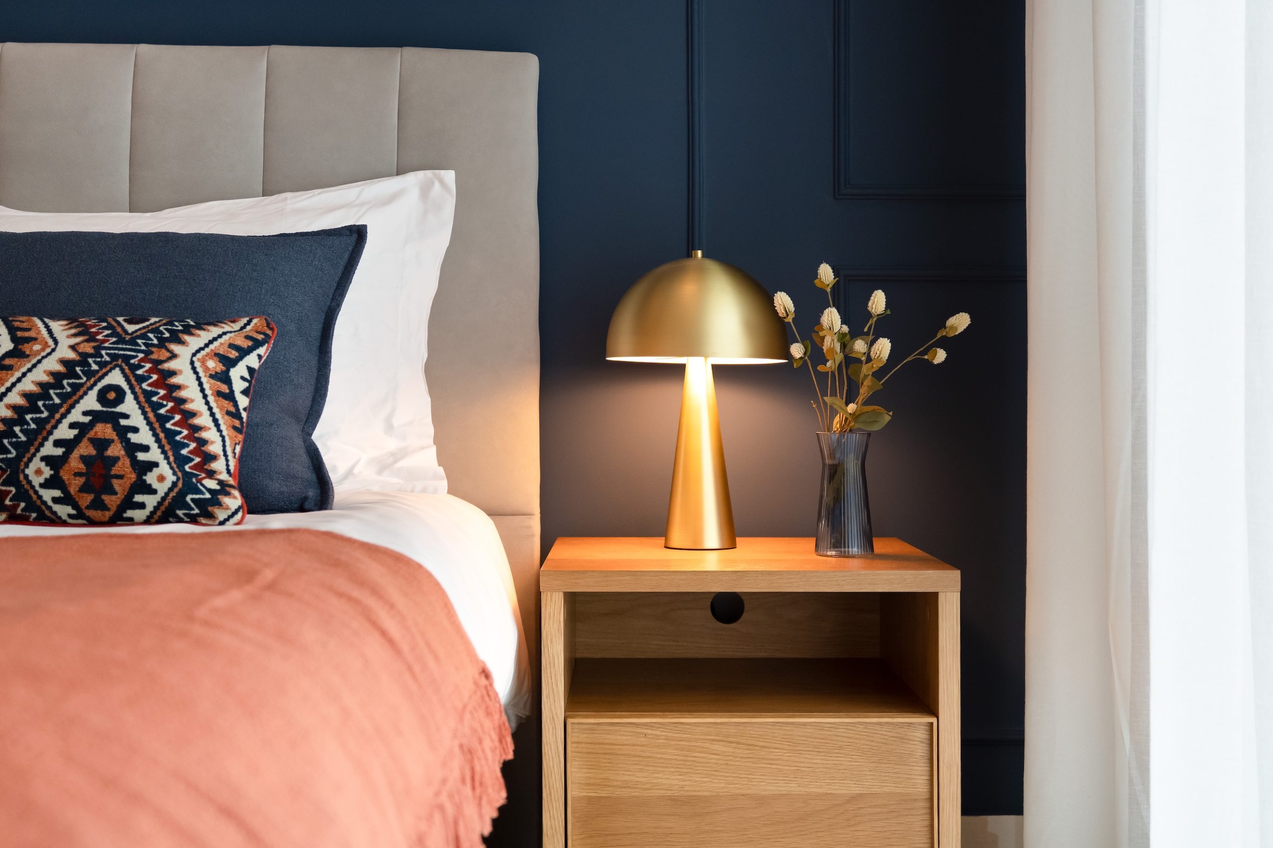
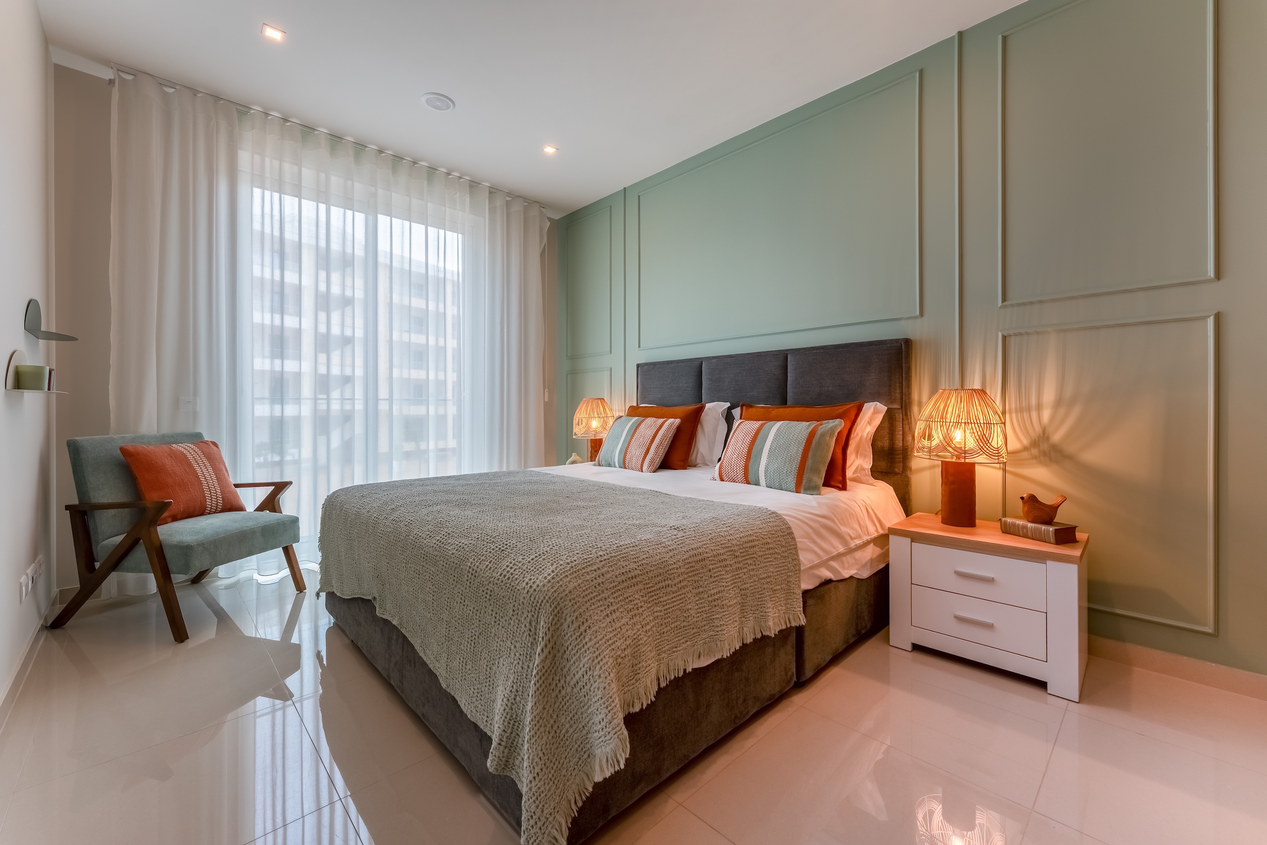
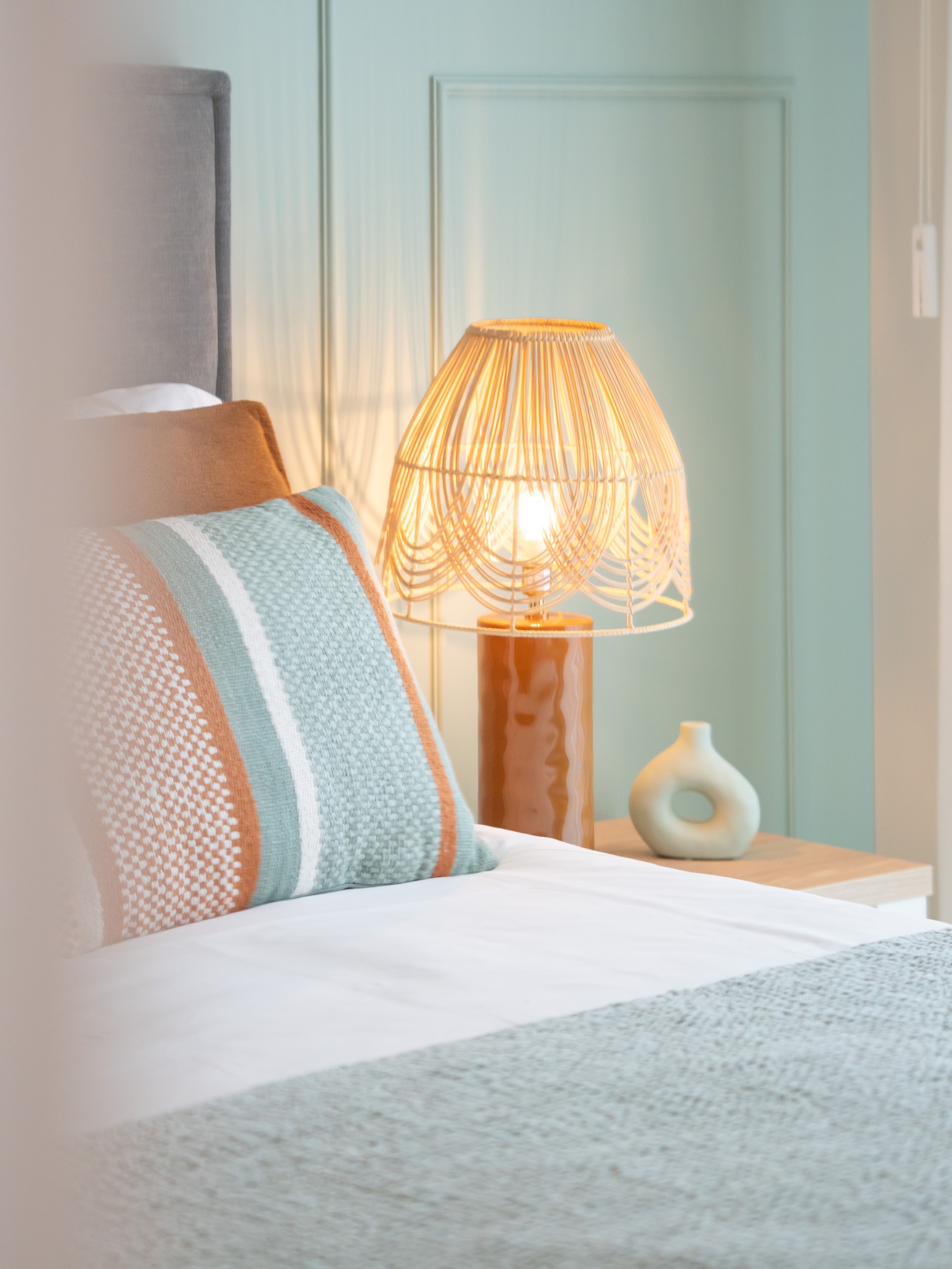
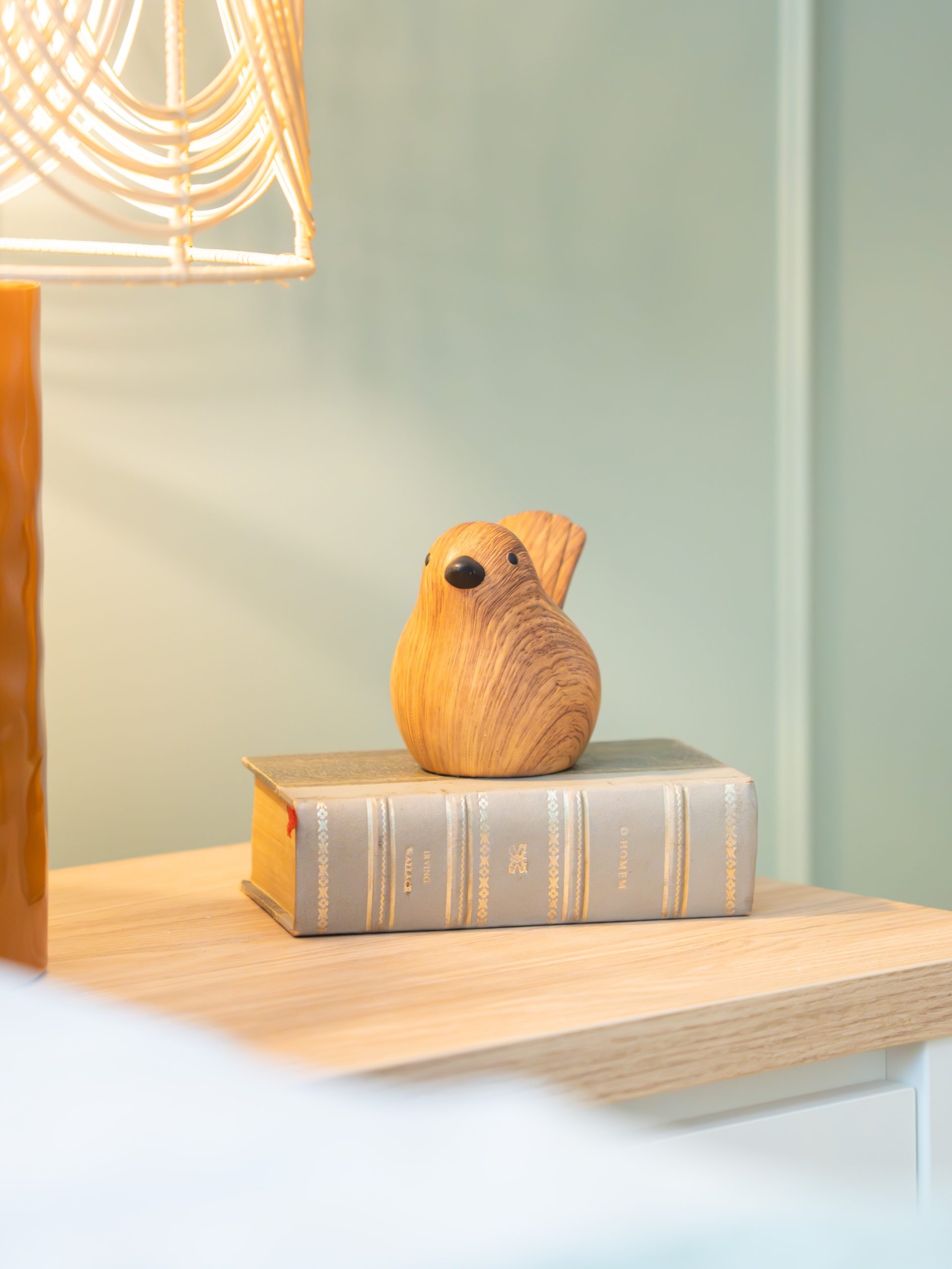
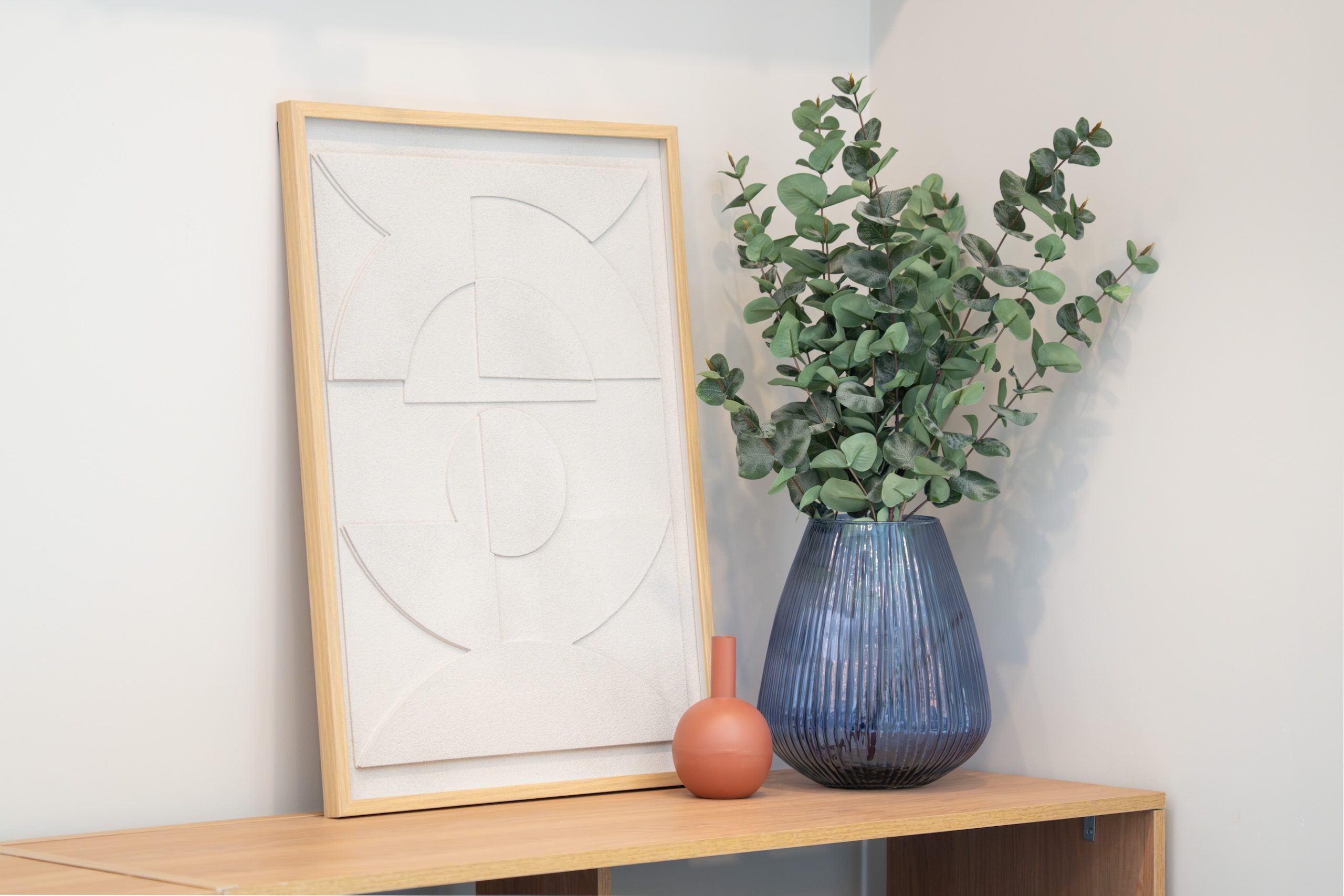
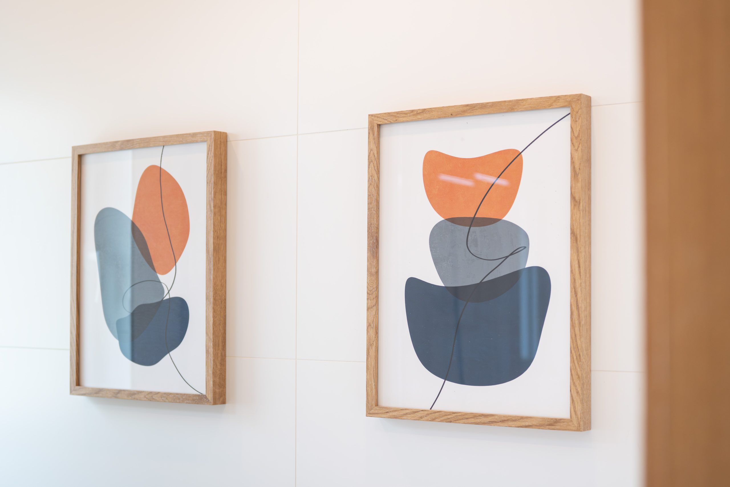
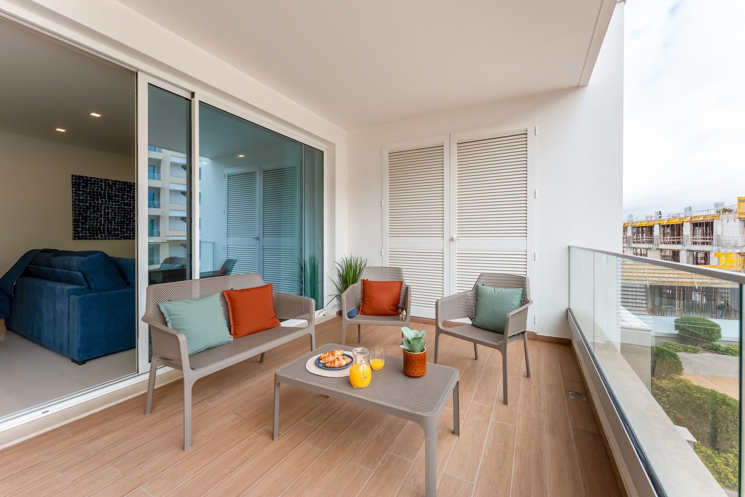
Redecorate a holiday rental apartment that felt sterile and much like the surrounding apartments, quickly and economically, without affecting the summer rental season.
The color story
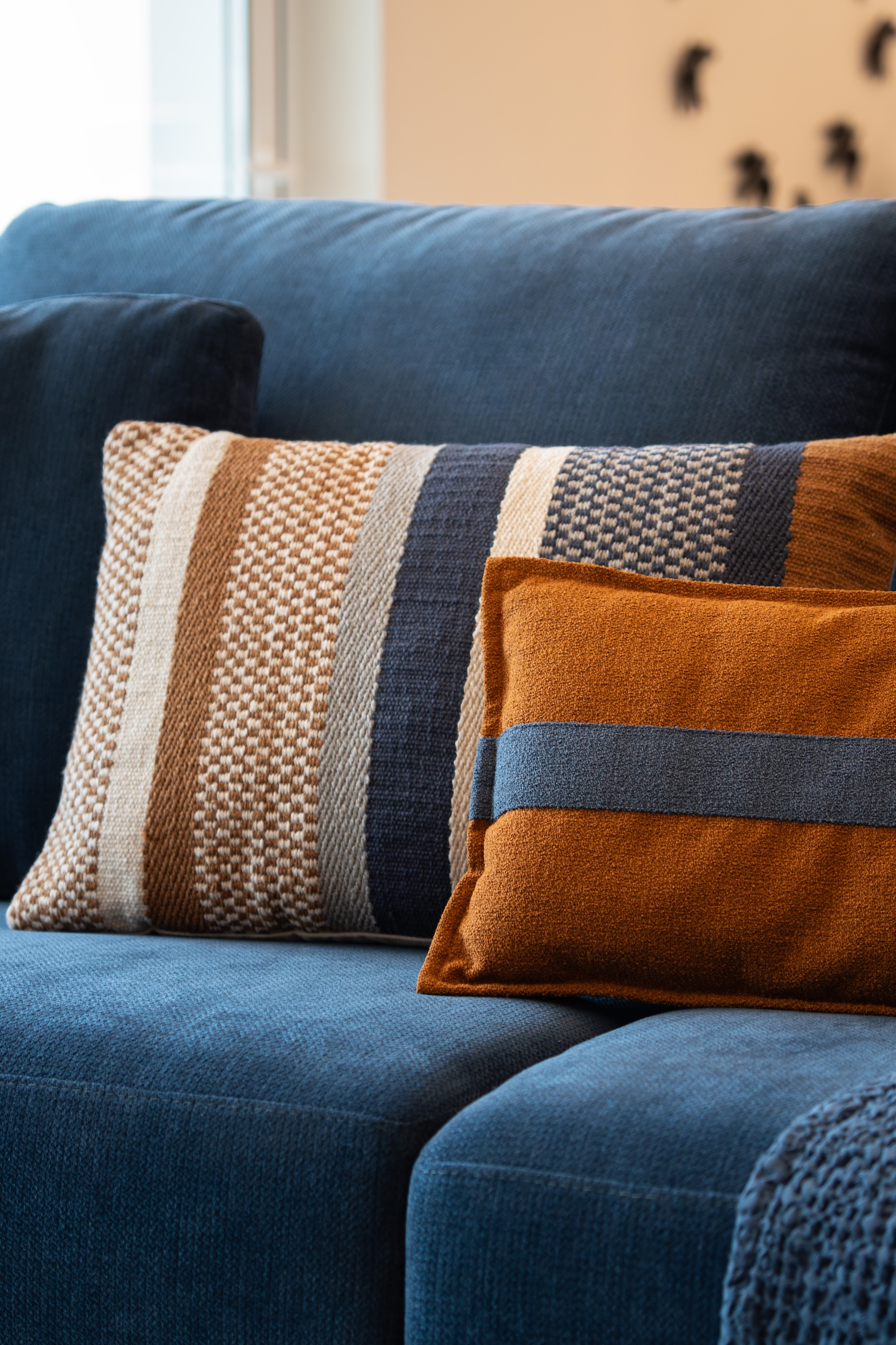
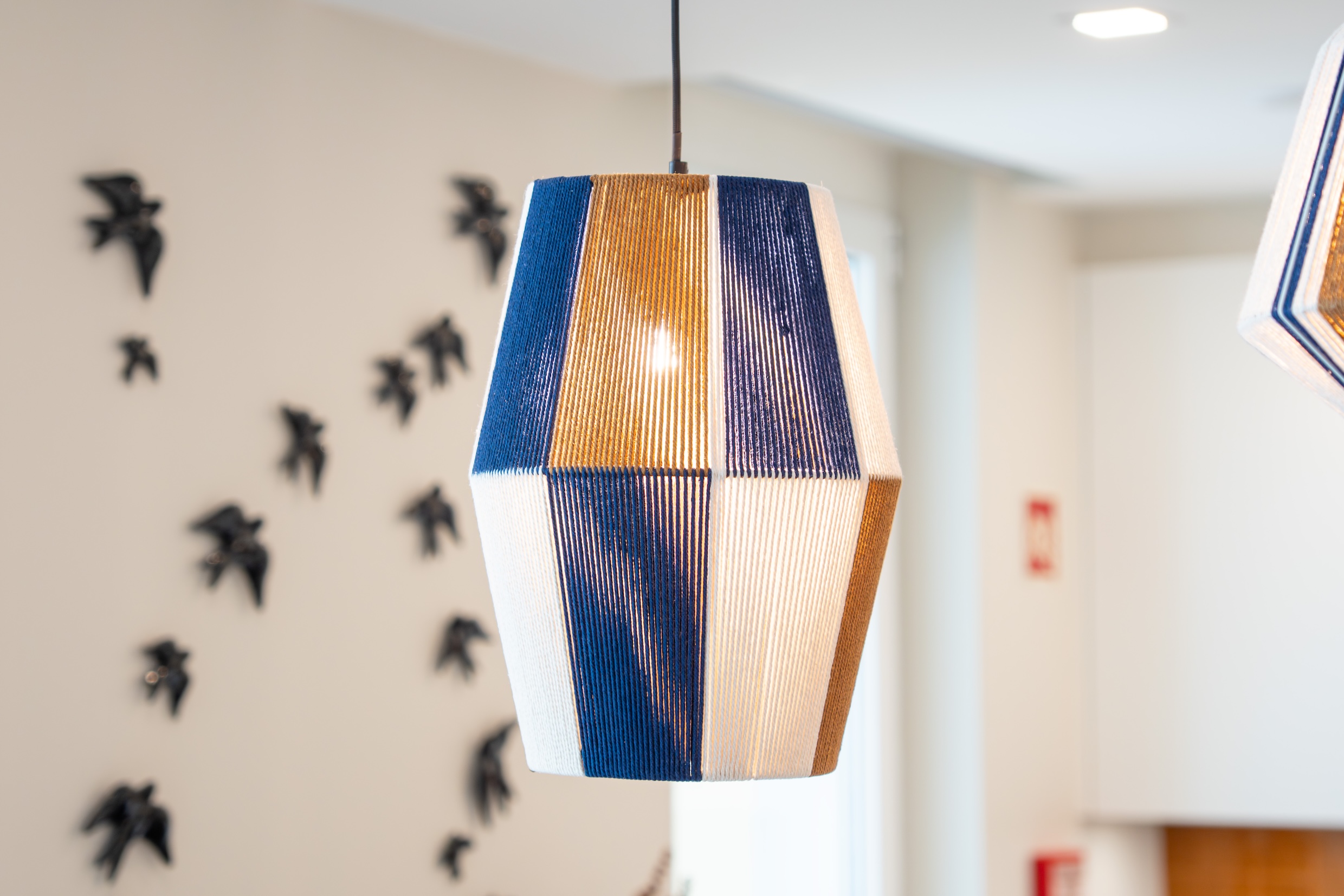
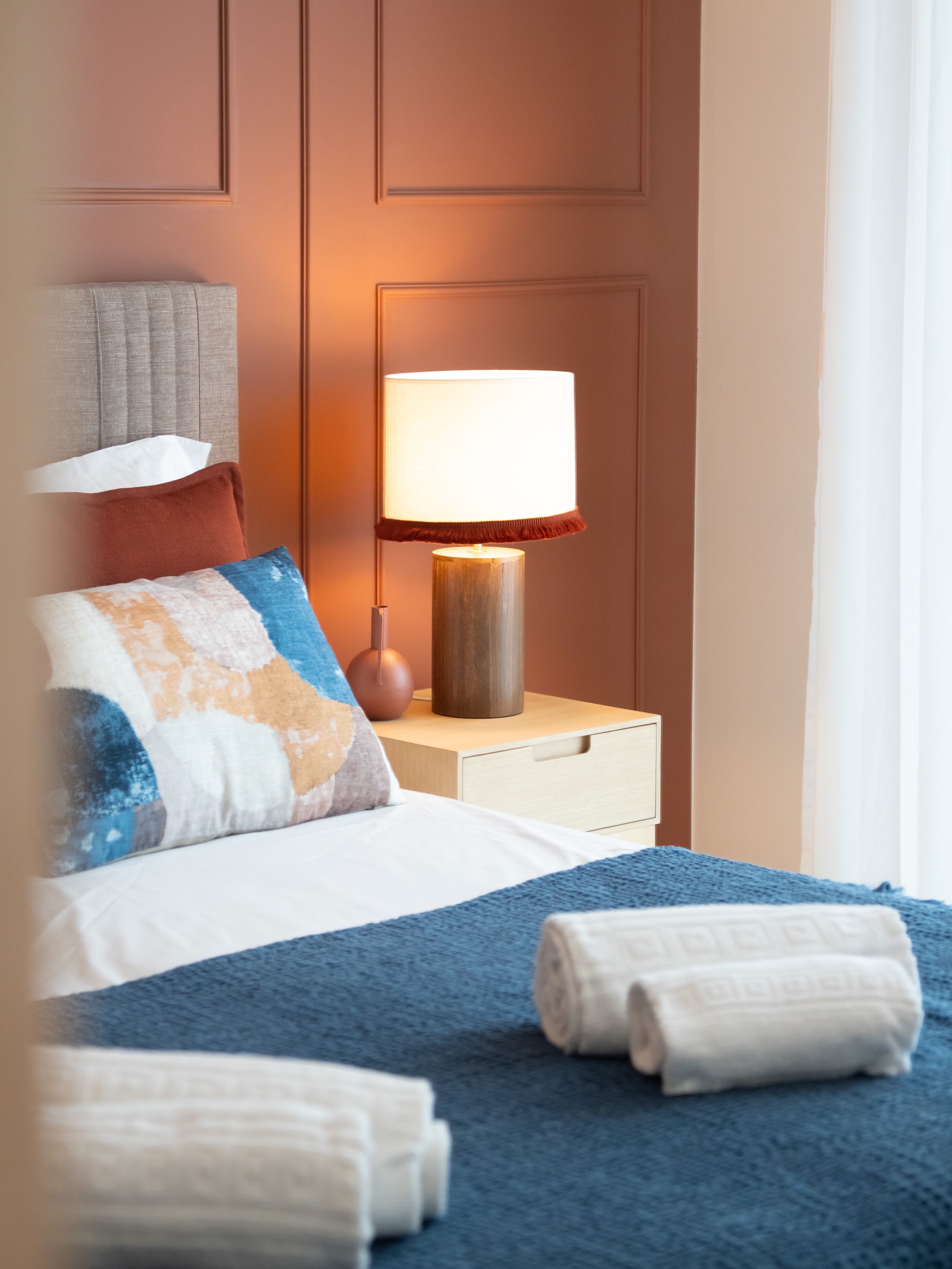
A warmer, more colorful palette turned it into an inviting place to stay, while keeping it practical and easy to maintain for holiday guests. A project with an Algarve-based decorator.